Today we are creating a super cool and pretty quick CSS effect.
I love this effect. It’s not super happy and can be made just by CSS.
Because it’s CSS based, we can even animate it if we want to. (I’ll leave that up to you)
The result of today’s article:
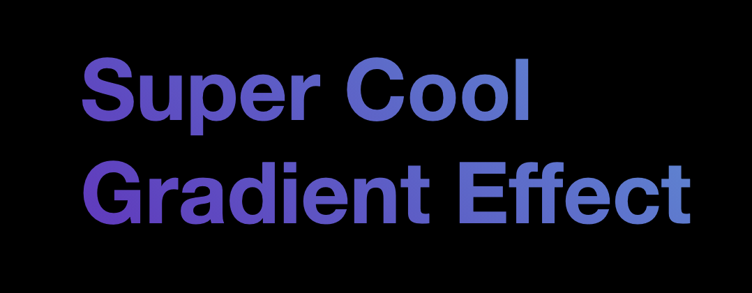
I’ll guide you through creating this excellent effect yourself in just a few lines of CSS!
HTML Structure
As for the HTML, we only need the following:
<h1>Super Cool<br />Gradient Effect</h1>
As you can see, I’ve added a break (<br />) just because I like to showcase it even works on two lines.
CSS Gradient text effect
Now let’s move to our CSS setup.
We’ll start by styling our body to center our element inside the <h1>.
body {
  display: grid;
  place-items: center;
  min-height: 100vh;
  background: #000;
}
I use CSS Grid to center everything ideally.
Then in my example, I’m using a black background to make it pop more.
Now we need to get cracking on our heading style.
h1 {
  font-family: Roboto, 'Helvetica Neue', Arial, sans-serif;
  font-size: 6vmax;
}
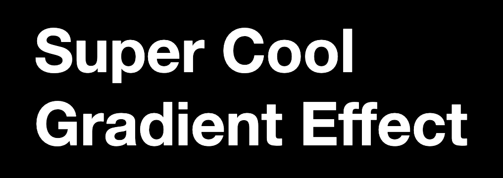
We start by defining a font we like and making it nice and big.
I’m using a 6vmax, a scalable viewport unit.
This results in the following:
The next step is to add our gradient. We are using the background-image to set our gradient.
h1 {
  font-family: Roboto, 'Helvetica Neue', Arial, sans-serif;
  font-size: 6vmax;
  background-color: #5390d9;
  background-image: linear-gradient(45deg, #6930c3, #5390d9);
}
As you can see, I also set a fallback color in case the gradient isn’t supported.
I’m using a primary CSS linear gradient with only two colors.
You can extend these to support even more colors or fancy gradients.
You can use this excellent generator for CSS gradients
Our result so far is pretty weird:
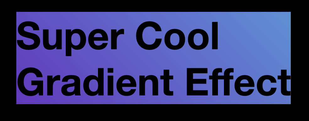
As you can see above, the text is now black and has a gradient surrounding it. It’s close, but we’re not there yet.
Let’s add the text gradient effect.
We use the background-clip property and set the text-fill-color to transparent.
The background-clip ensures the gradient goes on top of the text, and the text-fill will make it pop through.
h1 {
  font-family: Roboto, 'Helvetica Neue', Arial, sans-serif;
  font-size: 6vmax;
  background-color: #5390d9;
  background-image: linear-gradient(45deg, #6930c3, #5390d9);
  -webkit-background-clip: text;
  -webkit-text-fill-color: transparent;
  -moz-background-clip: text;
  -moz-text-fill-color: transparent;
}
Now that we get this fantastic result look around on this Codepen.
See the Pen eYdgOVg by Chris Bongers (@rebelchris) on CodePen.
Browser Support
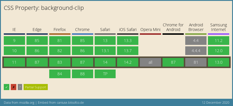
This whole setup doesn’t have full support, but the elements these days are widely supported.
I’ve shown the background-clip since it’s an important part.
Thank you for reading, and let’s connect!
Thank you for reading my blog. Feel free to subscribe to my email newsletter and connect on Facebook or Twitter