Gradients can make your website or application impressive and enhance its feel of it.
They also can be terrible and over the top (personal opinion, look at my demo… 🤷♂️)
Today we’ll be looking into CSS Linear Gradients, which we can use, and how to use them.
Types of CSS Gradients
There are two types of gradients we can leverage in CSS these two are:
Linear: From one side to the other sideRadial: Round gradient
Best to view them in action and see what they can do.
Also, check my Article on Radial Gradients
CSS Linear Gradient
Let’s start with the linear gradient; this one, by default, goes from top to bottom and accepts colors in whatever type you like (RGB,CMYK,hex,named).
.basic-linear {
  background-image: linear-gradient(#ff0000, #ffff00);
  background-image: linear-gradient(red, yellow);
  background-image: linear-gradient(rgb(255, 0, 0), rgb(255, 255, 0));
}
The above will render the same gradient a red top that flows into a yellow bottom.
Linear Gradient Left to Right
What if we want the gradient to move from left to right?
We can pass an additional first argument.
.left-linear {
  background-image: linear-gradient(to right, red, yellow);
}
Alternatively, we can define this by giving a percentage.
.left-linear {
  background-image: linear-gradient(90deg, red, yellow);
}
By doing so, we can also make the gradient diagonal.
.diagonal-linear {
  background-image: linear-gradient(45deg, red, yellow);
  background-image: linear-gradient(to top right, red, yellow);
}
Using Multiple Colours
Another thing we can do is keep adding colors!
.multi-linear {
  background-image: linear-gradient(45deg, red, yellow, green, blue);
}
We can also state where each color should begin like so:
.multi-linear {
  background-image: linear-gradient(45deg, red 10%, yellow 50%, blue 60%);
}
Linear Gradient Transparency
This is one of the options I use transparency in making something go from a solid color to a fully transparent one.
Let’s try black for this one.
.transparent-linear {
  background-image: linear-gradient(
    to right,
    rgba(0, 0, 0, 0),
    rgba(0, 0, 0, 1)
  );
}
Repeating Linear Gradient
Something that I used in making CSS images is a repeating gradient:
.repeating-gradient {
  background-image: repeating-linear-gradient(red 10%, yellow 20%);
}
An excellent tool for making awesome gradients and directly getting the code is CSSGradient.io!
Have a look at this Codepen.
See the Pen CSS Linear Gradients by Chris Bongers (@rebelchris) on CodePen.
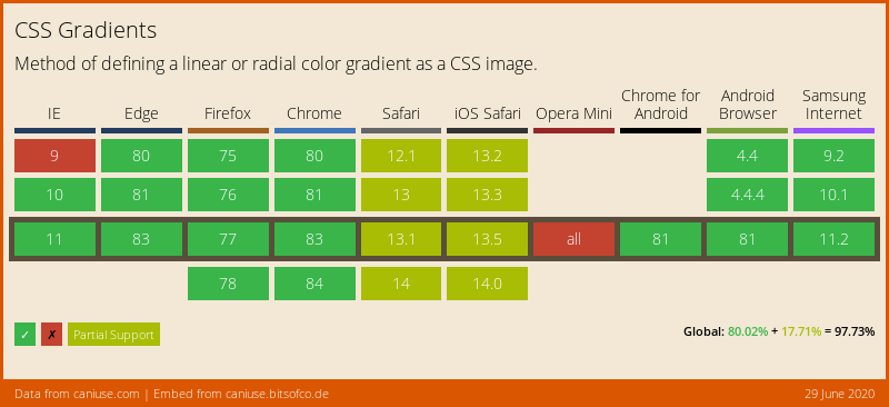
Browser Support
CSS Gradients are very well supported. Just Opera Mini is not working, and not all browsers support the complete set of options.
Thank you for reading, and let’s connect!
Thank you for reading my blog. Feel free to subscribe to my email newsletter and connect on Facebook or Twitter