Yesterday we looked at CSS Linear Gradiants. And as promised, today we’ll look into radial gradients. These gradients show from a round perspective.
Types of CSS Gradients
As a reminder, there are two types of gradients we can leverage in CSS. These types are:
Linear Gradient: From one side to the other sideRadial Gradient: Round gradient
It’s best to view them in action and see what they can do.
View how to use a Linear Gradient in CSS
CSS Radial Gradient
The radial gradient is defined by its center and moves from there.
In the most basic example, we can use it like this:
.basic-radial {
  background-image: radial-gradient(red, yellow);
}
This will shift from red (inside) colors to the yellow (outside) color spectrum.
Radial Gradient with Multiple Colors
We can also define multiple colors for the radial gradient, much like the linear gradient. Let’s look at an example with four colors:
.multi-radial {
  background-image: radial-gradient(red, yellow, green, blue);
}
We can also define the gradient position for the colors:
.position-radial {
  background-image: radial-gradient(red 10%, yellow 50%, green 90%);
}
Transparent Radial Gradients
We can even make the gradient transparent, which can be used for some cool overlay effects. To create a transparent gradient, we have to use the RGBA color spectrum:
.transparent-radial {
  background-image: radial-gradient(rgba(0, 0, 0, 0), rgba(0, 0, 0, 1));
}
Radial Gradient Shape
By default, the radial gradient will use an ellipse shape. We can change it to a circle too. But there are only these two options.
Shapes of radial gradients
- circle
- ellipse
Example:
.shape-gradient {
  background-image: radial-gradient(circle, red 10%, yellow 20%);
}
Repeat Radial Gradient
And for who knows what reason, we can repeat the gradient as well with this code:
.repeat-radial {
  background-image: repeating-radial-gradient(red 10%, yellow 20%);
}
View all these code examples in this Codepen
See the Pen CSS Radial Gradients by Chris Bongers (@rebelchris) on CodePen.
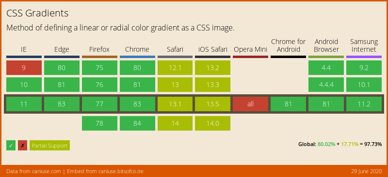
Browser Support
CSS Gradients are very well supported. Just Opera Mini is not working, and not all browsers support the complete set of options.
Thank you for reading, and let’s connect!
Thank you for reading my blog. Feel free to subscribe to my email newsletter and connect on Facebook or Twitter