This effect is so cool and just around fun to see. Today we will learn how to do a cut-out text effect in CSS! The effect will show an image through the cut-off text shape.
It works by having a div that holds an image as a background. On the div element, we put another text element, using blend-mode, which will make the image show through the text.
Example code for text cut-out
You can see a CSS code example of a knockout text in this Codepen:
See the Pen CSS cut out effect that will blow your mind 🤯 by Chris Bongers (@rebelchris) on CodePen.
HTML Structure
The HTML for this project could not be more straightforward.
It’s only a div with a text element inside.
<div class="background">
  <h1>GALAXY</h1>
</div>
That’s it!
CSS Cut out text effect
Let’s start by making our background div centered.
body {
  display: flex;
  justify-content: center;
  align-items: center;
  height: 100vh;
}
We are using CSS Flexbox to center anything inside the body tag. It’s versatile to do this if you are only styling one element.
Now we need to add our background image.
.background {
  background: url('https://images.unsplash.com/photo-1465101162946-4377e57745c3?ixlib=rb-1.2.1&ixid=eyJhcHBfaWQiOjEyMDd9&auto=format&fit=crop&w=1957&q=80')
    center;
  background-size: cover;
}
Okay, so the background receives an image, and we set the size to cover in the CSS.
So now we should see something like the below:
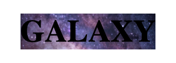
It’s a start, but it’s the opposite of our desired effect. So let’s go ahead and style the text element with the blend-mode.
h1 {
  font-size: 15vw;
  font-weight: bold;
  font-family: Roboto, 'Helvetica Neue', Arial, sans-serif;
  color: #000;
  background: #fff;
  mix-blend-mode: lighten;
}
First, we set big font size. I’m using the viewport size to make the font responsive.
Then we set the color of the letters to black and the background white. This gives it a full contrast. You can also change the color to get an excellent alpha effect!
The last step is enabling the mix-blend mode with CSS. Since we are using a full contrast (black/white), it will remove the black text and show the image behind the text element:
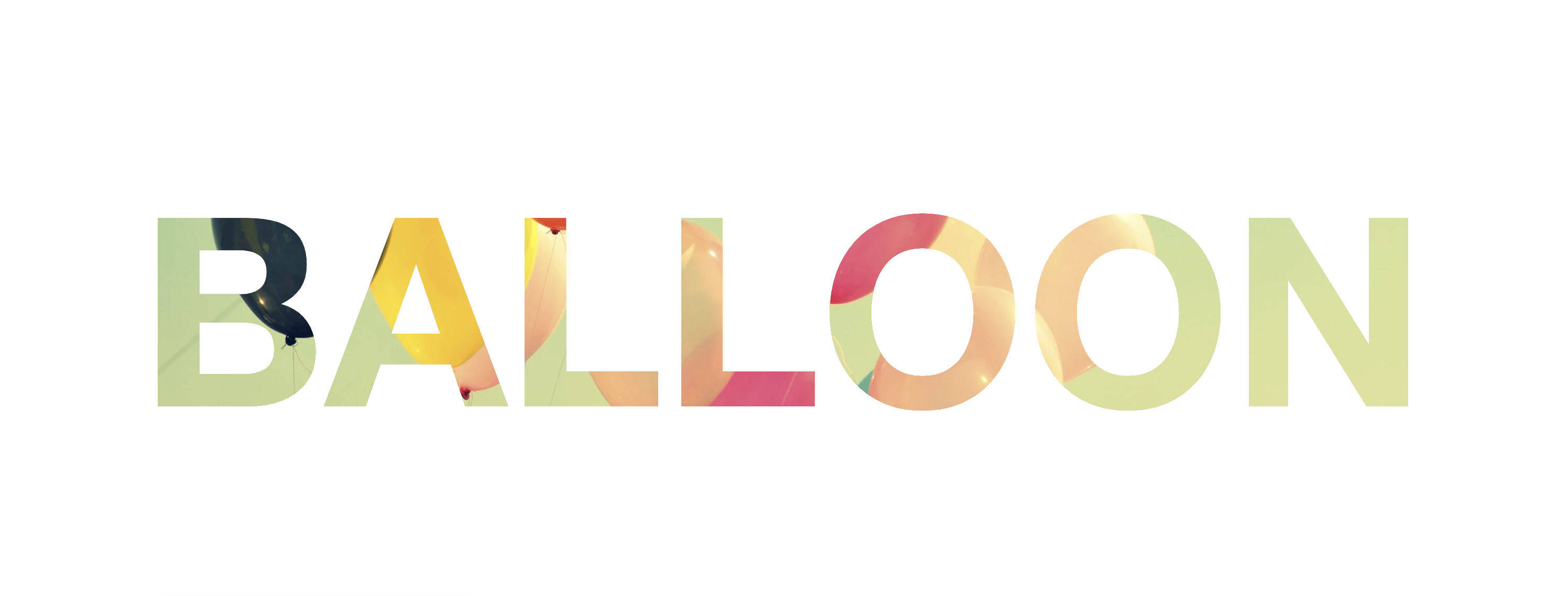
So this is how you create a CSS knockout effect with a background image and a few letters of text!
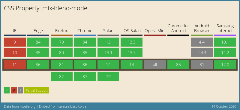
Browser Support for knockout text
Mix-blend-mode does not have full support in all browsers. Internet Explorer, for one, will not render it 🤕.
Thank you for reading, and let’s connect!
Thank you for reading my blog. Feel free to subscribe to my email newsletter and connect on Facebook or Twitter