We will do something unique this weekend - we’ll be re-creating Photoshop!
Not entirely, but we’ll be re-creating the image filters in Photoshop using variable CSS Filters.
I choose to build a playground so people can understand each filter’s effect! I do hope you find it helpful.
Things we will address in this article are:
- CSS Variables
- CSS Filters
- JavaScript Setting CSS Variables
Please play around with this Codepen because trying it will show you how it works.
See the Pen Building a Realtime Photoshop 🎨 by Chris Bongers (@rebelchris) on CodePen.
HTML Structure
Our application is going to have one image on the left-hand side and then our slider controls on the right, so let’s start by creating this in HTML:
<div class="container">
  <img
    src="https://images.unsplash.com/photo-1508671323699-6df22ecaec2a?ixlib=rb-1.2.1&ixid=eyJhcHBfaWQiOjEyMDd9&auto=format&fit=crop&w=250&q=80"
    id="main-image"
  />
  <div class="toolbox">
    <label>
      Blur
      <input id="blur" max="20" min="0" step="1" type="range" value="0" />
    </label>
    <label>
      Brightness
      <input
        id="brightness"
        max="1"
        min="0"
        step="0.1"
        type="range"
        value="1"
      />
    </label>
    <label>
      Contrast
      <input
        id="contrast"
        max="200"
        min="0"
        step="1"
        type="range"
        value="100"
      />
    </label>
    <label>
      Grayscale
      <input id="grayscale" max="100" min="0" step="1" type="range" value="0" />
    </label>
    <label>
      Hue
      <input id="hue" max="360" min="0" step="1" type="range" value="0" />
    </label>
    <label>
      Invert
      <input id="invert" max="100" min="0" step="1" type="range" value="0" />
    </label>
    <label>
      Opacity
      <input id="opacity" max="100" min="0" step="1" type="range" value="100" />
    </label>
    <label>
      Saturate
      <input
        id="saturate"
        max="200"
        min="0"
        step="1"
        type="range"
        value="100"
      />
    </label>
    <label>
      Sepia
      <input id="sepia" max="100" min="0" step="1" type="range" value="0" />
    </label>
  </div>
</div>
As you can see, we are using the HTML range type sliders and giving them default values, which are the typical values for each filter.
Adding our General Styling
Let’s start by adding our general styling:
.container {
  display: flex;
  align-items: center;
  justify-content: center;
  height: 100vh;
  background: #eee;
}
.toolbox {
  margin-left: 50px;
  display: flex;
  justify-content: center;
  flex-direction: column;
}
label {
  margin-bottom: 5px;
}
Nothing fancy. We are using Flex to center for everything to add some primary margin to our elements.
Adding our CSS Variables
We are addressing today’s topic CSS Variables. These are super useful because they can easily be changed by JavaScript!
:root {
  --blur: 0;
  --brightness: 1;
  --contrast: 100;
  --grayscale: 0;
  --hue: 0;
  --invert: 0;
  --opacity: 100;
  --saturate: 100;
  --sepia: 0;
}
Above, you see all the variables we are using. They correspond with the HTML inputs we created!
So we set them all to have our fundamental starting point values, but how do they do something?
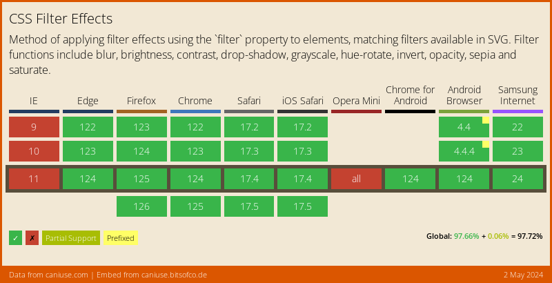
CSS Filters
As we saw in our article about our CSS Disco Text, CSS Filters are cool.
The filters we can use are as follows:
- URL (We won’t use this today)
- blur
- brightness
- contrast
- drop-shadow (Also, it won’t be used)
- grayscale
- hue-rotate
- invert
- opacity
- saturate
- sepia
So let’s address this and add the filters to our Image.
#main-image {
  transition: all 300ms ease-in-out;
  filter: blur(calc(1px * var(--blur))) brightness(var(--brightness)) contrast(
      calc(1% * var(--contrast))
    ) grayscale(calc(1% * var(--grayscale))) hue-rotate(calc(1deg * var(--hue)))
    invert(calc(1% * var(--invert))) opacity(calc(1% * var(--opacity))) saturate(
      calc(1% * var(--saturate))
    )
    sepia(calc(1% * var(--sepia)));
  border: 5px solid #fff;
}
Wow! Massive code-block, but you can only have one filter element, so we “chain” the filters after each other!
Ok, cool, we now set all the filters on our image, but nothing changed.
Correct! These are all the default values of each filter, so let’s add some JavaScript to make the sliders affect our variables.
JavaScript Setting CSS Variables
First, let’s start and get our image object.
const img = document.getElementById('main-image');
Ok, now we need to find all our sliders.
const inputs = document.querySelectorAll('input');
Next, we want to loop over each input and attach an event listener.
[].forEach.call(inputs, function (input) {
  input.addEventListener('input', (e) => {
    img.style.setProperty('--' + input.id, input.value);
  });
});
We add an event listener to our input event, executing the function every time the slider changes.
The function then gets our image variable and uses the setProperty function to set the variables (e.g. --blur) to the input value!
Browser Support
As mentioned before, CSS Filters are cool but not widely supported yet 😩.
There is a polyfill, but also limited.
Thank you for reading, and let’s connect!
Thank you for reading my blog. Feel free to subscribe to my email newsletter and connect on Facebook or Twitter