Today I will teach you something useless but fun! I will teach you how to create text with a disco effect in CSS.
I wanted to explore the hue-rotate function and didn’t have any better use case for it.
If you have an excellent use case drop me a message!
HTML Structure
<div class="container">
  <input type="checkbox" />
  <div>D I S C O</div>
  <i>click above</i>
  <span></span>
</div>
I’m going with a sluggish solution today, and we’ll use an invisible checkbox to get the party started 🥳.
Our text will be one word. It will be the star of the show. And a span element for the background effect.
Disco Text effect with CSS Hue-rotate
For the text effect, the main idea is to showcase the power of the hue-rotate filter in CSS.
But let’s start with the basic styling:
.container {
  position: relative;
  display: flex;
  height: 100vh;
  align-items: center;
  justify-content: center;
  flex-direction: column;
}
The most important part here is the relative position.
The other is just basic centering with flex.
.container span {
  width: 100%;
  height: 100%;
  background: #efefef;
  position: absolute;
  z-index: -1;
  transition: all 0.5s ease;
}
This span will be our virtual background, so we give it a starting grey color and position it absolute on the whole background.
We then add a transition on all effects.
.container div {
  position: relative;
  width: auto;
  background: #1d1e21;
  color: #555;
  padding: 20px 40px;
  display: flex;
  justify-content: center;
  align-items: center;
  font-size: 46px;
  cursor: pointer;
  margin: 0 4px;
  border-radius: 25px;
  box-shadow: 0px 0px 5px rgba(0, 0, 0, 0.5);
  transition: all 0.5s ease;
}
Now for our main div, it’s nothing fancy, with some general styling to make it look nice.
This article uses a checkbox to turn our disco on/off. We’ll make the checkbox invisible across our whole page for easy usability.
input[type='checkbox'] {
  position: absolute;
  opacity: 0;
  cursor: pointer;
  height: 100%;
  width: 100%;
  z-index: 100;
}
Ok, on to the magic part: What happens if we click this checkbox:
input[type='checkbox']:checked ~ span {
  background: #333;
}
First, we make our background span a darker color to “turn the lights off.”
And then, we turn the actual disco text on with this CSS code:
input[type='checkbox']:checked ~ div {
  box-shadow: 0px 0px 5px rgba(255, 255, 255, 0.5);
  color: yellow;
  text-shadow: 0 0 15px yellow, 0 0 25px yellow;
  animation: glow 5s linear infinite;
}
The glow animation is where the excellent disco effect takes place:
@keyframes glow {
  0% {
    filter: hue-rotate(0deg);
  }
  100% {
    filter: hue-rotate(360deg);
  }
}
There we go! This is how to create a text with animating disco colors.
See the Code example on Codepen
The result is in the following Codepen:
See the Pen CSS Disco Text by Chris Bongers (@rebelchris) on CodePen.
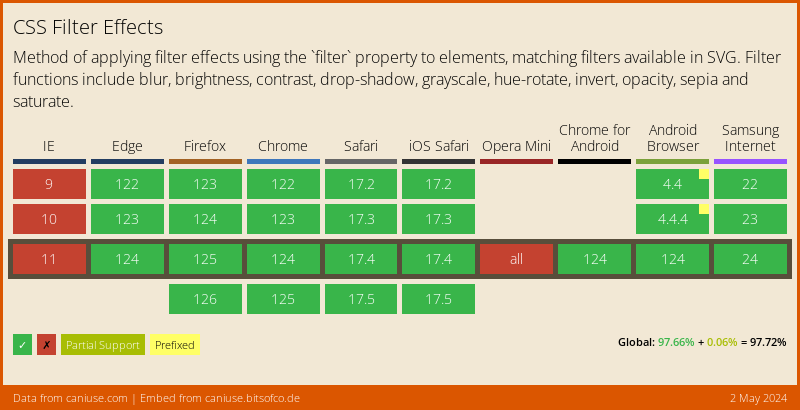
Browser Support
As you can imagine, such a cool CSS feature comes at the price of not supporting every browser :(.
There is a polyfill, but also limited.
Thank you for reading, and let’s connect!
Thank you for reading my blog. Feel free to subscribe to my email newsletter and connect on Facebook or Twitter