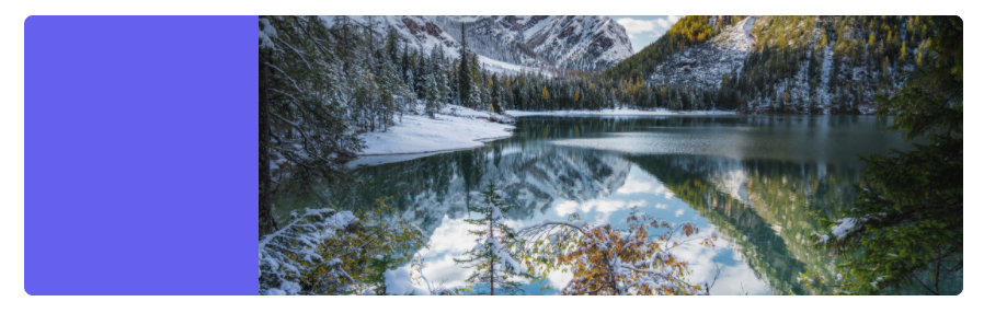
In this tutorial, we will be creating a super cool responsive header with an image only using Tailwind CSS.
This header will include the following elements.
- ✅ Left side for text
- ✅ Right side for a responsive image
- ✅ Diagonal line and opacity line to split them
- ✅ No custom CSS is needed!
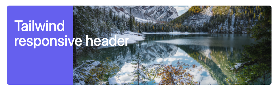
The result is this super cool header, including a responsive image:
Tailwind CSS responsive header
We won’t be writing our own CSS, so bear with me as we build this header using HTML elements with Tailwind classes.
We will start off by building the main wrapper:
<div class="relative h-64 m-8 overflow-hidden bg-indigo-500 rounded-lg"></div>
We give this wrapper a height with the h-64 class and round the corners. Next, we also make the background a cool indigo tint.
As you can see, this wrapper has a relative positioning. That’s because we need to use some absolute divs to position elements on top of each other.
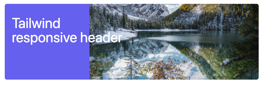
The above code gives us the following result:

We want to place the image on the right and make it flexible first.
<div class="relative h-64 m-8 overflow-hidden bg-indigo-500 rounded-lg">
  <div class="absolute top-0 right-0 block w-9/12 h-full">
    <img
      alt="Snowy mountain lake"
      class="object-cover h-full min-w-full"
      src="https://images.unsplash.com/photo-1607025952930-da2ac6748e7a?ixid=MXwxMjA3fDB8MHxwaG90by1wYWdlfHx8fGVufDB8fHw%3D&ixlib=rb-1.2.1&auto=format&fit=crop&w=1650&q=80"
    />
  </div>
</div>
As you can see, we place an absolute div inside our container. This div is set to the right of the parent element. We also state it should be 9/12 of the width and use the full height. Inside of the div is the actual image. We state it should use an object-fit method and use the full height.
The result so far:
Already a pretty awesome result. We need to make the left side for the content and the even cooler diagonal lines.
<div class="relative h-64 m-8 overflow-hidden bg-indigo-500 rounded-lg">
  <div class="absolute z-30 flex w-full h-full">
    <div class="relative z-30 w-5/6 px-6 py-8 text-white md:py-10 md:w-1/2">
      <h2 class="text-5xl">Tailwind responsive header</h2>
      <span></span>
    </div>
  </div>
  <div class="absolute top-0 right-0 block w-9/12 h-full">
    <img
      alt="Snowy mountain lake"
      class="object-cover h-full min-w-full"
      src="https://images.unsplash.com/photo-1607025952930-da2ac6748e7a?ixid=MXwxMjA3fDB8MHxwaG90by1wYWdlfHx8fGVufDB8fHw%3D&ixlib=rb-1.2.1&auto=format&fit=crop&w=1650&q=80"
    />
  </div>
</div>
We add another absolute div, which uses the entire width and height. This is because we will cut down on the size relative to the parent inside the div. We placed a relative div inside, which defined some padding and the size of the text div. We have the heading text, nothing fancy, just a big, bold font.
If we now render this, it looks a bit odd. The text is half over the image, which is weird-looking.
Now we need to find a way to add the diagonal line and have some more indigo behind the text.
<div class="relative h-64 m-8 overflow-hidden bg-indigo-500 rounded-lg">
  <div class="absolute z-30 flex w-full h-full">
    <div class="relative z-30 w-5/6 px-6 py-8 text-white md:py-10 md:w-1/2">
      <h2 class="text-5xl">Tailwind responsive header</h2>
      <span></span>
    </div>
    <div class="absolute top-0 right-0 flex w-full h-full">
      <div class="w-1/3 h-full bg-indigo-500"></div>
    </div>
  </div>
  <div class="absolute top-0 right-0 block w-9/12 h-full">
    <img
      alt="Snowy mountain lake"
      class="object-cover h-full min-w-full"
      src="https://images.unsplash.com/photo-1607025952930-da2ac6748e7a?ixid=MXwxMjA3fDB8MHxwaG90by1wYWdlfHx8fGVufDB8fHw%3D&ixlib=rb-1.2.1&auto=format&fit=crop&w=1650&q=80"
    />
  </div>
</div>
Here we added another absolute div. For now, we add a 1/3 width element inside with the indigo color. This is the background for our text element.
It’s still not fully covering the text. That is because our shape will do the final stretch.
Now it’s time to add the shapes. I use SVG’s with a polygon inside.
<div class="relative h-64 m-8 overflow-hidden bg-indigo-500 rounded-lg">
  <div class="absolute z-30 flex w-full h-full">
    <div class="relative z-30 w-5/6 px-6 py-8 text-white md:py-10 md:w-1/2">
      <h2 class="text-5xl">Tailwind responsive header</h2>
      <span></span>
    </div>
    <div class="absolute top-0 right-0 flex w-full h-full">
      <div class="w-1/3 h-full bg-indigo-500"></div>
      <div class="relative w-1/3">
        <svg
          fill="currentColor"
          viewBox="0 0 100 100"
          class="absolute inset-y-0 z-20 h-full text-red-500"
        >
          <polygon id="diagonal" points="0,0 100,0 50,100 0,100"></polygon>
        </svg>
      </div>
    </div>
  </div>
  <div class="absolute top-0 right-0 block w-9/12 h-full">
    <img
      alt="Snowy mountain lake"
      class="object-cover h-full min-w-full"
      src="https://images.unsplash.com/photo-1607025952930-da2ac6748e7a?ixid=MXwxMjA3fDB8MHxwaG90by1wYWdlfHx8fGVufDB8fHw%3D&ixlib=rb-1.2.1&auto=format&fit=crop&w=1650&q=80"
    />
  </div>
</div>
We added another 1/3 column, but with relative positioning for now. Inside, you can see the SVG, which contains a polygon. You can change the color of these SVGs by using text classes. For the demo, I made this text-red to see that it is added.
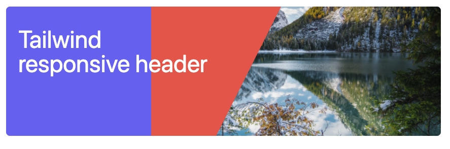
Pretty cool, right!
Now, let’s finish the shapes and add the last copy of our SVG, but offset it a little bit and add transparency to it.
<div class="relative h-64 m-8 overflow-hidden bg-indigo-500 rounded-lg">
  <div class="absolute z-30 flex w-full h-full">
    <div class="relative z-30 w-5/6 px-6 py-8 text-white md:py-10 md:w-1/2">
      <h2 class="text-5xl">Tailwind responsive header</h2>
      <span></span>
    </div>
    <div class="absolute top-0 right-0 flex w-full h-full">
      <div class="w-1/3 h-full bg-indigo-500"></div>
      <div class="relative w-1/3">
        <svg
          fill="currentColor"
          viewBox="0 0 100 100"
          class="absolute inset-y-0 z-20 h-full text-indigo-500"
        >
          <polygon id="diagonal" points="0,0 100,0 50,100 0,100"></polygon>
        </svg>
        <svg
          fill="currentColor"
          viewBox="0 0 100 100"
          class="absolute inset-y-0 z-10 h-full ml-6 text-white opacity-50"
        >
          <polygon points="0,0 100,0 50,100 0,100"></polygon>
        </svg>
      </div>
    </div>
  </div>
  <div class="absolute top-0 right-0 block w-9/12 h-full">
    <img
      alt="Snowy mountain lake"
      class="object-cover h-full min-w-full"
      src="https://images.unsplash.com/photo-1607025952930-da2ac6748e7a?ixid=MXwxMjA3fDB8MHxwaG90by1wYWdlfHx8fGVufDB8fHw%3D&ixlib=rb-1.2.1&auto=format&fit=crop&w=1650&q=80"
    />
  </div>
</div>
We added another SVG, which is offset by using the ml-6 class, which gives it margin-left.
We also add opacity-50 to make it 50% opacity.
We made a fully responsive header with Tailwind with a flexible image inside with this final code.
See the example code in this Codepen
I challenge you to play on this Codepen and inspect the classes to see the stacking format.
See the Pen Responsive header in Tailwind CSS by Chris Bongers (@rebelchris) on CodePen.
Thank you for reading, and let’s connect!
Thank you for reading my blog. Feel free to subscribe to my email newsletter and connect on Facebook or Twitter