In the previous article we had a first play with routes in Next 13. In this article we’ll dive deeper into the nested layouts and how they can benefit us.
As described previously Next now introduces a nesting layout option, meaning we can have shared layouts that renders certain parts.
There is only one required layout, which is the root layout, this one defines your HTML and base structure.
In our case this one sits in the root app directory and currently looks like this.
import './globals.css';

export default function RootLayout({
  children,
}: {
  children: React.ReactNode,
}) {
  return (
    <html lang='en'>
      <head>
        <title>Create Next App</title>
        <meta name='description' content='Generated by create next app' />
        <link rel='icon' href='/favicon.ico' />
      </head>
      <body>{children}</body>
    </html>
  );
}
Thinking in layouts
Before we dive into the details, let’s take a look at the routes we set up yesterday.
Note: I renamed
(dashboard)todashboardagain for the purpose of this article.
We created the following pages.
http://localhost:3000/dashboard/settingshttp://localhost:3000/dashboard/account
Where localhost can be seen as our main layout, then we have a dashboard layout, and inside that our pages settings, and account.
This means we can split it up in the following elements.
app/layout: Contains the HTML and header which should be seen on every page.app/dashboard/layout: Contains a left menu with all the dashboard links.app/dashboard/page: Contains the page content as we already have.
Adding a shared header
With this in mind, let’s make some changes to the main layout to render a header.
I then added Tailwind CSS and added some classes to make it look appealing.
<body>
  <header className='flex flex-row justify-between px-12 py-4'>
    <h1>MyApp</h1>
    <nav>
      <ul className='flex gap-4'>
        <li>
          <a href='#'>Home</a>
        </li>
        <li>
          <a href='#'>Dashboard</a>
        </li>
      </ul>
    </nav>
  </header>
  <main className='flex'>{children}</main>
</body>
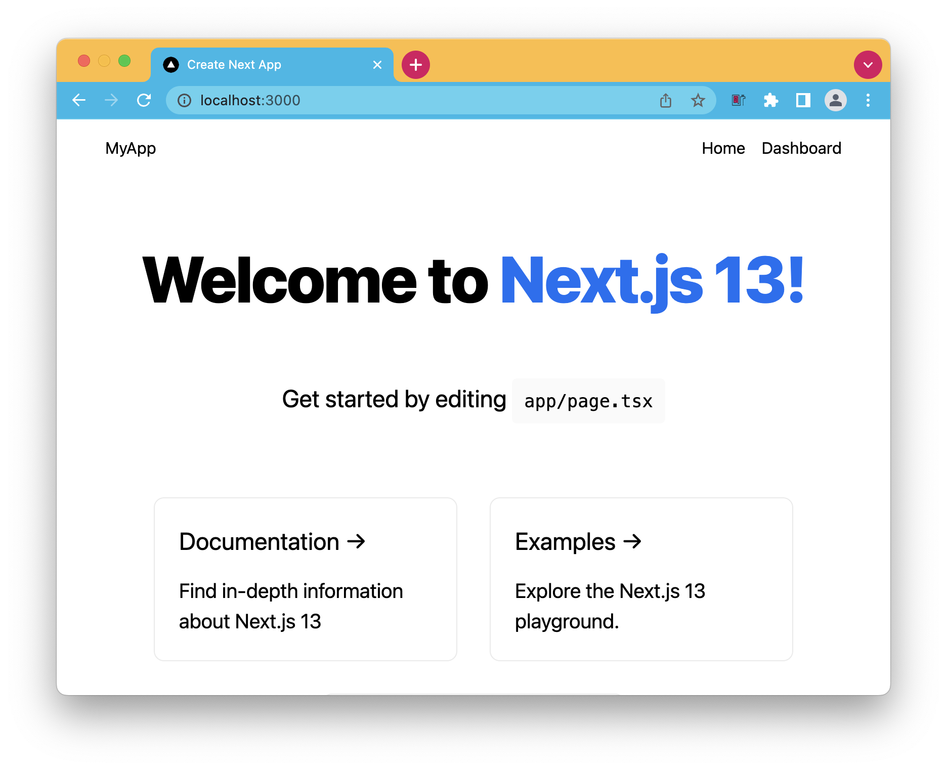
If we run this code now, we should see the default homepage, but with a header on top of it.

As mentioned this header will now be available on each page, but we’ll see that in a second.
Creating the dashboard layout
With this header in place we want to add a side menu to all pages under the dashboard folder.
This side menu will be used for the navigation between the pages in there.
Let’s create the app/dashboard/layout.tsx file and a layout.
export default function DashboardLayout({
  children,
}: {
  children: React.ReactNode,
}) {
  return (
    <>
      <aside>
        <nav>
          <ul>
            <li>
              <a href='#'>Account</a>
            </li>
            <li>
              <a href='#'>Settings</a>
            </li>
          </ul>
        </nav>
      </aside>
      <main>{children}</main>
    </>
  );
}
Now let’s add some Tailwind classes so it looks nice.
<>
  <aside className='w-64 bg-cyan-100 rounded-xl m-4'>
    <nav>
      <ul className='gap-4 flex flex-col p-4'>
        <li>
          <a href='#'>Account</a>
        </li>
        <li>
          <a href='#'>Settings</a>
        </li>
      </ul>
    </nav>
  </aside>
  <main className='p-4'>{children}</main>
</>
Sidenote
While working on this I noticed Next 13 wraps each segment in a div, this causes me quite some headaches at first when styling my solution.
You can read the discussion here.
To make generic layouts work with Tailwind CSS, add the following to your Tailwind layers.
@layer base {
  [data-nextjs-scroll-focus-boundary] {
    display: contents;
  }
}
This way you can wrap in top level layouts.
Note: This is only supported from Next 13.0.1 onwards!
Testing it out
With our layouts in place, let’s open up the first page and see how it looks.

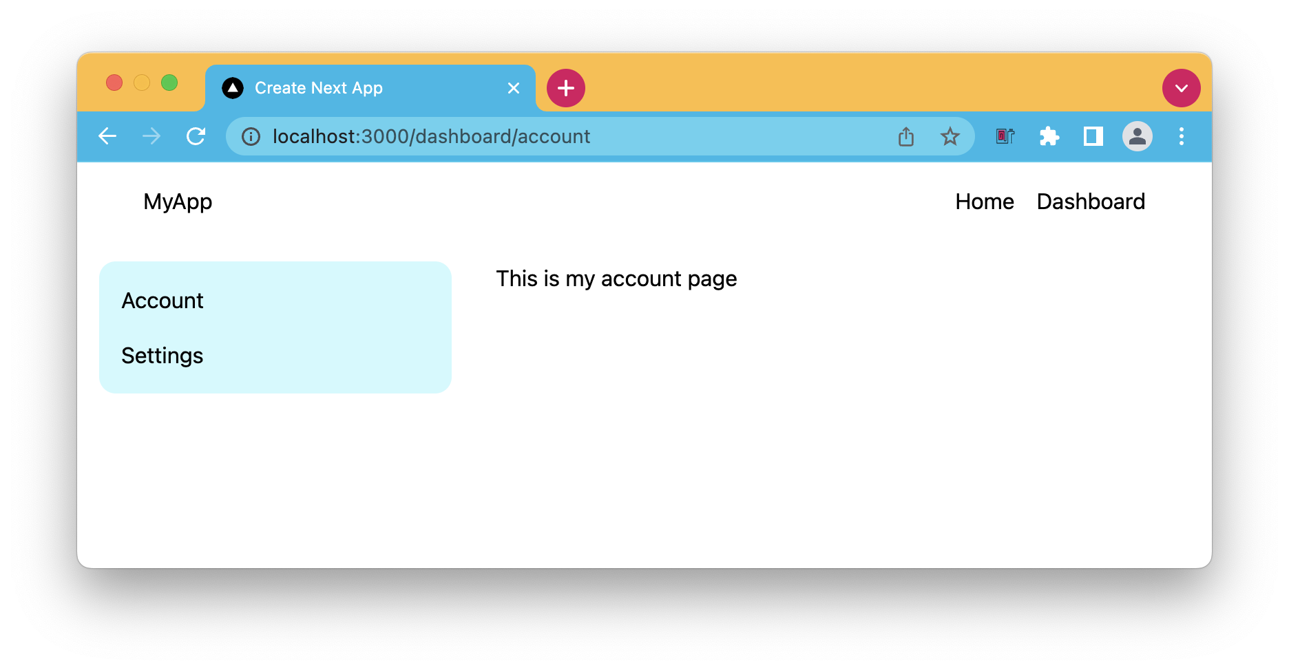
As you can see the settings page has the header from our main layout and the sidebar from the dashboard layout.
If we now open the account page it should automatically have the same wrapping layout elements.

You can also find today’s completed code on GitHub.
Thank you for reading, and let’s connect!
Thank you for reading my blog. Feel free to subscribe to my email newsletter and connect on Facebook or Twitter