I’m taking a risk here, it’s currently the 4th of March when I’m writing this, and I’ll be scheduling this post to go out on the 13th.
Let’s hope you’ve already read this on the new website 👀.
About Daily Dev Tips
If you are a regular reader, you might have spotted the name does make sense. I’ve been writing articles every day (yes, including Saturdays and Sundays) for the past two years.
When I began this journey, I wanted to focus on writing, not making a blog from scratch, not finding the perfect design, just writing and ship.
I went with Eleventy and a fantastic theme I found that I modified a bit over time.

I’ll be honest with you, that was probably the whole reason this project succeeded, and I’ll tell you why.
I’m one of those people who is never completely satisfied by the things I make, constantly finding something that can be improved and made better.
A little side-step, this v2 design should have been launched at the one-year mark, so it took me over one year to complete 🤯.
A redesign roller coaster
I mean, the website does its thing. It’s content-driven and drives a lot of traffic, so why change it anyway?
I felt the website was in a good spot, but it could use a fresh coat of paint.
To ease the eyes of its many viewers, I think that’s precisely why it took so long. It needs to fit and please so many people, which isn’t easy.
And defiantly not a task that i felt i could take on alone. I might be a developer, but the design is not my forte.
In December 2021, I started looking for people who could help me design this thing from scratch.
At first, I hired a super great designer but had no affinity for the product. So ended up with a design that was no longer focused on helping the readers solve problems.
I had to make a hard decision not to use this design, although it looked amazing. (Of course, I paid the designer for his work)
Then I came to talk with Jim, who I’ve been chatting with for a while about different topics.
He was very interested in helping me out, but at that time, my budget didn’t allow me to hire him. Jim was kind enough to make a proposal where he would help me in 4 public sessions. These general sessions meant he could use them to drive more clients to his business.
That sounded like a good plan, and we went deep into the why and how of the website. Its main focus was what it was lacking and how we could improve it.
This all happened in about January of 2021, but you know how things go. Life got busy, and we got a bit off track, so we never managed to finish the sessions.
I put the redesign on a low priority at that stage because I had to focus on other things, including a new job, and keep on writing content.
At one stage closer to the end of 2021, I reached out to Jim again and offered to pay for him to make the design.
And Jim agreed, but also was very busy, so it was done in sections.
Meeting her for the first time
I still remember the first time Jim sent me the design mockup. I was blown away. This was precisely what I was hoping for.
A fresh look focussed on content, but it just worked! I was over the moon.
I started working on this while Jim was finishing up some other pages. I decided to choose Astro, as I had this migration in mind for a while.
Due to my busy schedule, it took me a long time to build. I was focusing on one thing at a time.
But in the end, we got there, and it’s looking charming 💖.
The tech stack change
As you have read, the last stack ran on Eleventy, which is a superb tool. I just had some dreams of mixing components with Markdown, which happened to be precisely what Astro was working on.
Essentially, they do the same thing: parse markdown files into plain HTML.
But for me, there was even less overhead in Astro, and the site had fewer components to worry about.
I also choose to use Tailwind as my CSS engine because the purge is so amazing.
What’s new?
I’m pretty sure many people are curious to hear what’s new, so let me sum things up.
-
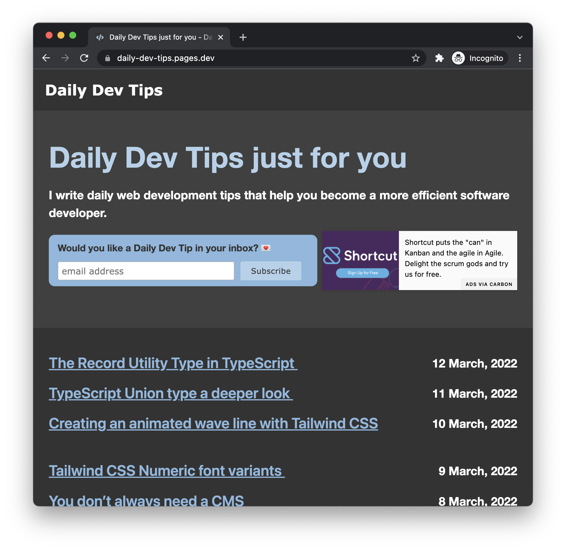
A fresh look: The fresh new look is visible, and I hope you enjoy this.
-
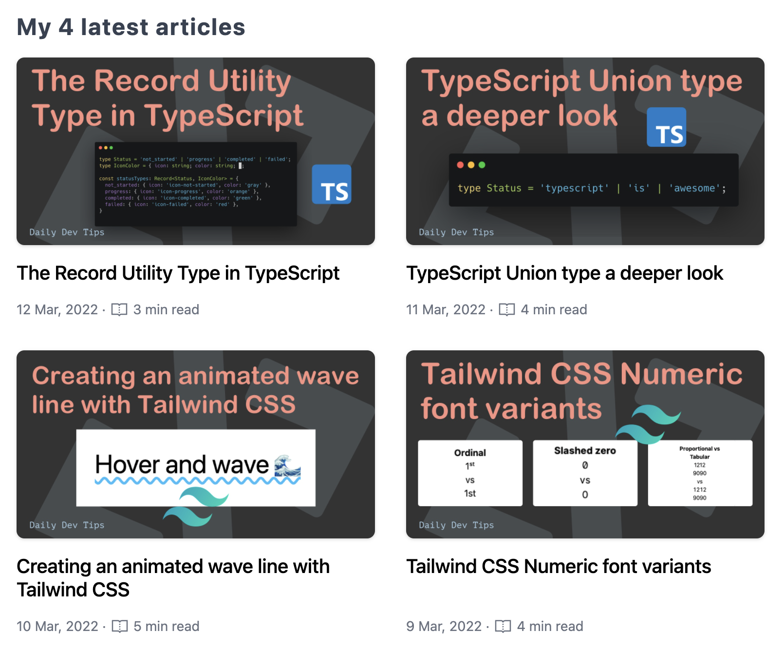
4 latest tips on the homepage You can quickly see the four latest articles on the homepage, although I might add the four best articles at one stage.

-
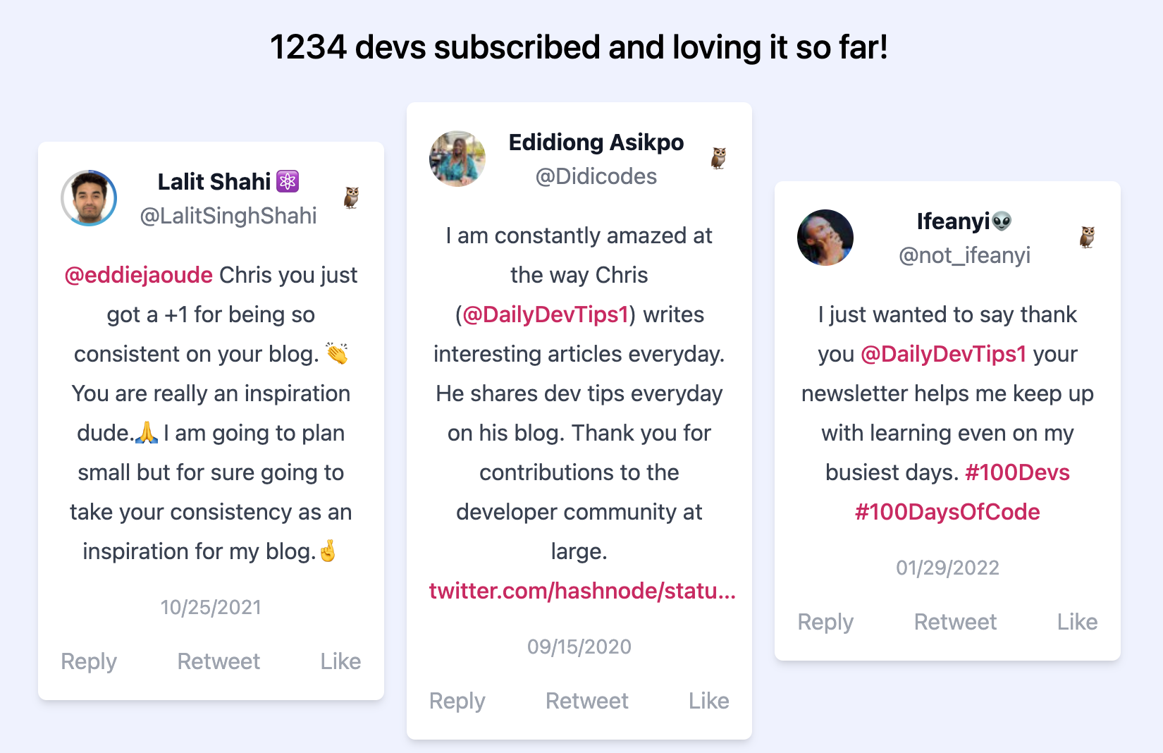
Stats visible I always missed some stats on the website, so I decided to add a real-time subscribers count and how many articles people can find.
-
Testimonials 🎉 I’m so happy that many people have amazing things to say about the website and my writing, so why not share them to be always visible, rather than disappearing in the Twitter algorithm.

-
Added the header images for each post You might have seen these headers around on social media. Since I already had them, I might as well add them to the website.
-
Webmention revamp In v2, I was always showing the full web mentions, but often it did not add much and took a lot of space, so I decided only to show the images of these fantastic people.
-
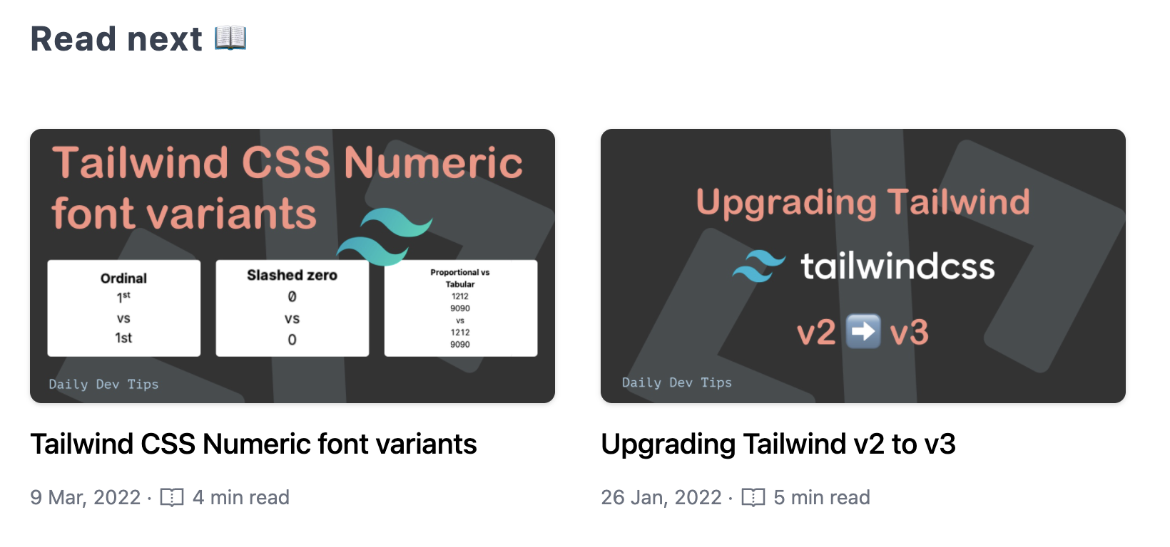
Related article section Finally! Related articles, once you are done reading an article, an intelligent algorithm I put together with some help of my good friend Alex will decide which article might also be of interest to you.

-
No more illegal tracking I was still using Google Analytics underwater but decided with v2, no more. I’ve opted to use Fathom analytics so you, the readers, are safe from being illegally tracked.
-
Auto light/dark mode In the v1, I used to have a dark/light mode toggle but decided to make it only dark at one stage. Now that I was using auto mode, I found my website annoying, so I decided to add two modes based on your preferences.
Review round
Once I was happy with it, I decided to ask my followers who would be interested in an early review.
I got so many requests. It was amazing to see. So many people were interested, and they provided valuable feedback!
Thank you to everyone who helped make v2 even better 🙏.
I considered all the reviews. Some were urgent, so I fixed those right away. Some have been added to the never-ending backlog of ideas and suggestions to improve this over time.
Open source it
I’ve written 700+ articles throughout the two years, and of course, I make many spelling mistakes.
With this said, I decided to open source my blog.
This way, everyone (including you!) can contribute to the website. This can be as simple as changing a typo for me.
You have to believe me when I say I try my best at running every article through Grammarly Hemingway and have people proofread it. But still, there is always that chance of it still containing a mistake.
So, I’m happy to open source the blog and see how that goes 💖
Thank you for reading, and let’s connect!
Thank you for reading my blog. Feel free to subscribe to my email newsletter and connect on Facebook or Twitter