In this tutorial, we will learn how to build a scrollable vertical slider using Tailwind CSS and Eleventy. It will also come with a nice CSS scroll-snap effect.
This example will become the homepage for my lifestyle blog. The result of today’s article will look like this:
Build a vertical slider in Tailwind CSS
We will start by coding our main container and the entire screen sections inside.
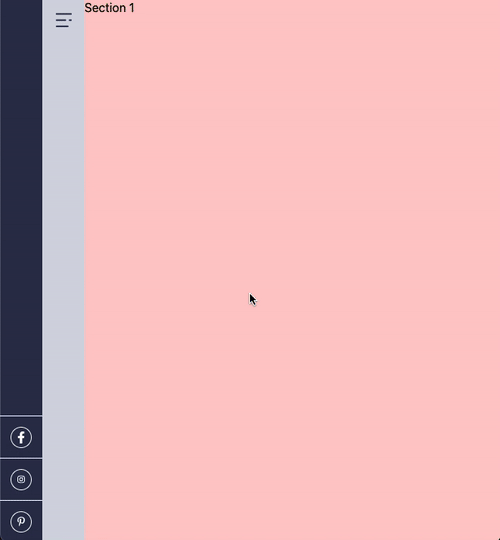
We have a total of five slider sections for the homepage:
<main>
  <section class="w-full h-screen bg-red-200">Section 1</section>
  <section class="w-full h-screen bg-blue-200">Section 2</section>
  <section class="w-full h-screen bg-green-200">Section 3</section>
  <section class="w-full h-screen bg-indigo-200">Section 4</section>
  <section class="w-full h-screen bg-yellow-200">Section 5</section>
</main>
This code gives us the following result:
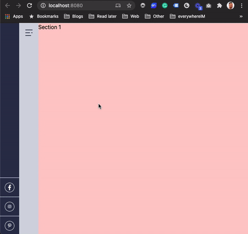
As you can see, each vertical slider section is our viewport’s exact width/height. Even if we resize it, the slider will stay fullscreen.
But we can only scroll to each section. How can we make the branches snap during scrolling?
Tailwind Slider with Scroll-snap
There is a very cool CSS property called scroll-snap. It can help us create this “scroll-snapping” behavior on the slider without custom JavaScript.
However, Tailwind CSS is missing the scroll-snap feature. So let’s start by extending the tailwind utilities.
Open up the global.css file and add the following code:
@layer utilities {
  .snap {
    scroll-snap-type: var(--scroll-snap-direction) var(--scroll-snap-constraint);
  }
  .snap-y {
    --scroll-snap-direction: y;
  }
  .snap-mandatory {
    --scroll-snap-constraint: mandatory;
  }
  .snap-start {
    scroll-snap-align: start;
  }
}
This will extend Tailwind and add the missing CSS classes we need for scroll-snap.
Note: I only added the actual classes we need, not all the scroll-snap types.
Now let’s add these classes to our HTML elements, starting with the <main> element.
<main class="max-h-screen overflow-y-scroll snap snap-y snap-mandatory"></main>
First, we’ll ensure the element has a max height on the screen and the overflow vertical is set to scroll. Then we add our recently created snap classes which will render to the following:
scroll-snap-type: y mandatory;
Now we just need to tell our slider sections where they have to snap.
<section class="w-full h-screen bg-red-200 snap-start"></section>
We added the snap-start class to each section, which will now render to behave as you can see in the GIF below.
Pretty cool, right?
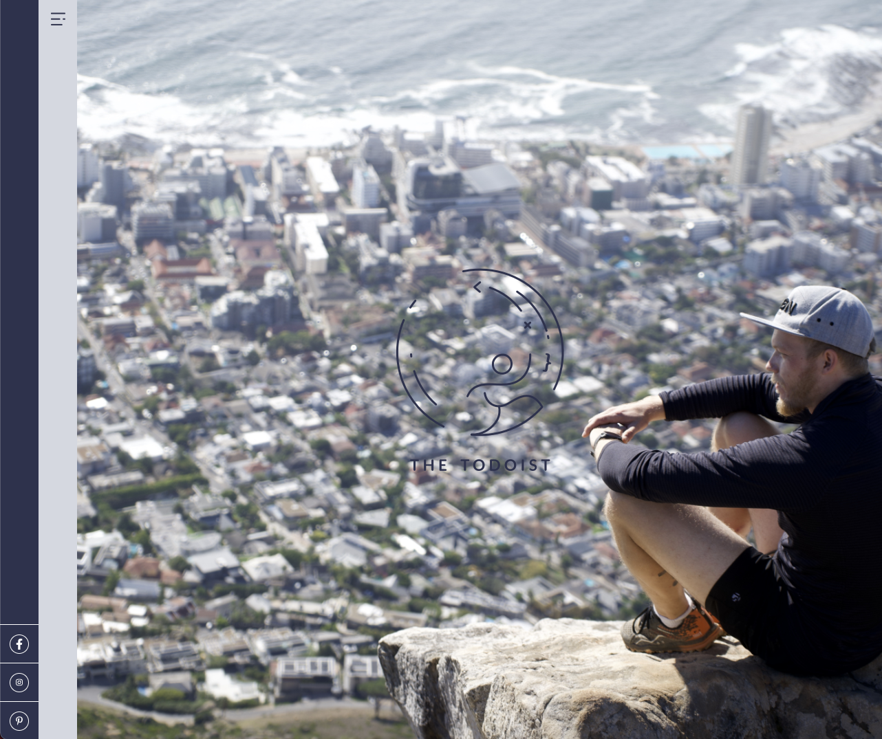
Vertical slider final styling
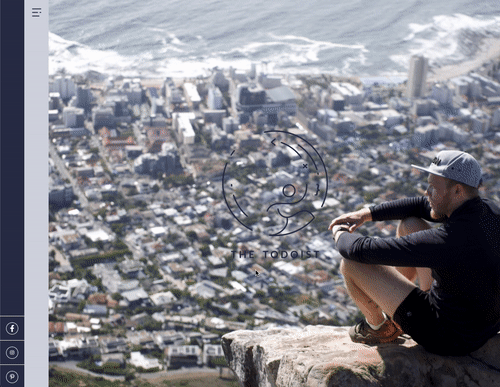
Each of our slides will have its unique styling. The first section is a full-screen background image with the logo in the middle.
I’ve placed the images directly in the src/images folder.
First, we need to add a custom background image in our tailwind.config.js file. It will allow us to use the background image as a class easily.
module.exports = {
  purge: [],
  darkMode: false,
  theme: {
    extend: {
      // Other extends
      backgroundImage: {
        'home-1': "url('images/home-intro.jpg')",
      },
    },
  },
  variants: {
    extend: {},
  },
  plugins: [],
};
Now we can use this background using the following class.
class="bg-home-1"
The HTML for this section will look like this:
<section
  class="flex items-center justify-center w-full h-screen bg-center bg-cover snap-start bg-home-1"
>
  <img alt="The todoist logo" title="The Todoist Logo" src="images/logo.png" />
</section>
This will give us the following result:
Section two is the about page section which showcases an image with some offset text on top of it.
We will use Tailwind CSS Grid as we did in the Newsletter layout.
<section class="flex items-center justify-center w-full h-screen snap-start">
<div class="grid grid-flow-row grid-cols-12 grid-rows-1 gap-8">
<div
class="z-10 flex flex-col justify-center col-span-3 col-start-2 row-start-1"
>
<h1 class="font-black text-purple">About The Todoist</h1>
<h3 class="text-pink">Coffee, Adrenaline, and a bunch off craziness</h3>
</div>
<div class="flex flex-col items-end col-span-6 col-start-3 row-start-1">
<img src="https://thetodoist.com/static/media/home_about.104e3ad7.jpg" />
<a href="/about" class="mt-2 text-xs underline">Find out more →</a>
</div>
</div>
</section>
I use the same start-row and start-col hack in this section to overlap the elements.
I then use CSS Flex to align the elements in the correct position.
The result for this section:
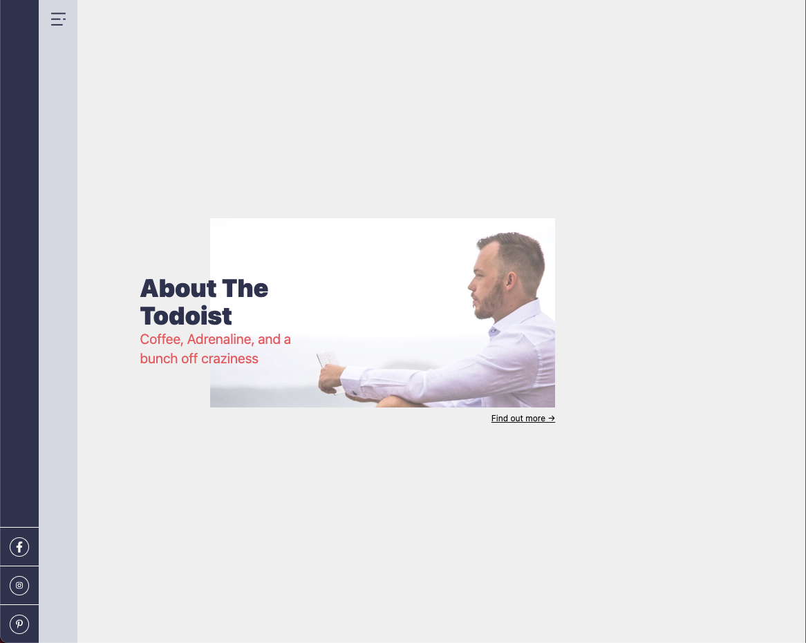
As you can see, it’s an offset element. This is how it was designed. You could center it by adjusting the col-start position.
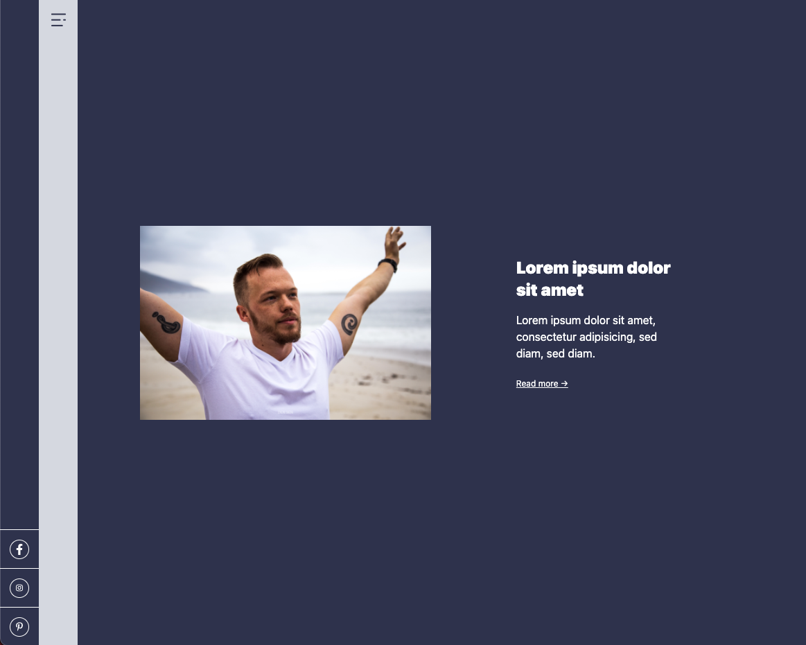
The third section it’s an extensive section that showcases the featured post.
For this example, we will hardcode the article, and in a later stage, we will connect it to our data store.
<section
class="flex items-center justify-center w-full h-screen text-white bg-purple snap-start"
>
<div class="grid grid-flow-row grid-cols-12 grid-rows-1 gap-8">
<div class="col-span-5 col-start-2">
<img
src="https://thetodoist.com/img/blog/forgotten-punctuation/overview.jpg"
/>
</div>
<div class="flex flex-col justify-center col-span-3 col-start-8">
<h2 class="font-black">Lorem ipsum dolor sit amet</h2>
<p>
Lorem ipsum dolor sit amet, consectetur adipisicing, sed diam, sed diam.
</p>
<a href="#" class="mt-2 text-xs underline">Read more →</a>
</div>
</div>
</section>
This is again a section where I used mainly CSS Grid to create the elements next to each other and flex to align them.
The result for this section:
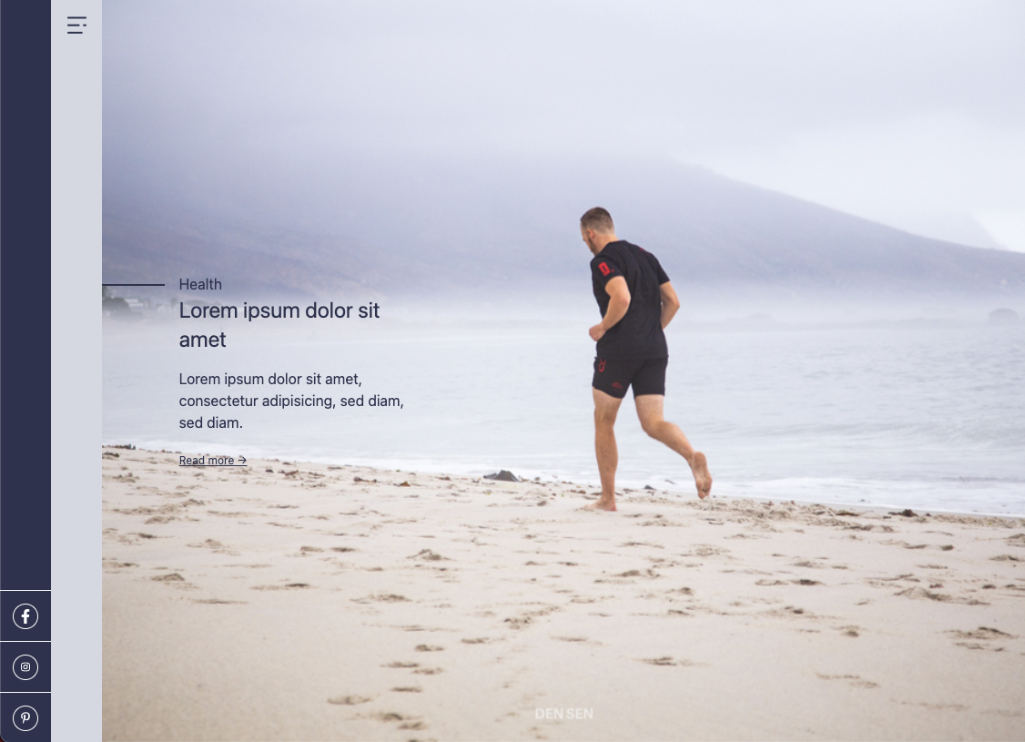
The fourth section is very similar to the previous one. It showcases a blog item, however, focussing on the background image, like in section one.
Since this data will be populated from the actual blog item, we need to use an inlined background-image.
We can then use a div with a narrow text area width.
The full HTML for this section will look like this:
<section
class="flex items-center w-full h-screen bg-indigo-200 bg-center bg-cover text-purple snap-start"
style="background-image: url(https://thetodoist.com/img/blog/beach-workouts/running.jpg)"
>
<div class="w-1/12"> </div>
<div class="w-3/12">
<div class="relative">
<span
class="absolute flex w-full h-0.5 -ml-4 bg-purple -left-full top-1/2"
></span
>Health
</div>
<a href="#">
<h2>Lorem ipsum dolor sit amet</h2>
<p>
Lorem ipsum dolor sit amet, consectetur adipisicing, sed diam, sed diam.
</p>
</a>
<a href="#" class="mt-2 text-xs underline">Read more →</a>
</div>
</section>
And this will give us the following result:
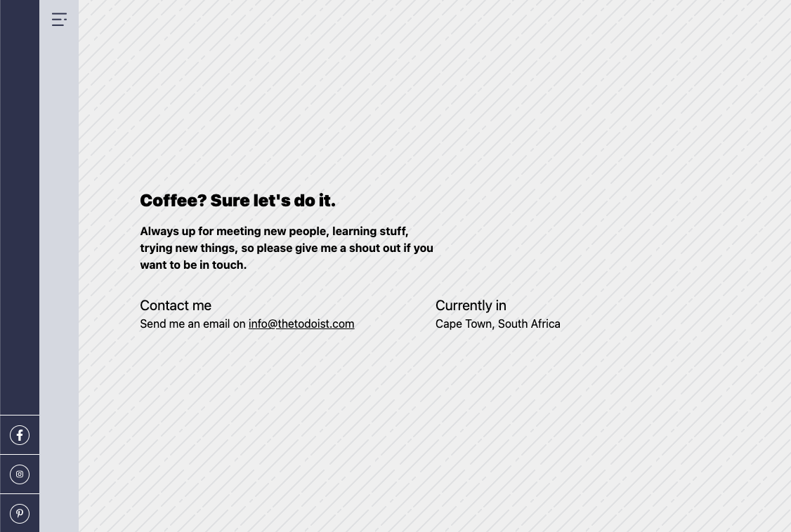
The last slide is the contact section. I will change the design a little bit, so we don’t have the form anymore.
The tricky part here is enabling the background pattern for this section.
Let’s first add this pattern to our tailwind.config file.
backgroundImage: {
  "home-1": "url('images/home-intro.jpg')",
  "pattern-striped": "url('images/pattern-striped.png')",
},
Now we can use this on our slide:
<section class="w-full h-screen bg-pattern-striped snap-start"></section>
The rest of the block uses a grid and flex to align the items.
<section class="flex items-center justify-center w-full h-screen bg-pattern-striped snap-start">
  <div class="grid grid-flow-row grid-cols-12 grid-rows-1 gap-8">
    <div class="col-span-10 col-start-2">
    <h2 class="font-black">Coffee? Sure let's do it.</h2>
    <strong class="flex w-1/2">Always up for meeting new people, learning stuff, and trying new things, so please give me a shout-out if you want to be in touch.</strong>

    <div class="flex mt-8">
      <div class="w-1/2">
        <h4>Contact me</h4>
        <p>Send me an email on <a class="underline" href="mailto:[email protected]">[email protected]</a></p>
      </div>
      <div class="w-1/2">
        <h4>Currently in</h4>
        <p>Cape Town, South Africa</p>
      </div>
    </div>
  </div>
</section>
This will render in the following result.
There we go. We now have our full vertical scrollable homepage slider in Tailwind and Eleventy.
You can find today’s code example on GitHub.
Thank you for reading, and let’s connect!
Thank you for reading my blog. Feel free to subscribe to my email newsletter and connect on Facebook or Twitter