We have quite an extended layout for the Lifestyle blog as our blog overview.
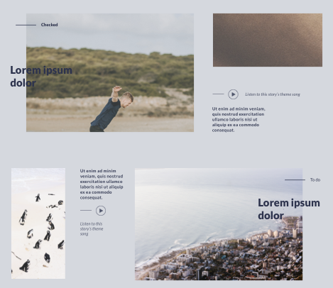
As you can see, it’s quite the “newsletter” style layout, with overlapping elements, offset elements, and non-equal recurring blocks.
In this article, I will be going through two ways of building this using Tailwind CSS
Analysing the design
Before we start building, let’s begin by analyzing the design. This is an excellent process to understand how we can best make it and what elements we need.
Having a quick look, we can see some columns we can use.
Note the design is not pixel perfect, so I will adjust it so it will fix an equal column grid
What do you see in this outline?
- Red area’s 1-column spacer
- Blue columns 6 column image
- Green 5 column that gets sub-divided
Then we are just missing the titles and Checked and Todo category elements, which we’ll introduce using absolute positions.
Tailwind newsletter layout with flex
I’m far more skilled in using flex than a grid, so my first attempt is to create this in flex.
I’ve divided it into two sections, so let’s introduce the first section, where the title is on the left-hand side.
Note: Tailwind is built mobile-first, so we’ll keep that in mind when creating the blocks.
Let’s start by wrapping everything inside a flex div.
<div class="flex flex-col gap-4 mb-24 md:flex-row">
  <!-- content -->
</div>
This will be the container for the first section. We tell it to flex the column on mobile but switch to the row on desktop. We also add a gap between the columns and a margin-bottom for the next element.
Now we will need the two sections. Left: Image + Titel (total of 7 columns) Right: Image + Summary (total of 6 columns)
<div class="flex flex-col gap-4 mb-24 md:flex-row">
  <div class="relative w-full md:w-7/12">
    <!-- LEFT -->
  </div>
  <div class="w-full md:w-5/12">
    <!-- RIGHT -->
  </div>
</div>
We make both sections 100% width for mobile, but we span them over the columns we want for desktop.
The left column is also relative since we will place the title and category element absolute inside it.
Let’s add the left elements we will need, and I’ll walk you through the styling.
<div class="flex flex-col gap-4 mb-24 md:flex-row">
  <div class="relative w-full md:w-7/12">
    <div class="absolute mt-4">
      <span
        class="absolute flex w-full h-0.5 -mr-4 bg-purple -right-full top-1/2"
      ></span>
      Health
    </div>
    <div
      class="absolute flex items-center w-1/2 min-h-full text-3xl font-black text-purple"
    >
      Lorem Ipsum Dolar
    </div>
    <div class="min-h-full ml-20">
      <img
        class="object-cover h-full"
        src="https://via.placeholder.com/800x600"
      />
    </div>
  </div>
  <div class="w-full md:w-5/12">
    <!-- RIGHT -->
  </div>
</div>
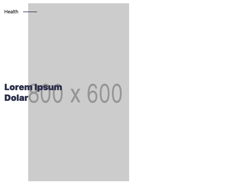
Quite a big chunk, but we start by adding the category Health. You will see its absolute position with a margin-top. This will offset it from the top a little bit.
Inside that, you find the <span> element used to create the purple line to the right.
The next element is the actual text. We also position this absolute but use flex to span it over the full height and use items-center to get the text in the middle.
Then the last element is the image. We make this smaller by adding the ml-20 (margin-left).
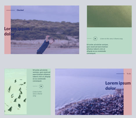
By now, we should have the following result:
On to the right side.
As seen in the design, the right side spans an image on top and a descriptive text below that. This text is positioned at the bottom of the element and is only half the width.
<div class="flex flex-col gap-4 mb-24 md:flex-row">
  <div class="relative w-full md:w-7/12">
    <div class="absolute mt-4">
      <span
        class="absolute flex w-full h-0.5 -mr-4 bg-purple -right-full top-1/2"
      ></span
      >Health
    </div>
    <div
      class="absolute flex items-center w-1/2 min-h-full text-3xl font-black text-purple"
    >
      Lorem Ipsum Dolar
    </div>
    <div class="min-h-full ml-20">
      <img
        class="object-cover h-full"
        src="https://via.placeholder.com/800x600"
      />
    </div>
  </div>
  <div class="w-full md:w-5/12">
    <img
      class="object-cover w-full h-1/2"
      src="https://via.placeholder.com/800x600"
    />
    <p
      class="flex items-end w-full mt-4 font-bold md:w-1/2 h-1/2 text-purple md:mt-0"
    >
      Lorem ipsum dolor sit amet, consectetur adipiscing elit. Nulla maximus
      iaculis ante, et iaculis ipsum accumsan sit amet.
    </p>
  </div>
</div>
The image is directly placed inside the right column, using a full width with object-cover to make it span the parent.
Then the text uses flex with the items-end class to get the reader to the bottom.
You will also see the md:w-1/2 class, making it only 50% on desktop screens.
That is it. We should now have the following responsive layout element for the first one:
The next element is very similar. The only difference is that the title’s position is reversed, and the left side is a column layout.
<div class="flex flex-col-reverse gap-4 md:flex-row">
  <div class="flex flex-col w-full gap-4 md:w-5/12 md:flex-row">
    <div class="w-full md:w-1/2">
      <img
        class="object-cover w-full h-full"
        src="https://via.placeholder.com/800x600"
      />
    </div>
    <p class="w-full font-bold md:w-1/2 text-purple">
      Lorem ipsum dolor sit amet, consectetur adipiscing elit. Nulla maximus
      iaculis ante, et iaculis ipsum accumsan sit amet.
    </p>
  </div>
  <div class="relative w-full md:w-7/12">
    <div class="absolute right-0 mt-4">
      <span
        class="absolute flex w-full h-0.5 -ml-4 bg-purple -left-full top-1/2"
      ></span
      >Health
    </div>
    <div
      class="absolute right-0 flex items-center w-1/2 min-h-full text-3xl font-black text-purple"
    >
      Lorem Ipsum Dolar
    </div>
    <div class="min-h-full mr-20">
      <img
        class="object-cover h-full"
        src="https://via.placeholder.com/800x600"
      />
    </div>
  </div>
</div>
A super important element here is the top-level flex-col-reverse. This ensures that the bigger right side is on top of mobile devices!
A super nighty flex function!
You can find this complete example on the following Codepen.
See the Pen yLawjgQ by Chris Bongers (@rebelchris) on CodePen.
Tailwind newsletter layout with grid
We made it, it was working, and that would have been it. However, I felt this would be a better fit for CSS Grid.
So I put out a tweet asking for some tips on doing this with Tailwind Grid.
Does anyone know if this layout is possible with Tailwind Grid? (without custom config)
— Chris Bongers 🤓💻⚡️ (@DailyDevTips1) January 18, 2021
I've got it with Flex, but I feel grid might be the better solution.https://t.co/T89GyQ4syV pic.twitter.com/3UMr2r0MOP
I started converting what I had into a grid layout with the feedback, which went surprisingly well.
It was more challenging to make this in a CSS grid, so bear with me, as there might be a more efficient way of doing this grid layout.
Let’s start with the first block again.
<div class="grid grid-flow-row grid-cols-12 grid-rows-2 gap-4">
  <!-- CONTENT -->
</div>
We create a 12-column grid with two rows and add a gap as we did in the flex layout.
I’m using a column/row-start combination method to overflow the elements.
As you might see, I will add starting positions for each element, which allows them to sit on top of each other.
Let’s start with the first column, which is the title column.
<div class="grid grid-flow-row grid-cols-12 grid-rows-2 gap-4">
  <div
    class="relative z-50 flex items-center col-span-12 col-start-1 row-span-2 row-start-1 md:col-span-4 md:col-start-1"
  >
    <div class="absolute top-0 mt-4">
      <span
        class="absolute flex w-full h-0.5 -mr-4 bg-purple -right-full top-1/2"
      ></span
      >Health
    </div>
    <h1 class="text-3xl font-black text-purple">Lorem Ipsum Dolar</h1>
  </div>
</div>
We make this a span 4, and on mobile, we turn it into a span-12. Inside we have the category and title again, using flex to align them accordingly.
The best way to show how this works is using the grid explorer in Chrome/Firefox
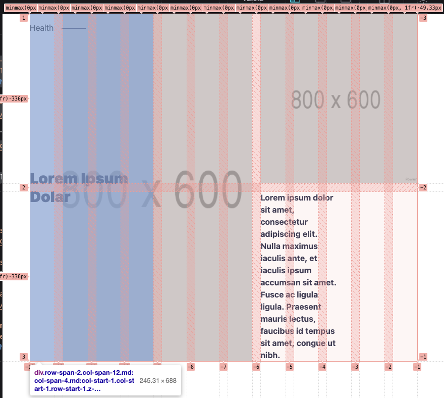
You can see the 12 column grid, with the left element highlighted. You can see it spans over four columns.
The next element is the big image on the left, spanning 6 columns, starting from the second.
<div class="grid grid-flow-row grid-cols-12 grid-rows-2 gap-4">
  <div
    class="relative z-50 flex items-center col-span-12 col-start-1 row-span-2 row-start-1 md:col-span-4 md:col-start-1"
  >
    <div class="absolute top-0 mt-4">
      <span
        class="absolute flex w-full h-0.5 -mr-4 bg-purple -right-full top-1/2"
      ></span
      >Health
    </div>
    <h1 class="text-3xl font-black text-purple">Lorem Ipsum Dolar</h1>
  </div>
  <div
    class="col-span-11 col-start-2 row-span-2 row-start-1 md:col-span-6 md:col-start-2"
  >
    <img
      class="object-cover h-full"
      src="https://via.placeholder.com/800x600"
    />
  </div>
</div>
Here, we add the col-span-11 for mobile and md:col-span-6 for desktop. We also offset it to start on column two.
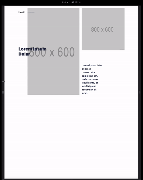
The two columns on the right are both the same, but they only span 1 row and 5 columns.
<div class="grid grid-flow-row grid-cols-12 grid-rows-2 gap-4">
  <div
    class="relative z-50 flex items-center col-span-12 col-start-1 row-span-2 row-start-1 md:col-span-4 md:col-start-1"
  >
    <div class="absolute top-0 mt-4">
      <span
        class="absolute flex w-full h-0.5 -mr-4 bg-purple -right-full top-1/2"
      ></span
      >Health
    </div>
    <h1 class="text-3xl font-black text-purple">Lorem Ipsum Dolar</h1>
  </div>
  <div
    class="col-span-11 col-start-2 row-span-2 row-start-1 md:col-span-6 md:col-start-2"
  >
    <img
      class="object-cover h-full"
      src="https://via.placeholder.com/800x600"
    />
  </div>
  <div class="col-span-12 row-span-1 md:col-span-5">
    <img
      class="object-cover w-full h-full"
      src="https://via.placeholder.com/800x600"
    />
  </div>
  <div class="flex items-end col-span-12 row-span-1 md:col-span-5">
    <p class="w-full font-bold md:w-1/2 text-purple">
      Lorem ipsum dolor sit amet, consectetur adipiscing elit. Nulla maximus
      iaculis ante, et iaculis ipsum accumsan sit amet.
    </p>
  </div>
</div>
This will give us the following result:
The bottom element is a copy but spans the two left columns on two rows.
Also, on mobile, it switches their position to rows 3 and 4.
<div class="grid grid-flow-row grid-cols-12 grid-rows-2 gap-4 mt-24">
  <div
    class="col-span-12 col-start-1 row-span-1 row-start-3 md:row-span-2 md:col-span-3 md:row-start-1"
  >
    <img
      class="object-cover w-full h-full"
      src="https://via.placeholder.com/800x600"
    />
  </div>
  <div
    class="col-span-12 col-start-1 row-span-1 row-start-4 md:row-span-2 md:col-span-3 md:row-start-1 md:col-start-4"
  >
    <p class="font-bold text-purple">
      Lorem ipsum dolor sit amet, consectetur adipiscing elit. Nulla maximus
      iaculis ante, et iaculis ipsum accumsan sit amet.
    </p>
  </div>
  <div
    class="col-span-11 col-start-1 row-span-2 row-start-1 md:col-span-5 md:col-start-7"
  >
    <img
      class="object-cover h-full"
      src="https://via.placeholder.com/800x600"
    />
  </div>
  <div
    class="relative flex items-center justify-end col-span-3 col-start-10 row-span-2 row-start-1"
  >
    <div class="absolute top-0 right-0 mt-4">
      <span
        class="absolute flex w-full h-0.5 -ml-4 bg-purple -left-full top-1/2"
      ></span
      >Health
    </div>
    <h1 class="text-3xl font-black text-purple">Lorem Ipsum Dolar</h1>
  </div>
</div>
This gives us the following result you can try out in Codepen.
See the Pen Tailwind newsletter layout with grid by Chris Bongers (@rebelchris) on CodePen.
I would love to hear what you guys think of these approaches and what you would pick.
The flex one is just a little bit easier to set up, but it might be because I’ve used it more.
The grid looks powerful, especially if we named the grid elements.
You can find today’s code on GitHub.
Thank you for reading, and let’s connect!
Thank you for reading my blog. Feel free to subscribe to my email newsletter and connect on Facebook or Twitter