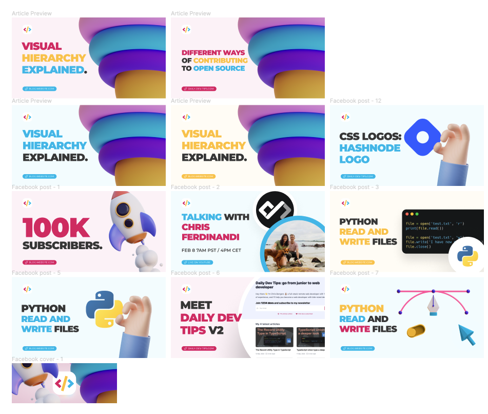
I often get asked how I create the headers for my articles. Thus I thought, let me write down how I do it and set it up.
When writing, I used two kinds of headers: my old legacy ones. These are kind of dark and contain the logo in the background. And then the new colorful ones.
The old ones were all hand-made in Sketch locally.
But today we’ll talk more about the new ones.
From idea to execution
When I rebranded my website and logo, I also decided to take the headers of each article more seriously.
And thus, I decided to hire someone with more experience in the design field.
Before even looking for a designer, I decided to write down the types of headers I wanted.
I was able to split it out into these categories:
- Celebration banners
- Social media headers
- Event banners
And then article headers:
- Code block + logo
- Logo/Icon
- Image
These were all rough the banner types I had, and I decided to put them in a notion document linking some existing examples.
Now that I had a clear idea of what I was looking for, I decided to look at Fiverr and target five people whose styles I liked.
I reached out to these five people and ordered one header from each. This was pretty cheap and gave me a good idea of what I liked.
I really liked designedbyhello’s work most and decided to go with this person to create the actual templates.
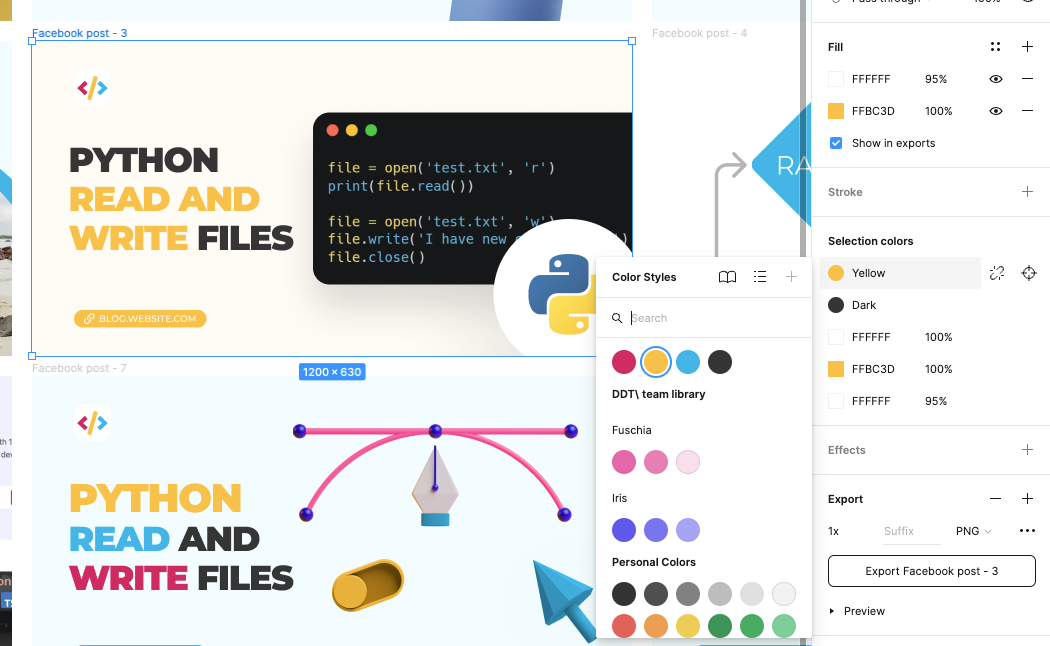
He decided to create a Figma template file for each of my templates where I could easily add images/change texts.
The Figma file looks like this:

As you can see, I can use all kinds of different setups, and for each file, I can easily switch color patterns or images.

And that’s it. I’m super happy with my design templates, as this style reflects my style and blog.
I’d love to hear about your process and how you like my headers.
Thank you for reading, and let’s connect!
Thank you for reading my blog. Feel free to subscribe to my email newsletter and connect on Facebook or Twitter