You have probably seen a parallax effect before. A parallax effect is when you scroll and it looks like the background image is sitting in one place and is unaffected by the scroll.
Some people take parallax scrolling over the top by adding multiple layers and create the most stunning effects!
For today’s tutorial, we will learn how to add a parallax scrolling effect with pure CSS. It is the simplest example possible - to get you included in adding this wonderful effect to your website or project.
Parallax scrolling with CSS only
Yes, it is possible to do parallax with CSS only.
For the HTML, let’s use the following setup to keep it simple:
<section class="header">
  <h1>Welcome! 👋</h1>
  <h2>How are you?</h2>
</section>
<section class="bg-grey">
  <h2>Demonstrating parallax</h2>
  <br />
  <div>
    <a href="https://daily-dev-tips.com/" target="blank">Blog</a>
    <a href="https://twitter.com/DailyDevTips1" target="blank">Twitter</a>
  </div>
</section>
We included 2 sections which we will size at 100% of the viewport. The first one will contain the parallax image background.
- To read more about the CSS units, check out how to work with CSS viewport units.
For the CSS we are going to use the following:
section {
  width: 100vw;
  height: 100vh;
  display: flex;
  justify-content: center;
  align-items: center;
  flex-direction: column;
}
section.header {
  background-image: url('https://images.unsplash.com/photo-1564415637254-92c66292cd64?ixlib=rb-1.2.1&ixid=eyJhcHBfaWQiOjEyMDd9&auto=format&fit=crop&w=975&q=80');
  background-position: center center;
  background-repeat: no-repeat;
  background-size: cover;
  background-attachment: fixed;
  color: #fff;
}
.bg-grey {
  background: #efefef;
}
As you can see we make every section width: 100vw (100% of the viewport width) and height: 100vh (100% of the viewport height).
Next, we make this a flex container to center the headings and buttons inside of it. (Read more on alignment here)
Then for the header section, we add the parallax background and center it using background-position. Then I learned to always include background-repeat: no-repeat but you can omit this. We set background-size: cover this will make the background expand over the whole section.
And for the magic part 🎩, we set background-attachment: fixed. This is what will make give the background a parallax scrolling effect!
See the Code examples in this Codepen
See for yourself in this pure CSS parallax example:
See the Pen Parallax demo by Chris Bongers (@rebelchris) on CodePen.
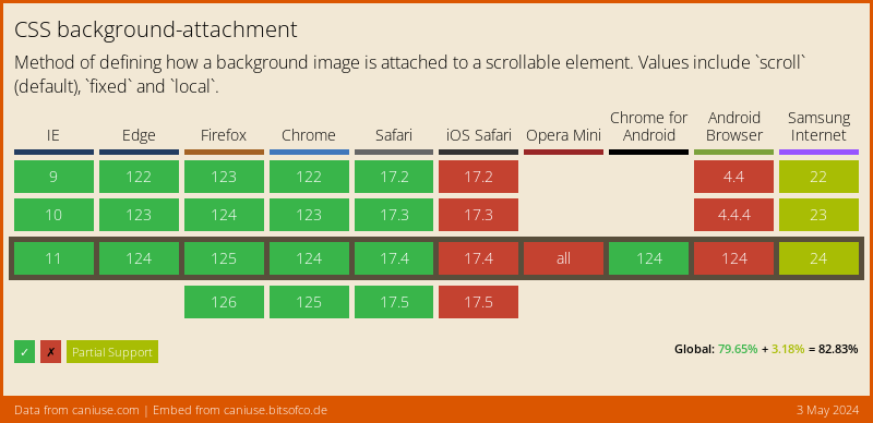
Browser Support
background-attachment has quite a good browser support, just on mobile it’s a bit glitchy, but you can use other queries to fix this.
Thank you for reading, and let’s connect!
Thank you for reading my blog. Feel free to subscribe to my email newsletter and connect on Facebook or Twitter