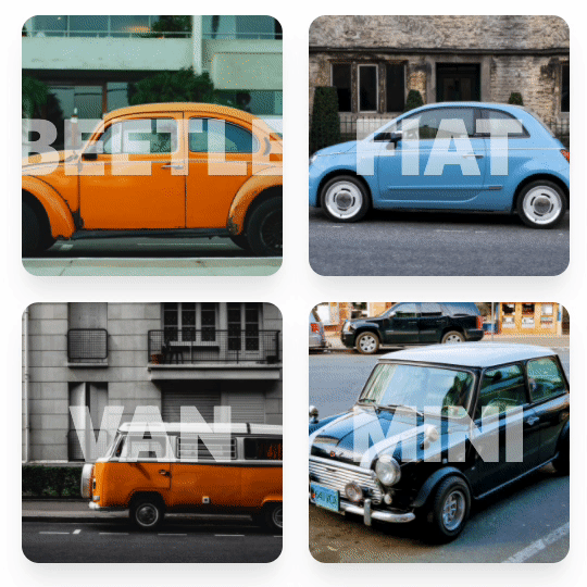
You might be familiar with this background zoom effect. You hover over a card, and the image gets bigger.
Today, you will learn how to zoom into an image with Tailwind CSS!
The result will look like this:
HTML Structure
Let’s start by looking at the HTML markup and how we would format this.
We will need cards that have an image and some text inside. The HTML for each card will look like this:
<div class="card-zoom">
  <div class="card-zoom-image"></div>
  <h1 class="card-zoom-text">CAR</h1>
</div>
As you may have spotted, I’m not using Tailwind’s inline classes since we will be re-using these blocks multiple times.
Add a custom background image in Tailwind CSS
Before we continue, let’s see how we can add custom background images with Tailwind CSS.
Open up your tailwind config, and add an extended option for background images:
module.exports = {
  theme: {
    extend: {
      backgroundImage: {
        beetle:
          "url('https://custom.image/name.jpg')"
      },
    },
  },
  variants: {},
  plugins: [],
}
That is how we can add a custom background image to the Tailwind config. We can then use the images using the bg sub-class.
<div class="card-zoom-image bg-beetle"></div>
We use the bg prefix with the name we put in our Tailwind config file.
Styling the cards
Now let’s get working on adding some generic styling to our cards.
We will use the @apply rule only to use Tailwind classes.
The first element is the card-zoom class. It’s the main wrapper for the image and the text.
.card-zoom {
  @apply relative flex items-center justify-center m-3 overflow-hidden shadow-xl w-60 h-60 rounded-2xl;
}
This will ensure everything inside the card zoom div is centered and that the card has rounded corners with a nice shadow effect.
The next element will be the background image. This has to be an absolute class since we will zoom the whole image on hover.
.card-zoom-image {
  @apply absolute w-full h-full transition-all duration-500 ease-in-out transform bg-center bg-cover;
}
As you can see, we make it absolute and the full size of the parent element. We then add a transition and a transform to give it a nice animated effect later.
Then we have the text left. The text has to be an absolute element since we will also be animating this.
.card-zoom-text {
  @apply absolute text-5xl font-black transition-all duration-500 ease-in-out transform scale-150 text-gray-50 opacity-60;
}
Tailwind zoom image on hover effect
One of the reasons I went with the separate classes is because we want to add the hover effect on the parent class.
So once we hover over the card-zoom class, the inner image and text element should start the zoom animation.
For the zoom, add these animations using the following classes:
.card-zoom:hover .card-zoom-image {
  @apply scale-150;
}
.card-zoom:hover .card-zoom-text {
  @apply scale-100;
}
These scale animations will ensure the image becomes bigger, and the text will zoom smaller on mouse hover - all in all, it creates a cool image zoom effect.
Check out the code in the full demo here: Tailwind CSS for zooming images
Thank you for reading, and let’s connect!
Thank you for reading my blog. Feel free to subscribe to my email newsletter and connect on Facebook or Twitter