When it comes to tailwind CSS layouts we have two main options:
- Flexbox
- Grid
If you know me, I use CSS Flexbox for many things. It’s one of these things you start with and end up using for many elements.
However, I want to explore some CSS grid action in Tailwind and see how easy it can be.
We’ll be creating a responsive 4 column block layout for large devices. On tablet size, they should stack 2-2, and on mobile, it should be 1 column layout.
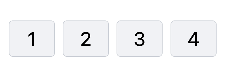
The result is as the following:
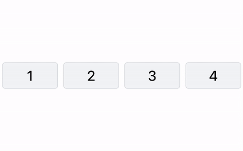
Tailwind grid: 4 Column grid layout
Let’s start with our basic HTML structure and style from there.
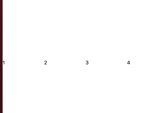
<div>
  <div>
    <div>1</div>
    <div>2</div>
    <div>3</div>
    <div>4</div>
  </div>
</div>
As you can see, I choose a double wrapper, the top div will be our container, and the inner one will be the actual grid.
Let’s add some basic styles for the containers first.
<div class="container mx-auto">
  <div class="grid grid-cols-4 gap-6">
    <div>1</div>
    <div>2</div>
    <div>3</div>
    <div>4</div>
  </div>
</div>
This will already give us a pretty good column space.
Let’s quickly add some styling to our grid example too:
<div class="container mx-auto">
  <div class="grid grid-cols-4 gap-6">
    <div
      class="flex justify-center p-6 text-6xl bg-gray-100 border-2 border-gray-300 rounded-xl"
    >
      1
    </div>
    <div
      class="flex justify-center p-6 text-6xl bg-gray-100 border-2 border-gray-300 rounded-xl"
    >
      2
    </div>
    <div
      class="flex justify-center p-6 text-6xl bg-gray-100 border-2 border-gray-300 rounded-xl"
    >
      3
    </div>
    <div
      class="flex justify-center p-6 text-6xl bg-gray-100 border-2 border-gray-300 rounded-xl"
    >
      4
    </div>
  </div>
</div>
Pretty solid, right?
However, this is not yet responsive. Luckily for us, the Tailwind grid is super easy to make responsive.
To get a responsive grid, all we have to do is to add the breakpoints on our grid element.
Remember: Tailwind is mobile-first, which will be the mobile view.
<div class="grid grid-cols-1 gap-6 md:grid-cols-2 lg:grid-cols-4"></div>
You can find the entire demo and tailwind grid example on this Codepen:
See the Pen Tailwind grid responsive 4 column blocks by Chris Bongers (@rebelchris) on CodePen.
Thank you for reading, and let’s connect!
Thank you for reading my blog. Feel free to subscribe to my email newsletter and connect on Facebook or Twitter