Tailwind is a fantastic CSS framework. It makes it so easy to create incredible designs without much effort.
Today I want to create something fundamental but widely used: Skew cards.
They are cards skewed in a specific direction, and the offset is the skewed opposite.
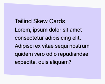
It looks like this:

Creating Tailwind skew cards
We need 2 div elements and some content in the inner one for our primary skew card.
<div>
  <div>
    <h2>Tailind Skew Cards</h2>
    <p>
      Lorem, ipsum dolor sit amet consectetur adipisicing elit. Adipisci ex
      vitae sequi nostrum quidem vero odio repudiandae expedita, quis aliquam?
    </p>
  </div>
</div>
This will be our main structure. Let’s add the outer classes first.
<div class="w-1/2 p-8 transform skew-y-3 bg-purple-200"></div>
The main part is the transform and skew class. This will make sure the card looks slanted. Then we add a simple background, padding, and width.
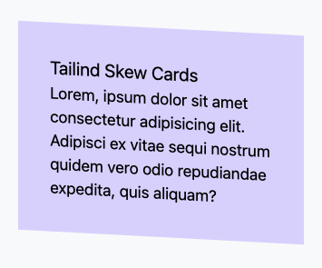
Now our card will look somewhat weird:

The text also went skew, which is not what we want. However, we can offset this in the inner div.
<div class="transform -skew-y-3"></div>
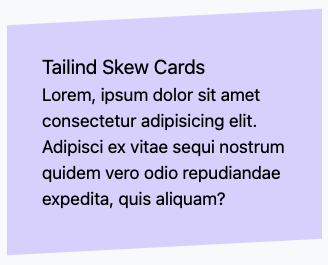
And that’s it. We now got our first skew card.
We can also have them skew the other way by reversing the skews.
<div class="w-1/2 p-8 transform -skew-y-3 bg-purple-200">
  <div class="transform skew-y-3">
    <h2 class="text-lg">Tailind Skew Cards</h2>
    <p>
      Lorem, ipsum dolor sit amet consectetur adipisicing elit. Adipisci ex
      vitae sequi nostrum quidem vero odio repudiandae expedita, quis aliquam?
    </p>
  </div>
</div>

You can find the full demo on the following Codepen.
See the Pen Tailwind CSS skew cards by Chris Bongers (@rebelchris) on CodePen.
Thank you for reading, and let’s connect!
Thank you for reading my blog. Feel free to subscribe to my email newsletter and connect on Facebook or Twitter

