Now that we have a good basic understanding of stories in Storybook, let’s take a closer look at how we can leverage it to create some docs.
When you use Storybook, you automatically get built-in docs. It can aggregate stories, text, tables, and code samples into a single page for each component.
This can be super beneficial to explain in more detail how your components work and what needs to be used and set up.
The default docs
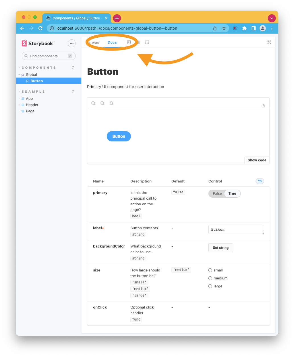
By default, the docs auto-generate based on the arguments and main component.
If we look at our button component, we can see that the docs combine everything we have set up.

It’s also possible to add multiple components into one docs page. This could be useful when you are using various components that group together.
You can achieve this by using the subComponents options like this.
export default {
  title: 'ButtonGroup',
  component: ButtonGroup,
  subcomponents: { Button },
};
This will show the components in tabs. The only downside is that you lose control over the sub-components, so you can’t interact with their properties.
Replacing the docs with MDX
We can also replace the docs page with an MDX page, which will give us more freedom.
To achieve that, add a page called Button.docs.mdx.
That file could have contents like this:
import { Canvas, Meta, Story } from '@storybook/addon-docs';

import { Button } from './Button';

<Meta title="MDX/Button" component={Button} />

export const Template = (args) => <Button {...args } />

# Badge

Let's define a custom button:

<Canvas>
  <Story
  id="example-button--primary"
    args={{
      label: 'Unchecked',
    }}>
    {Template.bind({})}
   </Story>
</Canvas>
And then, we can modify our existing button story to use this doc page instead.
import ButtonDocsMDX from './Button.doc.mdx';

export default {
  title: 'Example/Button',
  component: Button,
  parameters: {
    docs: {
      page: ButtonDocsMDX,
    },
  },
};
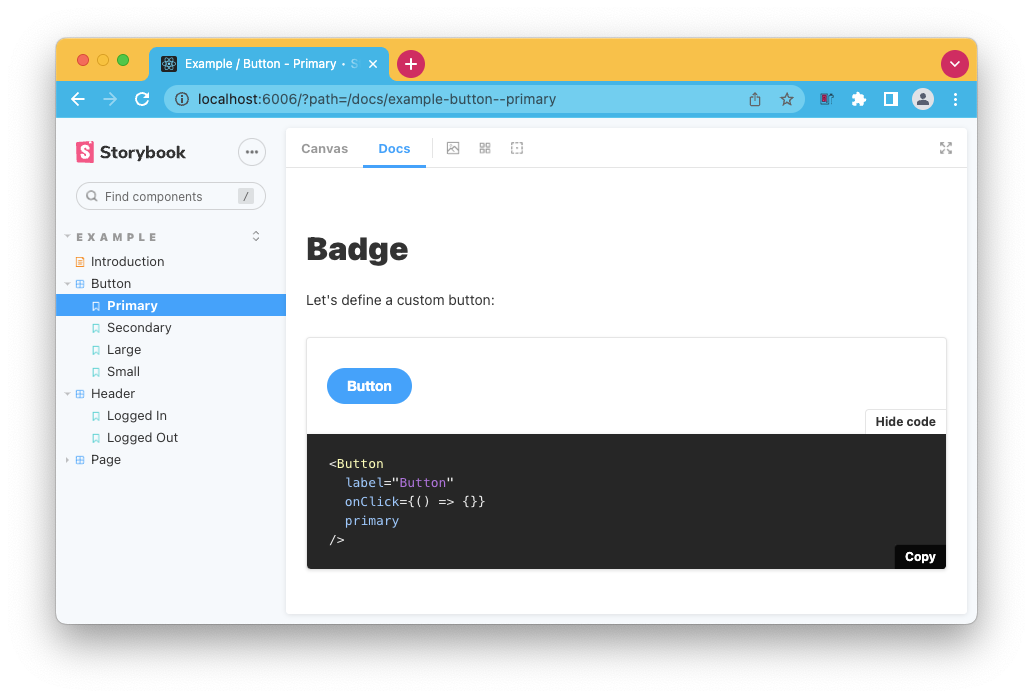
And now, if we visit the docs page for the button component, we see this custom format in action.

The cool part is that we can mix and match, perhaps for some components, it’s enough to use the default docs, but in some cases, you might want to add more details.
Thank you for reading, and let’s connect!
Thank you for reading my blog. Feel free to subscribe to my email newsletter and connect on Facebook or Twitter