I may be the worst advocate for actually doing this, but let me try and be a better person from now on.
And please, you too!
Let’s all get away from pixels
But, don’t take just my word for it:
CSS tip 🦄
— Ido Shamun (@idoshamun) September 1, 2020
Use `rem` instead of `px`.
This takes into account the user's accessibility settings.
To convert `px` to `rem`, divide by 16.
For example:
8px = 0.5rem
Why no pixels?
From back in the days, we started using pixels for web development, and for a long time this was good enough.
So what makes them so bad you ask?
- A pixel in font size is not actually a pixel on the screen
- Accessibility becomes better if we as developers don’t define what the “default” font-size must be
- There are nowadays pixels densities (retina etc)
Ok, then what?
Well, we can choose between em and rem for font-size.
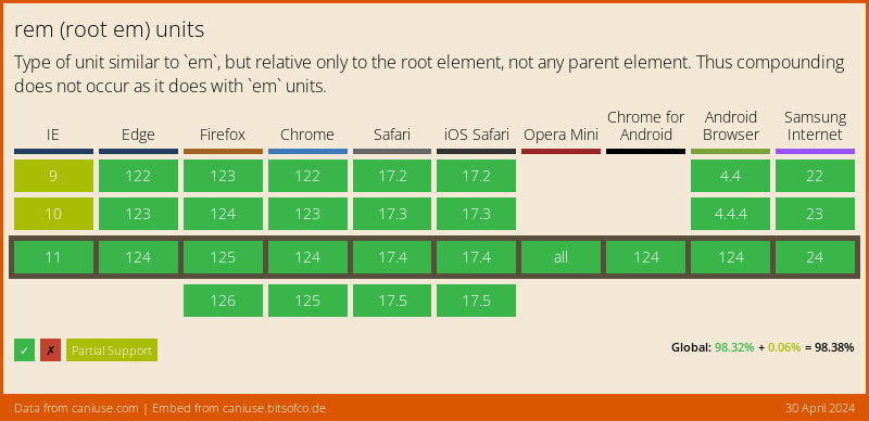
CSS3 came with rem which is a relative size to the root html element and is supported by 98,22% of the browsers!
So the cool part about this is people can have their default browser setting set to something else, then the defined 16px’s, and we will just scale for them.
Side note: REM is also a cool band!
Converting pixels to rem
To calculate the pixels to rem we have to understand that the default font size for an HTML document is 16 pixels…
We as developers, should never update that. It’s something the user can do.
So talking that in account it means that 1rem = 16px, and 2rem = 32px.
To make it super easy. I made this calculator for you guys:
See the Pen 🛑 Stop using pixels in CSS by Chris Bongers (@rebelchris) on CodePen.
Let us please all be aware this is the future 🛸.
Browser Support
The cursor is pretty well supported! The function has been around, some mobile browsers don’t go about it, but you must see this as an “extra”.

Thank you for reading, and let’s connect!
Thank you for reading my blog. Feel free to subscribe to my email newsletter and connect on Facebook or Twitter