You probably thought that was right. The portfolio is done and dusted. But now that it’s live, we have to ensure people visiting our website have the best possible experience.
So in today’s article, we will conduct a PageSpeed exam and address any issues we find.
The initial pagespeed
You can use this fantastic website powered by Google to perform a basic report for your website.
Visit the PageSpeed Insights website
Fill out the URL to your website and click the “Analyze” button.
For my portfolio, I got the following results on mobile.
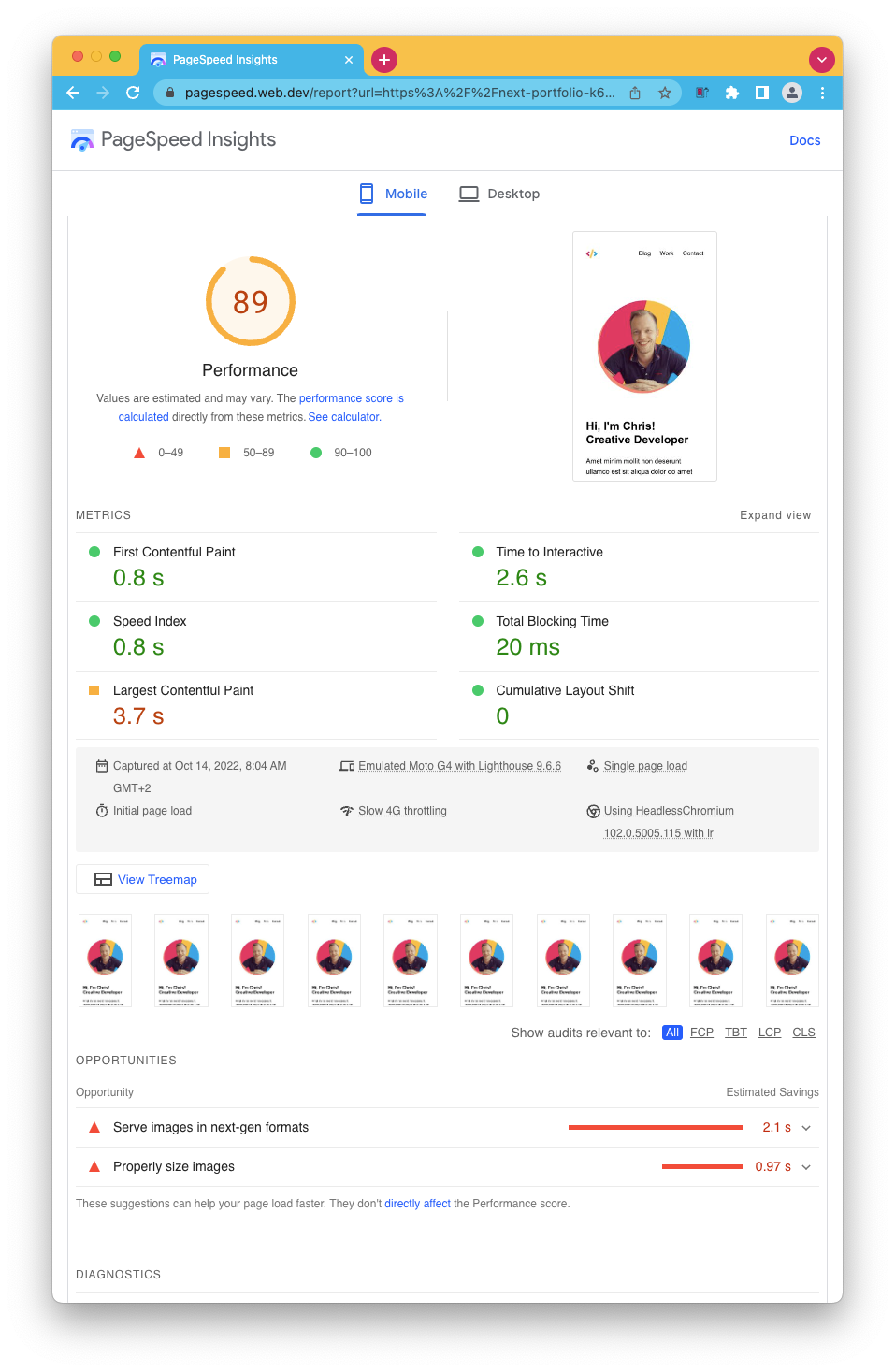
I’ll be honest with you. We did well out of the box. We score 100 on Desktop and 89 on mobile.
Both have the same remarks. Our images can be optimized!
So let’s tackle that issue and see what effect it has.
Optimizing images with Next/Image
You might have noticed I used the project’s default HTML <img /> tags.
There is an alternative we can (and should) use in Next.js, which is their wrapper called <Image />.
This component ensures all required props are set and will do some magic caching and sizing for us.
Let’s open the project and open up the introHeader.js file and start by importing the next/image package like this:
import Image from 'next/image';
Then modify the image to use the new tag.
<Image
  src='/profile.png'
  width='240'
  height='240'
  alt='Image of Chris'
  className='z-10 relative rounded-full'
/>
Yep, as easy as that, and our image will now be as optimal as possible.
The other image we use is actually on the work component.
So again, open up the work.js component and load the next image lib.
import Image from 'next/image';
This one is slightly different from before we had the image in the root. The image is also responsive, making it a bit more complicated with Next/image. So I added a wrapping div with the styling like this.
<div className='w-full md:w-1/3 mb-3 md:mr-6'>
  <Image
    src={item.image}
    className='rounded-lg'
    layout='responsive'
    width={500}
    height={335}
  />
</div>
You can also see we set the layout to be responsive, which ensures that the image scales nicely on mobile.
However, if we now run our application, we quickly see a Next.js error that the placedog.net domain is not a valid source for images.
This is because it’s a strict setup, and we must set our website to allow this domain explicitly.
Open up the next.config.js file and add the images prop like this.
const nextConfig = {
  images: {
    domains: ['placedog.net'],
  },
};
And now our images will load perfectly!
Putting it to the test
Let’s deploy our changes and re-run the PageSpeed test.
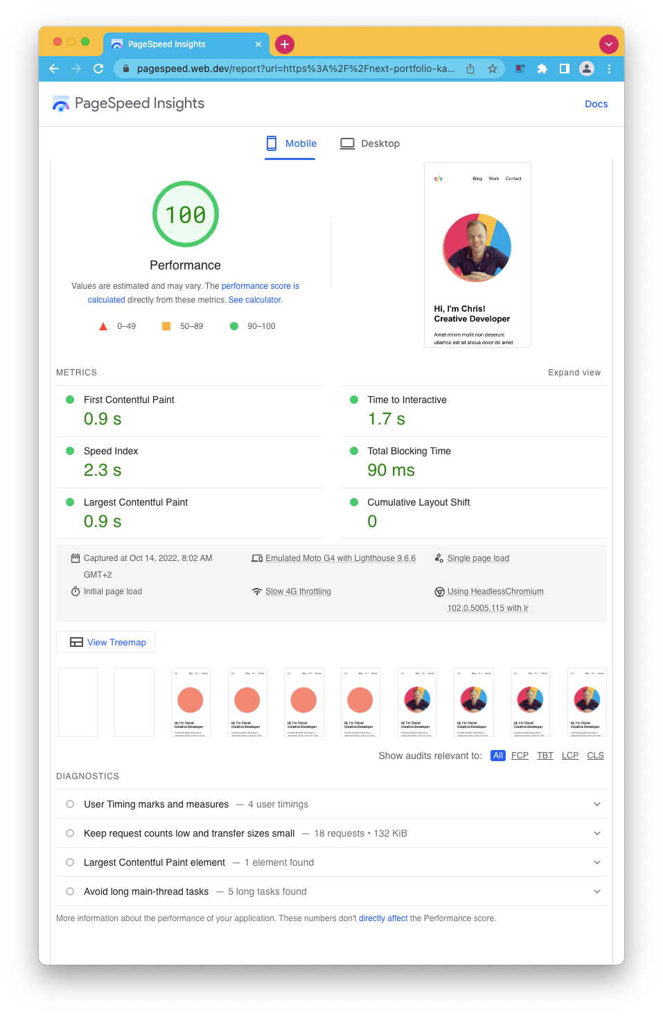
Wow! We also got a 100 score on mobile now, and all the recommendations are gone.
Well done to us. Our users will also be happy to get a faster and more optimized website.
If you want to check out the changes, view this GitHub branch.
Thank you for reading, and let’s connect!
Thank you for reading my blog. Feel free to subscribe to my email newsletter and connect on Facebook or Twitter