Layouts are an important part of any system. In Flutter, this is no different, but let’s look at how the layout system in Flutter works.
As mentioned in my previous article, Flutter is build of widgets. And yes, even the layouts are models.
Basically, every layout will start with a container. Flutter, however, does come with multiple container types. These are called “Layout Widgets”.
Exploring Flutter layout widgets
These so-called Layout Widgets have two kinds of types:
- Single-child layout widgets
These layouts can only have one child inside.
Some examples are: Center, Container, Align.
These widgets will have the child property like, for instance, on the center widget.
Center(
  child: Text(
		'Hello World 👋',
		textDirection: TextDirection.ltr,
  ),
),
As you can see, the Center widget will only have one property called child; this in return, has another widget in it.
- Multi-child layout widgets
The other option is multi-child layout widgets, these in return, can have multiple children.
You can for example, think of: Row, Column, GridView.
These widgets will have the children property and allow multiple child widgets to be inside them.
Center(
  child: (Row(
    mainAxisAlignment: MainAxisAlignment.spaceEvenly,
    children: [
      Icon(Icons.star, color: Colors.green[500]),
      Icon(
        Icons.star,
        color: Colors.green[500],
        size: 100,
      ),
      Icon(Icons.star, color: Colors.green[500])
    ],
  )),
);
Let’s see what’s going on here:
- Center
- Has one child: Row
- Has multiple Children:
- Icon
- Icon
- Icon
- Has multiple Children:
- Has one child: Row
Flutter does come with a lot more of these layout widgets, and you can find all of them on the Flutter layout page
To understand this scaffolding of widgets, Flutter has impressively good documentation.
For instance, let’s look at this example they are sketching to create a specific card widget.
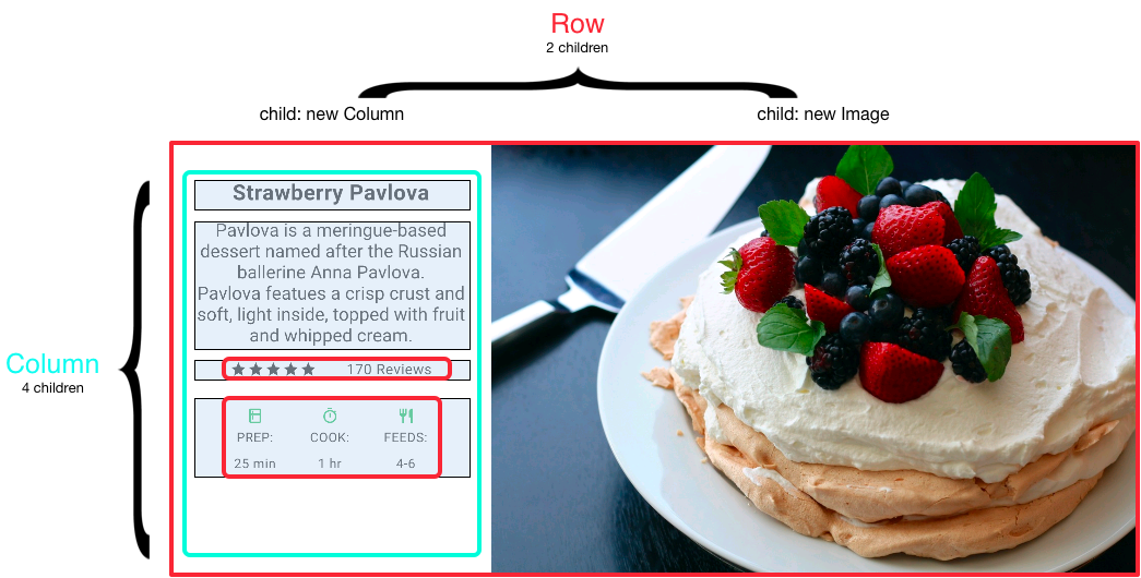
As you can see in this image, the flow works top-down.
- Row
- Column
- Image
Then inside that Column, there is another split. Let’s see what’s needed there:
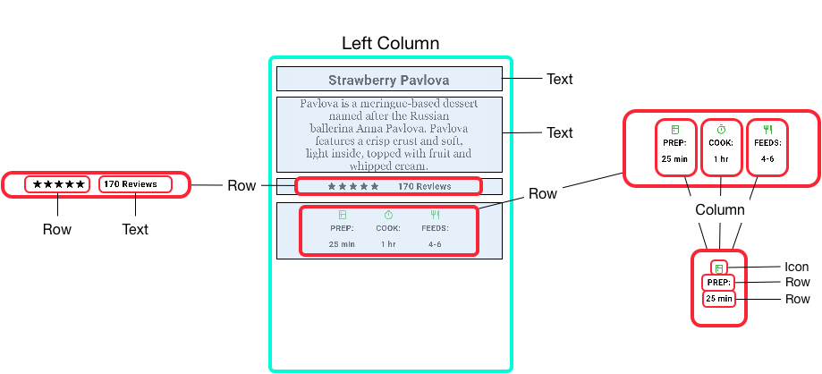
And as we can see here it shows:
- Column
- Text
- Text
- Row
- Row
- Text
- Row
- Column
- Icon
- Row
- Row
- Column
I hope this gives you a good understanding of how you can abstract widgets top down.
For me, it changed my way of looking at elements I need to create. This makes it easiest to draw out on paper and think about what elements are needed.
The layout itself has so much more options. I won’t be explaining every element and option in detail. I will be showing some important layout parts while trying them out.
I’ve tried out the described layout, and this is my result on the first try:
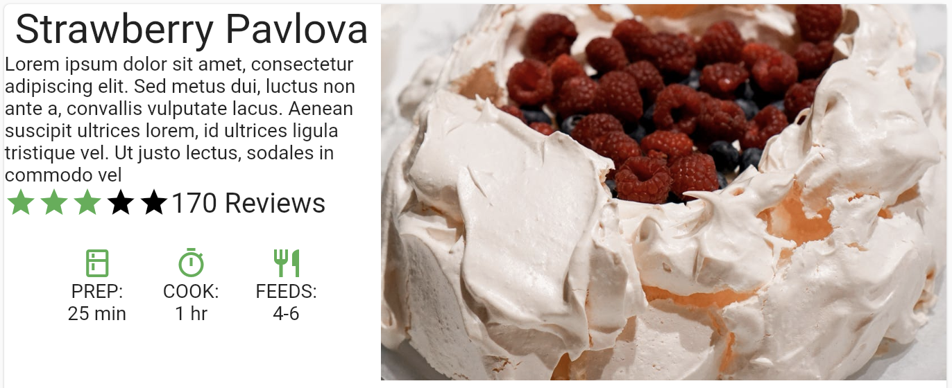
Not perfect in padding, but it should show you the basic flow of widgets inside widgets.
I’ve also added it on the Flutter Codepen, so you can give it a try.
See the Pen by Chris Bongers (@rebelchris) on CodePen.
Thank you for reading, and let’s connect!
Thank you for reading my blog. Feel free to subscribe to my email newsletter and connect on Facebook or Twitter
