Let’s talk about placeholders. They are an excellent addition to form elements.
Today we won’t be talking about them as accessibility issues and hazards but how to style the inputs that have them.
We can style the actual placeholder text in CSS using the ::placeholder pseudo-element.
But did you know there is also a pseudo-class called :placeholder-shown? It will select the actual input field and style so we can all of a sudden add borders and other styles!
Our result will be a styled input field based on the placeholder shown. Once we type text into it, the placeholder styling should be removed.
HTML Structure
First, let’s start by creating a basic HTML to render two input fields. One will have a placeholder, and one will have a text value.
<div class="container">
  <input type="text" value="I have a value" />
  <input type="text" placeholder="I have a placeholder" />
</div>
CSS :placeholder-shown
Let’s first add some basic styling to our page:
body {
  min-height: 100vh;
  background: #efe9e7;
  display: flex;
  justify-content: center;
  align-items: center;
}
.container {
  background: #dae0f2;
  padding: 2rem;
  border-radius: 1rem;
  display: flex;
  align-items: center;
  justify-content: center;
  flex-direction: column;
}
.container input {
  font-size: 1.5rem;
  padding: 0.5rem;
  margin: 0.5rem 0;
  border-radius: 0.5rem;
}
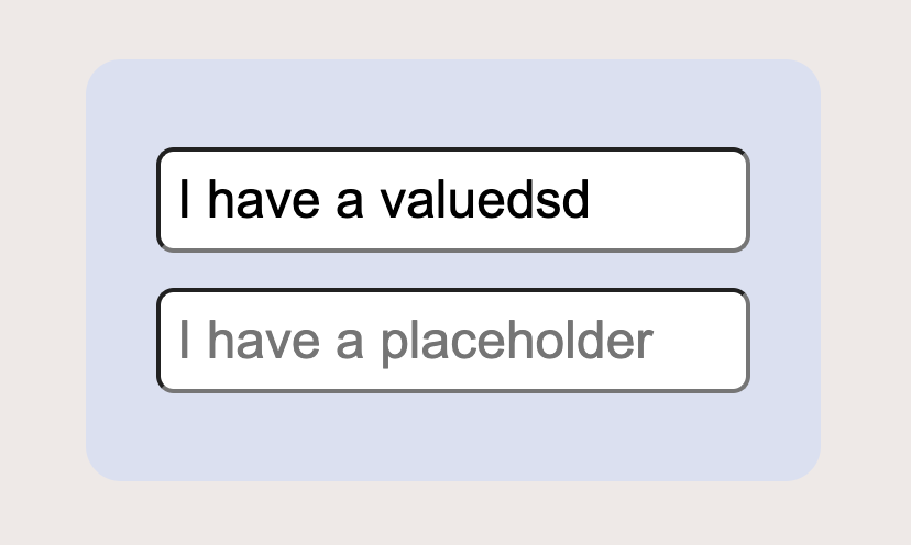
By running this, we will get a basic form that will look like the image below.
How can we render the text field where the placeholder is active differently? - We use the placeholder-shown pseudo-class like this:
.container input:placeholder-shown {
  border: 5px dashed teal;
}
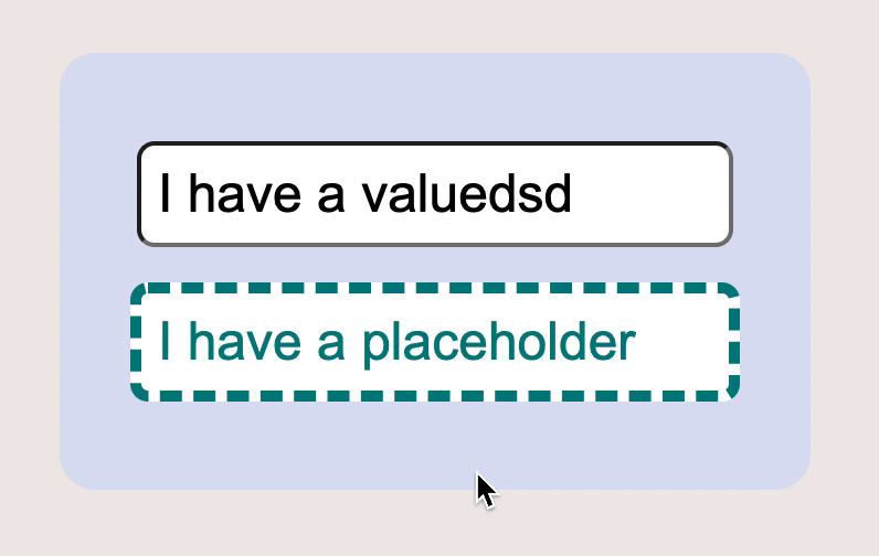
Now we should see a dashed teal border around the placeholder. Once we put a value in the field, that border will disappear!
Placeholder vs. placeholder-shown difference
To recap, we can use a ::placeholder pseudo-element to change the actual placeholder text styling:
input::placeholder {
  color: teal;
}
The difference is that we can use the :placeholder-shown pseudo-class to style the actual input styling:
input:placeholder-shown {
  border: 5px dashed teal;
}
So now you know how to use all placeholder pseudo-classes. We also learned the difference between placeholder and placeholder-shown.
See the code examples in this Codepen
Here you can find a full demo to play with:
See the Pen LYZvzaG by Chris Bongers (@rebelchris) on CodePen.
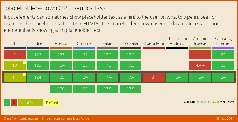
Browser Support
The main browsers support placeholder-shown fully. Of course, IE has to be a pain in the ass. I would suggest using this as an excellent addition, but don’t entirely rely on it.
Thank you for reading, and let’s connect!
Thank you for reading my blog. Feel free to subscribe to my email newsletter and connect on Facebook or Twitter