We made some CSS only tooltips. And the cool part about being a developer is there are always different ways to do it. I got feedback that the data attribute was also an excellent alternative, so I decided to rebuild my ones.
And it is indeed a neat way of doing so. It’s a cleaner code; with this one, we don’t have to define a fixed width.
HTML Structure
The HTML Structure only changes slightly from our previous example.
<div class="skills">
  <div class="skills-item" data-tooltip="HTML5">
    <!-- Content -->
  </div>
  <div class="skills-item" data-tooltip="CSS3">
    <!-- Content -->
  </div>
  <div class="skills-item" data-tooltip="JavaScript">
    <!-- Content -->
  </div>
</div>
So basically, we removed our span and placed our tooltip content inside the data-tooltip attribute we created.
CSS Tooltip Alternative
As for our CSS we are using the tooltip attribute selector as such:
.skills-item[data-tooltip] {
  position: relative;
}
Then we will add our actual tooltip element to the box and set the content to be whatever is in our data-tooltip
.skills-item[data-tooltip]:after {
  transition: opacity 0.3s;
  opacity: 0;
  position: absolute;
  content: attr(data-tooltip);
  bottom: 100%;
  background-color: #555;
  padding: 5px 0;
  border-radius: 6px;
  color: #fff;
  padding: 8px;
  width: auto;
  right: 50%;
  transform: translateX(50%);
}
We use the same styling but a slightly different position by offsetting it after placing it to the right.
We also want to have that little arrow at the bottom and leverage the base pseudo-element.
.skills-item[data-tooltip]:before {
  transition: opacity 0.3s;
  opacity: 0;
  content: '';
  position: absolute;
  border-width: 5px;
  border-style: solid;
  border-color: #555 transparent transparent transparent;
  right: 50%;
  transform: translateX(50%);
  margin-top: -10px;
}
Awesome!
Now all that’s left is showing it once we hover! Remember, we have to show two elements now, the before and after.
.skills-item[data-tooltip]:hover:after {
  opacity: 1;
}
.skills-item[data-tooltip]:hover:before {
  opacity: 1;
}
There you go, an alternative way of showing a tooltip.
View this on Codepen.
See the Pen CSS Only Tooltips Alternative by Chris Bongers (@rebelchris) on CodePen.
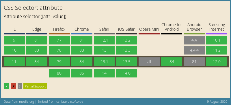
Browser Support
The browser support for this function mainly depends on the attribute selector, and that’s pretty well supported!
Thank you for reading, and let’s connect!
Thank you for reading my blog. Feel free to subscribe to my email newsletter and connect on Facebook or Twitter