I’m sure you have seen the React JS logo before, but as a reminder, this is what it looks like as PNG-image:

In today’s tutorial you’ll learn to recreate the React JS logo with pure CSS. ✨
This is what the result will look like:
See the Pen Untitled by Chris Bongers (@rebelchris) on CodePen.
Let’s get started!
Reactjs Logo style analysis
The ReactJS logo consists of three ellipses in orbit around a ball - like an atom.
I want to challenge myself and try to create this as a single div artwork, ensuring it follows responsive design principles..
We should be able to use the before and after pseudo-elements to create two of the lines making the icon recognizable.
Then the main div can hold the dot and the third line.
Since this is a little bit simpler, we’ll also animate the logo, so you get to experience CSS animations.
How to make the React logo in CSS
Let’s get started and create a single div HTML-element with a CSS class react.
<div class="react"></div>
Let’s also look into an excellent concept in processed CSS called @extend.
I’ll be using SCSS as we have a lot of recurring elements that we can quickly share between selectors.
Note: You can still use CSS, copy-paste the main element instead of using
@extend
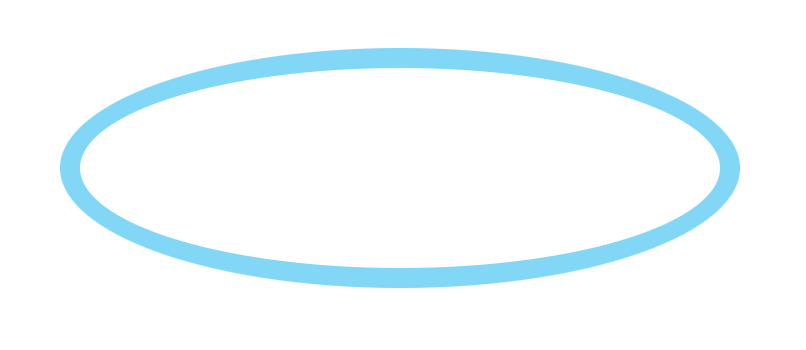
We’ll start by creating the orbit class.
.orbit {
  height: 6.25rem;
  width: 20rem;
  border-radius: 50%;
  border: 0.625rem solid #61dafb;
}
This code is not used anywhere now. But we can quickly add all these CSS styles to our div element like this.
.react {
  @extend .orbit;
}
At this point, we have the primary orbit in place.

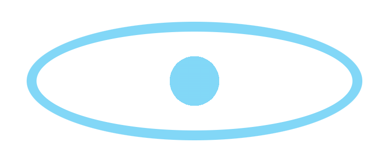
Before we add the other two orbit rings, let’s first look at how we can add the ball in the center. 👀
The ball will have to be a background on the main element.
But we don’t want to fill the whole background, in fact the rest should stay transparent. And we can leverage a radial gradient for this!
We saw a similar concept in the Dev.to logo where we had hard stops. By using transparent background stops, we can set the center color.
.react {
  @extend .orbit;
  background: radial-gradient(circle, #61dafb 15%, transparent 15%);
}
As you can see, we start the gradient set to a circle at 15%, which will fill with the React blue color.
And then, we transition to transparent from 15% onwards.

And now, let’s add the other two orbit rings.
We’ll use the before and after pseudo elements.
.react {
  // Other classes
  position: relative;
  &:before,
  &:after {
    content: '';
    @extend .orbit;
    position: absolute;
    left: -0.625rem;
    top: -0.625rem;
  }
}
The main thing to note here, is that we extend the orbit again for the before and after.
Then we offset it by -0.625rem, which reflects the border width of the orbit.
And then, we can rotate each element a bit differently.
&:before {
  transform: rotate(60deg);
}
&:after {
  transform: rotate(120deg);
}
By now, we have our react logo as intended.

The last thing we wanted to add is the React logo animation. The original logo rotates around the orb.
Let’s add a rotation animation to the main element.
.react {
  animation: rotate 15s infinite linear;
}
Some elements to note here:
rotate: This is the name of the animation we’ll create in a second15s: How long each animation will take, 15 seconds in this caseinfinite: how often the animation runs (forever)linear: the type of animation, we want it to be equal over time, but you can also useease-in.
The animation itself (named rotate) we can add like this:
@keyframes rotate {
  to {
    transform: rotate(1turn);
  }
}
We say, animate to rotate exactly one turn (which equals 360 degrees).
And there you go, a one-div CSS React logo that animates. ✨
CodePen Demo
See the Pen Untitled by Chris Bongers (@rebelchris) on CodePen.
Thank you for reading, and let’s connect!
Feel free to subscribe to my email newsletter and connect on Facebook or Twitter