For today’s article, we’ll recreate the iconic Netflix logo. While working on this logo, I found it was quite an easy one.
Super fun to try yourself 💖
Let’s take a look at the logo.

Analysing the logo
The logo is built up by three sticks of the same size; however, the middle one casts a shadow and is skewed.
Then at the bottom, it’s good to note the logo is a bit rounded off.
My idea is to leverage borders for the two side pillars and pseudo-elements to make the skew stick + the rounded bottom section.
Recreating the Netflix logo in CSS
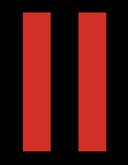
Let’s create a simple box and set the borders left and right to get started.
.netflix {
  height: 15rem;
  width: 3rem;
  border-left: 3rem solid #e50914;
  border-right: 3rem solid #e50914;
  position: relative;
}
It’s important to note the 3rem will be the size for each stick.
So far, we get the following styled element.

Let’s add a before element to add the third skew line. The main idea is that this can be simply the width and height of the box.
&:before {
  display: block;
  content: '';
  width: 100%;
  height: 100%;
  background: #e50914;
  transform: skewX(21.5deg);
  box-shadow: 0 0 30px black;
}
We can see we skew the element to fit the edges and add a bit of box-shadow to cast the shadow on the sticks below.
The last thing we need is the bottom rounded effect. We’ll leverage a round box that we offset from the bottom.
&:after {
  content: '';
  width: 15rem;
  height: 2rem;
  background: black;
  border-radius: 50%;
  display: block;
  position: absolute;
  left: -200%;
  top: 98%;
}
Which result in the following CodePen.
See the Pen Untitled by Chris Bongers (@rebelchris) on CodePen.
Thank you for reading, and let’s connect!
Thank you for reading my blog. Feel free to subscribe to my email newsletter and connect on Facebook or Twitter