Recently I had my portfolio reviewed and received a comment about someone liking my footer. So I decided why not write down how to create this!
This article is going to be quite a technical item. Feel free to copy/paste or ask me any questions on Facebook or Twitter if you get stuck.
Html structure
<div class="container">
  <ul class="particles">
    <li></li>
    <li></li>
    <li></li>
    <li></li>
    <li></li>
    <li></li>
    <li></li>
    <li></li>
    <li></li>
    <li></li>
  </ul>
</div>
Nothing exciting, right? 🤷♂️ We need a container, a particle list, and some particles (li’s).
Next up is the css that makes this magic happen.
CSS animated floating blocks
html,
body {
  margin: 0;
  padding: 0;
}
.container {
  background: #50514f;
  position: relative;
  width: 100vw;
  height: 100vh;
}
.particles {
  position: absolute;
  top: 0;
  left: 0;
  width: 100%;
  height: 100%;
  overflow: hidden;
  margin: 0px;
  padding: 0px;

  li {
    position: absolute;
    display: block;
    list-style: none;
    width: 20px;
    height: 20px;
    background: rgba(255, 255, 255, 0.2);
    -webkit-animation: animate 25s linear infinite;
    animation: animate 25s linear infinite;
    bottom: -150px;

    &:nth-child(1) {
      left: 25%;
      width: 80px;
      height: 80px;
      -webkit-animation-delay: 0s;
      animation-delay: 0s;
      background: #f25f5c;
    }
    &:nth-child(2) {
      left: 10%;
      width: 20px;
      height: 20px;
      -webkit-animation-delay: 2s;
      animation-delay: 2s;
      -webkit-animation-duration: 12s;
      animation-duration: 12s;
      background: #ffe066;
    }
    &:nth-child(3) {
      left: 70%;
      width: 20px;
      height: 20px;
      -webkit-animation-delay: 4s;
      animation-delay: 4s;
      background: #247ba0;
    }
    &:nth-child(4) {
      left: 40%;
      width: 60px;
      height: 60px;
      -webkit-animation-delay: 0s;
      animation-delay: 0s;
      -webkit-animation-duration: 18s;
      animation-duration: 18s;
      background: #70c1b3;
    }
    &:nth-child(5) {
      left: 65%;
      width: 20px;
      height: 20px;
      -webkit-animation-delay: 0s;
      animation-delay: 0s;
      background: #50514f;
    }
    &:nth-child(6) {
      left: 75%;
      width: 110px;
      height: 110px;
      -webkit-animation-delay: 3s;
      animation-delay: 3s;
      background: #f25f5c;
    }
    &:nth-child(7) {
      left: 35%;
      width: 150px;
      height: 150px;
      -webkit-animation-delay: 7s;
      animation-delay: 7s;
      background: #ffe066;
    }
    &:nth-child(8) {
      left: 50%;
      width: 25px;
      height: 25px;
      -webkit-animation-delay: 15s;
      animation-delay: 15s;
      -webkit-animation-duration: 45s;
      animation-duration: 45s;
      background: #247ba0;
    }
    &:nth-child(9) {
      left: 20%;
      width: 15px;
      height: 15px;
      -webkit-animation-delay: 2s;
      animation-delay: 2s;
      -webkit-animation-duration: 35s;
      animation-duration: 35s;
      background: #70c1b3;
    }
    &:nth-child(10) {
      left: 85%;
      width: 150px;
      height: 150px;
      -webkit-animation-delay: 0s;
      animation-delay: 0s;
      -webkit-animation-duration: 11s;
      animation-duration: 11s;
      background: #50514f;
    }
  }
}

@-webkit-keyframes animate {
  0% {
    -webkit-transform: translateY(0) rotate(0deg);
    transform: translateY(0) rotate(0deg);
    opacity: 1;
    border-radius: 0;
  }
  100% {
    -webkit-transform: translateY(-1000px) rotate(720deg);
    transform: translateY(-1000px) rotate(720deg);
    opacity: 0;
    border-radius: 50%;
  }
}

@keyframes animate {
  0% {
    -webkit-transform: translateY(0) rotate(0deg);
    transform: translateY(0) rotate(0deg);
    opacity: 1;
    border-radius: 0;
  }
  100% {
    -webkit-transform: translateY(-1000px) rotate(720deg);
    transform: translateY(-1000px) rotate(720deg);
    opacity: 0;
    border-radius: 50%;
  }
}
Ok, let’s go through what we are doing.
The container needs to be relative and have a specified width or height (it does not have to be 100%, but the particles will float inside this)
Next, the particles ul need to be absolutely positioned. And 100% of the container in both width and height.
It is also crucial to include overflow: hidden;.
We use li elements; these are also absolute positioned.
We define some basic parameters, which we will randomly override.
Then we set them to use animation. In this case, we call the animate function, which we will declare later. We also tell it to be linear and animate countless times.
And we start all blocks off -150px from the bottom.
Random sizes and colors
The random sizes and colors could be more random, but I wanted to have some degree of input in this specific case and decided to use the nth-child(x) selector.
The nth-child(x) selector gets a specific selector number, so (1) is the first occurrence.
We then randomly set some attributes, so each block is different;
- left (position from the left)
- width/height (the size)
- animation-delay (how quick it shows)
- animation-duration (how fast it moves)
- background (color of the block)
CSS Keyframe animation
As you can see, we use CSS @keyframes animate to define a new animation.
@keyframes animate {
  0% {
    -webkit-transform: translateY(0) rotate(0deg);
    transform: translateY(0) rotate(0deg);
    opacity: 1;
    border-radius: 0;
  }
  100% {
    -webkit-transform: translateY(-1000px) rotate(720deg);
    transform: translateY(-1000px) rotate(720deg);
    opacity: 0;
    border-radius: 50%;
  }
}
What this does is create a frame-by-frame animation. We can define 0-100% steps. In this case, I want it to go from 0 to 100% gently.
Starting at 0, we set the opacity to 1, the border radius to 0, and all the transformations to 0.
Then at 100% (result), we set it to rotate a lot by using translateY/rotate functions.
We also set the opacity to 0, so it will slowly disappear.
And the border-radius of 50% will turn it from a square to a ball.
You can see a demo below:
See the Pen CSS animation floating blocks by Chris Bongers (@rebelchris) on CodePen.
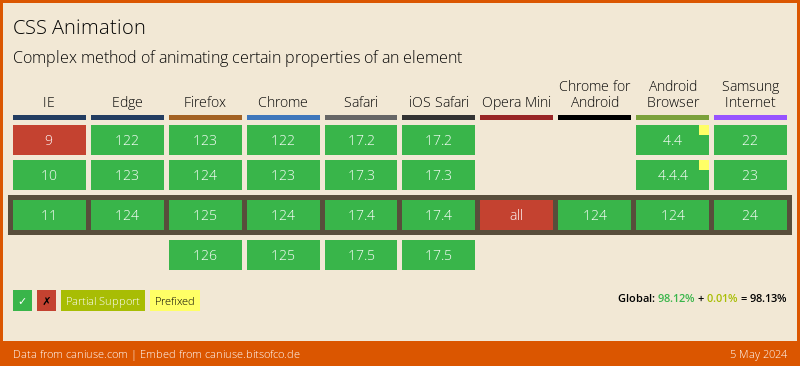
Browser support
CSS Animation is widely supported. Just Opera struggles.
There is no direct polyfill at the time of writing.
You can, however, use the JavaScript animate({}) function to achieve this result.
Thank you for reading, and let’s connect!
Thank you for reading my blog. Feel free to subscribe to my email newsletter and connect on Facebook or Twitter