Today I wanted to try and recreate a super cool dribbble shot from Dede Dwiyansyah I came across.
It’s a Figma tutorial on how to create the frosted glass effect. I decided to try and recreate this unique effect with CSS! It is also called “glass morphism”, and I gave it my own twist.
I knew it was possible to do the effect with CSS only. Normally people leverage a glass background blur filter, but in this case, it wouldn’t blur the objects behind the background.
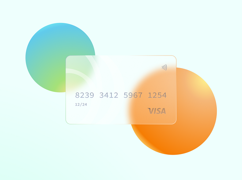
So I decided to do some research, and here you can see my result:
I’ll be guiding you through the steps to code this with CSS.
HTML Structure
Let’s start by defining the HTML structure for this tutorial.
<div class="holder">
  <div class="card">
    <div class="card__text">
      8293 3412 5976 1254
      <br />
      <small>12/24</small>
    </div>
    <svg>Insert Visa logo here</svg>
  </div>
</div>
As you can see, I’m using a holder div. We need this div for the two orbiting balls in the background.
Then we have the card, which contains another container for the text, and an SVG for the logo at the end.
Note: The full SVG visa logo can be found on Codepen.
Now it’s time to start the fun bit, the CSS.
CSS Frosted glass effect
I will be guiding you through all the little steps we need to re-create this cool CSS glass effect.
First, we need to use a font that resembles a credit card font. I found the Inconsolata font on Google fonts works pretty well.
@import url('https://fonts.googleapis.com/css2?family=Inconsolata&display=swap');
With this line, we import the font directly from Google fonts.
Next, we add a small CSS reset to eliminate default margins and paddings of the HTML elements.
* {
  margin: 0;
  padding: 0;
}
Now let’s style the body tag. In the dribbble example, we saw the person use a gradient background. So I decided to use a background image to appear behind the glass.
body {
  background: url('https://images.pexels.com/photos/1655166/pexels-photo-1655166.jpeg?auto=compress&cs=tinysrgb&dpr=2&h=750&w=1260')
    no-repeat center center;
  background-size: cover;
  display: grid;
  font-family: 'Inconsolata', monospace;
  min-height: 100vh;
  place-items: center;
}
I’m also using the CSS grid center method to get the card centered on our page. In this spot, we are also loading our fonts.
As mentioned, we are using the holder to place our two orbiting balls in it. We will be using pseudo-elements to create these balls, so our holder will need to be a relative element.
.holder {
  position: relative;
}
Now let’s create the balls. The orange one will be made using the before pseudo element and the blue one with the after pseudo element.
They share some similarities in size and roundness so let’s write that with a double selector.
.holder:before,
.holder:after {
  animation: orbit 5s linear infinite;
  border-radius: 50%;
  box-shadow: 0 0 1rem 0 rgba(0, 0, 0, 0.2);
  content: '';
  height: 150px;
  position: absolute;
  width: 150px;
}
This creates a round ball because of the 50% border-radius.
We also added an animation called orbit. We’ll create the animation in a bit.
Now for the orange ball, we need to create a radial gradient.
.holder:before {
  background: #ffe897;
  background: -moz-radial-gradient(top right, #ffe897, #f98a05);
  background: radial-gradient(to bottom left, #ffe897, #f98a05);
  background: -webkit-radial-gradient(top right, #ffe897, #f98a05);
}
I used css-gradient.com to generate the gradient.
Then for the blue one, we also place a radial gradient and offset it to the right side. This one also needs an animation delay. Else they’ll be doing the same thing.
.holder:after {
  animation-delay: 2.5s;
  background: #e0e793;
  background: -moz-radial-gradient(bottom right, #e0e793, #6dd0f1);
  background: radial-gradient(to top left, #e0e793, #6dd0f1);
  background: -webkit-radial-gradient(bottom right, #e0e793, #6dd0f1);
  right: 0;
  top: 0;
  z-index: -1;
}
Then it’s time to add our card.
The card itself has a fixed size and a small box-shadow to make it pop a bit more:
.card {
  border: 1px solid #fff;
  border-radius: 15px;
  box-shadow: 0 0 1rem 0 rgba(0, 0, 0, 0.2);
  font-size: 2rem;
  height: 220px;
  overflow: hidden;
  position: relative;
  width: 370px;
}
Now to the glass effect. For the glass morphism, we use another :before pseudo element.
.card:before {
  background-color: rgba(255, 255, 255, 0.3);
  backdrop-filter: blur(10px) saturate(100%) contrast(45%) brightness(130%);
  content: '';
  height: 100%;
  position: absolute;
  width: 100%;
}
The whole blur effect comes from the backdrop-filter. The filter gives it a blurry glassy look.
We also use a background color with an opacity of 30% using the rgba spectrum. It gives the background some transparency.
For the text inside, we only need to offset it a bit and ensure it’s on top of everything.
.card__text {
  color: #6f7886;
  margin-left: 30px;
  margin-top: 100px;
  position: relative;
  z-index: 2;
}
Remember: We had the Visa SVG logo. We put that in the right bottom corner.
.card svg {
  bottom: 30px;
  position: absolute;
  right: 30px;
}
Before we talk about the orbit animation, this animation will make the two balls move around the card in a circular motion.
@keyframes orbit {
  from {
    transform: rotate(0deg) translateX(100px) rotate(0deg);
  }
  to {
    transform: rotate(360deg) translateX(100px) rotate(-360deg);
  }
}
This specific animation uses a two-step animation transforming the elements to rotate from 0 to 360 degrees (a full circle).
It also offsets the translateX axis to make it move.
See the code example live in this Codepen
See the Pen CSS Frosted glass creditcard blurr by Chris Bongers (@rebelchris) on CodePen.
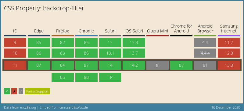
Browser Support
This method relies heavily on the backdrop-filter CSS property, which has decent support.
It can be safely used in all modern browsers. You can get some more support by leveraging all the prefixes for it.
Thank you for reading, and let’s connect!
Thank you for reading my blog. Feel free to subscribe to my email newsletter and connect on Facebook or Twitter