Today we’ll be making something slightly different. A complete CSS-powered dropdown menu!
No JavaScript required!
We will use a button with a focus state. We’ll check if we need to show this menu.
The result will look like this:
I’m using Tailwind CSS for this tutorial to focus more on the actual effect.
You can find my Tailwind article here.
HTML Structure
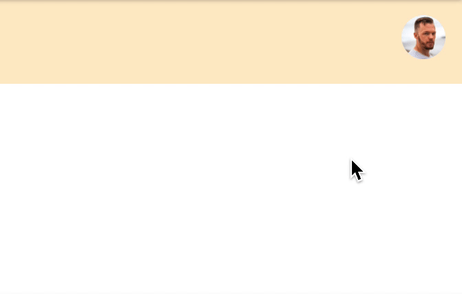
The HTML will be a navbar container, a logo, and a user icon on the right.
Tailwind does the styling and mainly uses flex to align the items.
As you can see, we have a button with the ID user-menu next to it. We have a div with the ID user-menu-dropdown. This will be the dropdown we’ll show once we focus on the button.
<nav class="flex items-center justify-between h-full p-3 m-auto bg-orange-200">
  <span>My Logo</span>
  <div class="relative">
    <button id="user-menu" aria-label="User menu" aria-haspopup="true">
      <img
        class="w-8 h-8 rounded-full"
        src="https://scontent.fcpt4-1.fna.fbcdn.net/v/t1.0-1/p480x480/82455849_2533242576932502_5629407411459588096_o.jpg?_nc_cat=100&ccb=2&_nc_sid=7206a8&_nc_ohc=rGM_UBdnnA8AX_pGIdM&_nc_ht=scontent.fcpt4-1.fna&tp=6&oh=7de8686cebfc29e104c118fc3f78c7e5&oe=5FD1C3FE"
      />
    </button>
    <div
      id="user-menu-dropdown"
      class="absolute right-0 w-48 mt-2 origin-top-right rounded-lg shadow-lg top-10 menu-hidden"
    >
      <div
        class="p-4 bg-white rounded-md shadow-xs"
        role="menu"
        aria-orientation="vertical"
        aria-labelledby="user-menu"
      >
        <a
          href="#"
          class="block px-6 py-2 mb-2 font-bold rounded"
          role="menuitem"
          >My profile</a
        >
        <a href="#" class="block px-6 py-2 font-bold rounded" role="menuitem"
          >Logout</a
        >
      </div>
    </div>
  </div>
</nav>
CSS menu on focus
To add the effect, we need to target the focus on the button. But first, let’s hide our dropdown and add a small effect.
Note: We could use @apply, but CodePen doesn’t support this
#user-menu ~ #user-menu-dropdown {
  transform: scaleX(0) scaleY(0);
  transition-timing-function: cubic-bezier(0.4, 0, 1, 1);
  transition-duration: 75ms;
  opacity: 0;
  top: 3.25rem;
}
For the dropdown, we add a transform to make it animate from the corner. Then we add an opacity of 0 to hide it.
Now we need to target the hover.
We use the #user-menu:focus and then target the following (~) dropdown.
We also add a focus-within in case someone clicks a link in the dropdown, and the menu will stay active then.
#user-menu ~ #user-menu-dropdown:focus-within,
#user-menu:focus ~ #user-menu-dropdown {
  transform: scaleX(1) scaleY(1);
  transition-timing-function: cubic-bezier(0, 0, 0.2, 1);
  transition-duration: 100ms;
  opacity: 1;
}
You can see the complete example on this Codepen.
See the Pen CSS focus powered dropdown menu by Chris Bongers (@rebelchris) on CodePen.
Thank you for reading, and let’s connect!
Thank you for reading my blog. Feel free to subscribe to my email newsletter and connect on Facebook or Twitter