Have you ever wondered how to make a playing card, Pokemon card, or CV image card flip around with animation in CSS?
Today we are going to learn this together.
HTML Setup
For the HTML part, we need at least the following. It is up to you to make it even fancier later on.
<div class="flip-card">
  <div class="inner">
    <div class="front">
      <img
        src="img_avatar.png"
        alt="Daily Dev Tips"
        style="width:300px;height:300px;"
      />
    </div>
    <div class="back">
      <h1>Chris Bongers</h1>
      <p>Writer, Developer</p>
      <p>Yes, I do love alpacas 🦙</p>
    </div>
  </div>
</div>
So, we have a flip-card container; this is important since we will be placing the perspective on here, which makes it look good.
Then we have an inner wrapper to put the actual cards in and style the back and front sides.
CSS to flip cards with a transform animation
.flip-card {
  background-color: transparent;
  width: 300px;
  height: 300px;
  perspective: 1000px;
}
.flip-card .inner {
  position: relative;
  width: 100%;
  height: 100%;
  transition: transform 0.8s;
  transform-style: preserve-3d;
}
.flip-card .inner .front,
.flip-card .inner .back {
  position: absolute;
  width: 100%;
  height: 100%;
  -webkit-backface-visibility: hidden;
  backface-visibility: hidden;
  display: flex;
  align-items: center;
  justify-content: center;
  flex-direction: column;
}
.flip-card .inner .front {
  background-color: #bbb;
}
.flip-card .inner .back {
  background-color: teal;
  color: white;
  transform: rotateY(180deg);
}
.flip-card:hover .inner {
  transform: rotateY(180deg);
}
One, as usual, let’s see piece by piece what’s happening:
.flip-card {
  background-color: transparent;
  width: 300px;
  height: 300px;
  perspective: 1000px;
}
This is our main container for the flip card and contains the width and height for the background.
We say perspective: 1000px, making it a cool 3d animation!
Try and remove the perspective in code to see what happens
.flip-card .inner {
  position: relative;
  width: 100%;
  height: 100%;
  transition: transform 0.8s;
  transform-style: preserve-3d;
}
In the inner card, we make relative so we can position: absolute the card front and back inside of it.
Then we say it must animate the transform property.
.flip-card .inner .front,
.flip-card .inner .back {
  position: absolute;
  width: 100%;
  height: 100%;
  -webkit-backface-visibility: hidden;
  backface-visibility: hidden;
  display: flex;
  align-items: center;
  justify-content: center;
  flex-direction: column;
}
We make these absolute and 100% of the wrapper for the front and back.
And set the backface-visibility to hidden, ensuring we don’t see the back while flipping the content, e.g., an image.
We then align everything in the center using flexbox centering.
.flip-card .inner .front {
  background-color: #bbb;
}
.flip-card .inner .back {
  background-color: teal;
  color: white;
  transform: rotateY(180deg);
}
Then, we give it a different background-color than the back for the front.
And on the back, we say transform: rotateY(180deg), making the card background flip around.
Then for the magic part 🎩
.flip-card:hover .inner {
  transform: rotateY(180deg);
}
We transform the inner div to rotate on the vertical axis on hover. So this will flip the card around the back and front!
See the CSS animation with code examples live on this Codepen:
See the Pen CSS Flip Cards by Chris Bongers (@rebelchris) on CodePen.
Vertical card flip animation in CSS
Of course, we can also use a vertical flip. We have to change the following values:
.back {
  transform: rotateX(180deg);
}
.flip-card:hover .inner {
  transform: rotateX(180deg);
}
See this transform flip effect in the following demo on Codepen:
See the Pen CSS Flip Cards Vertical by Chris Bongers (@rebelchris) on CodePen.
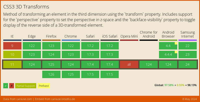
Browser Support for CSS transform
Internet Explorer is a bit damp here, and it doesn’t fully support the 3D effect, and Opera doesn’t like to play with this. We could add some JavaScript to check if it is supported and then change the animation to more 2d.
Thank you for reading, and let’s connect!
Thank you for reading my blog. Feel free to subscribe to my email newsletter and connect on Facebook or Twitter