Yesterday we looked into making rounded corners on our boxes and even circles with border-radius. My good friend svondervoort replied you could use double border-radius. And he is right. I even used it in my Totoro example.
So why not dive into how you use the double border-radius syntax.
HTML Structure
As for the HTML let’s keep it simple and use one big box.
<div class="box rounded"></div>
Then let’s dive into the syntax, it basically accepts two times the code split with a slash.
.rounded {
  border-radius: 40% 40% 30% 30% / 60% 60% 40% 40%;
}
We can use percentages and pixels.
It gets quite complicated I find to do these things from the top of your head, but luckily Adam Kuhn made this awesome playground to ease this.
See the Pen Border-Radius Playground by Adam Kuhn (@cobra_winfrey) on CodePen.
You can also view my example on Codepen.
See the Pen CSS Double Border Radius by Chris Bongers (@rebelchris) on CodePen.
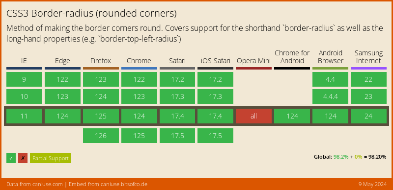
Browser Support
The border-radius is very well supported, and can safely be used.

Thank you for reading, and let’s connect!
Thank you for reading my blog. Feel free to subscribe to my email newsletter and connect on Facebook or Twitter