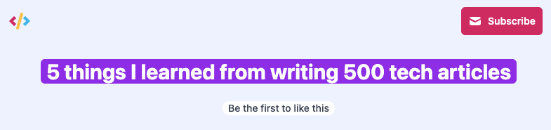
When I was working on redesigning this blog, I created this slick-looking header effect.
I’ll explain how to re-create this effect in a bit, and then we’ll dive into a problem that almost had me remove the effect.
How to create the text background effect
The idea of this effect is to have a background on your text, which wraps neatly around the words.
I’ll showcase the code in Tailwind, but I will also explain the essential parts.
The main setup will look like this:
<h1 class="inline px-2 text-3xl font-bold text-white bg-purple-600 rounded-md">
  Your content here
</h1>
This will already give us the effect we saw in the image above.
The main effect is a combination of display: inline and the background color we set.
We use rounded corners to make it look a bit slicker.
The problem at hand
Of course, there had to be a problem with this fantastic effect. And it quickly showed itself on mobile devices.
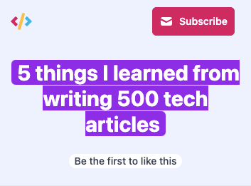
The idea is great, but it’s annoying that the text is cut off from the sides.
Well, I guess it was to be expected, right? 😩
Since everything is only one element, with one line of text, the padding is only applied at the beginning and end of that line.
At this point, I considered removing the effect or changing how it looked.
Until a superhero arrived called: Box Decoration Break! And it does exactly what we are looking for!
This amazing feature comes in two states:
slice: Elements are seen as one big element (So what we have seen happening)clone: Element is broken into fragments with each their copy of the styles.
The clone feature is what we are looking for, and let’s see how that looks.
To add it simply add the following classname: box-decoration-clone. (Or box-decoration-slice)
This, in return, will add the following CSS classes for those not using Tailwind.
.box-decoration-clone {
  -webkit-box-decoration-break: clone;
  box-decoration-break: clone;
}
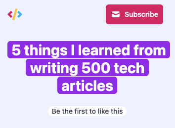
And that’s it, way better! Super happy I found this fantastic CSS property, and it made my headers look amazing.
You can see the completed code example on this CodePen.
See the Pen Untitled by Chris Bongers (@rebelchris) on CodePen.
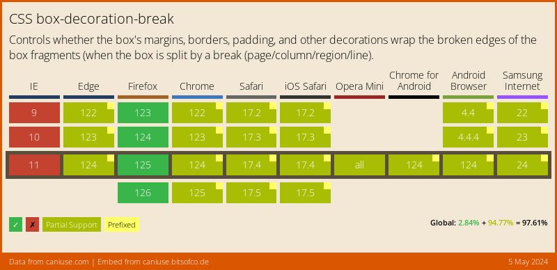
Browser support
The support is actually not bad, it has some partial support on certain browsers, but consider what it does I’m really happy to see such a wide support:
Thank you for reading, and let’s connect!
Thank you for reading my blog. Feel free to subscribe to my email newsletter and connect on Facebook or Twitter