You might remember I recreated this excellent CSS frosted glass effect based on a dribbble shot.
This was pretty cool to do, and I wanted to test some checkbox techniques, so I decided to look for a cool switch effect.
I found this fantastic dribble shot by Katia De Juan
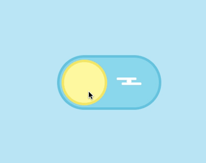
In this article, I’ll recreate this in CSS and help you understand the elements and code you need to do the same.
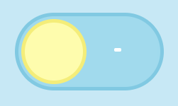
The result will look like this:
HTML Structure
<input type="checkbox" id="toggle" class="toggle--checkbox" />
<label for="toggle" class="toggle--label">
  <span class="toggle--label-background"></span>
</label>
<div class="background"></div>
Yes, that’s all the HTML we need, weird, right?
We will use a lot of pseudo-elements to add the little styling gimmicks.
The basic idea is that we use the label to control the checkbox. The checkbox, in turn, will be hidden. But its checked state will cause the switch effect.
We did use this effect before in this CSS Custom checkbox article.
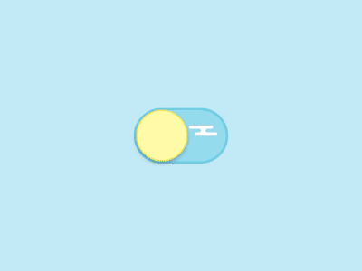
CSS only day/night toggle switch
To create our switch, we need to use many pseudo-elements.
But let’s start with the basics. We need to hide our checkbox. The checkbox is only used to toggle our styling.
The label will be the one visible and toggling the checkbox
We use ‘display: none’ to hide our checkbox.
.toggle--checkbox {
  display: none;
}
Once that is out of the way, let’s use CSS grid to center everything in our body.
body {
  display: grid;
  place-items: center;
  min-height: 100vh;
  position: relative;
}
I’m using CSS variables for this tutorial. Just for the colours, here is the variable declaration:
:root {
  /** sunny side **/
  --blue-background: #c2e9f6;
  --blue-border: #72cce3;
  --blue-color: #96dcee;
  --yellow-background: #fffaa8;
  --yellow-border: #f5eb71;
  /** dark side **/
  --indigo-background: #808fc7;
  --indigo-border: #5d6baa;
  --indigo-color: #6b7abb;
  --gray-border: #e8e8ea;
  --gray-dots: #e8e8ea;
  /** general **/
  --white: #fff;
}
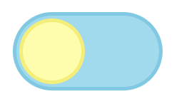
Then, we should move to the label styling. As you see in the result, this is about twice the size of our sun and moon elements.
We also add a transition so it will animate with ease. In this case, the animation will be the background and border color.
.toggle--label {
  width: 200px;
  height: 100px;
  background: var(--blue-color);
  border-radius: 100px;
  border: 5px solid var(--blue-border);
  display: flex;
  position: relative;
  transition: all 350ms ease-in;
}
This code will result in the following.
Let’s add our first pseudo-element: the sun icon. It is an absolute position element and has a fixed width and height.
.toggle--label:before {
  animation-name: reverse;
  animation-duration: 350ms;
  animation-fill-mode: forwards;
  transition: all 350ms ease-in;
  content: '';
  width: 82px;
  height: 82px;
  border: 5px solid var(--yellow-border);
  top: 4px;
  left: 4px;
  position: absolute;
  border-radius: 82px;
  background: var(--yellow-background);
}
Note: don’t use border-radius: 50% since we want to expand the width of this element.
Now we should see the following result.
We also added a custom animation called reverse. This animation takes 350ms to complete. The fill-mode is set to ‘forwards’, which will stop at the last frame.
This animation is as follows:
@keyframes reverse {
  0% {
    left: 104px;
    width: 82px;
  }
  60% {
    left: 72px;
    width: 112px;
  }
  100% {
    left: 4px;
  }
}
We start on our initial value, and then 60% of the time (350ms), we modify the left position and width. Then from 60-100%, we change the position to 4px. This gives us a neat grow and move effect.
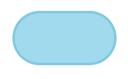
We also see the main background div. It’s used for the full color and is absolutely positioned in our body.
The only thing that will change there is the background color.
.background {
  position: absolute;
  left: 0;
  top: 0;
  background: var(--blue-background);
  z-index: -1;
  width: 100%;
  height: 100%;
  transition: all 250ms ease-in;
}
Adding the cloud detail
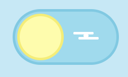
You might have also noted the white cloud in the sun switch. We will animate this to transform into the stars, so it’s based on three elements.
The main element is the span background inside the label. This, in turn, has a before and after pseudo-element.
The main span is relatively positioned on the right-hand side. It has a transition that takes 150ms, so it’s faster than our main toggle.
.toggle--label-background {
  width: 10px;
  height: 5px;
  border-radius: 5px;
  position: relative;
  background: var(--white);
  left: 135px;
  top: 45px;
  transition: all 150ms ease-in;
}
This alone results in the following:
The before and after are absolute positioned elements resembling the cloud’s top and bottom parts.
.toggle--label-background:before {
  content: '';
  position: absolute;
  top: -5px;
  width: 40px;
  height: 5px;
  border-radius: 5px;
  background: var(--white);
  left: -20px;
  transition: all 150ms ease-in;
}
.toggle--label-background:after {
  content: '';
  position: absolute;
  top: 5px;
  width: 40px;
  height: 5px;
  border-radius: 5px;
  background: var(--white);
  left: -10px;
  transition: all 150ms ease-in;
}
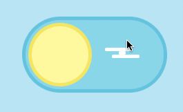
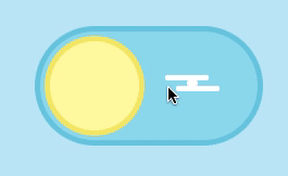
With those, we get the simplistic-looking cloud.
CSS changing styling based on checked class
Now that we have our default sunny side of the toggle, let’s go ahead and see how to make it switch to the nighttime mode.
There is a cool feature where you can detect a checkbox checked state and then target the next element.
The code works as follows.
.toggle--checkbox:checked + element {
  // Element can be after our checkbox
}
Knowing that, we will start with the background.
.toggle--checkbox:checked ~ .background {
  background: var(--indigo-background);
}
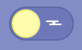
Now, if we click our label, the background will change.
So knowing this works, we can go ahead and use this principle for our label.
We only need to change the background and border, so the CSS is as follows.
.toggle--checkbox:checked + .toggle--label {
  background: var(--indigo-color);
  border-color: var(--indigo-border);
}
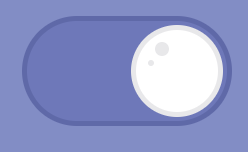
And this results in the following.
Let’s continue and change our sun into a moon. This has the same idea. A change of background and border is enough, but we want to reverse the animation. Hence, we add another custom animation to this one.
.toggle--checkbox:checked + .toggle--label:before {
  background: var(--white);
  border-color: var(--gray-border);
  animation-name: switch;
  animation-duration: 350ms;
  animation-fill-mode: forwards;
}
The animation is the same as the “reverse” one, but from left to right.
@keyframes switch {
  0% {
    left: 4px;
  }
  60% {
    left: 4px;
    width: 112px;
  }
  100% {
    left: 104px;
    width: 82px;
  }
}
Then, we need to add another after to show some dimples of the moon.
.toggle--label:after {
  transition-delay: 0ms;
  transition: all 250ms ease-in;
  position: absolute;
  content: '';
  box-shadow: var(--gray-dots) -13px 0 0 2px, var(--gray-dots) -24px 14px 0 -2px;
  left: 143px;
  top: 23px;
  width: 10px;
  height: 10px;
  background: transparent;
  border-radius: 50%;
  opacity: 0;
}
This has an opacity of 0, and once it’s checked, we will show it. You also see we use a box shadow to create this effect. What this does is create two circles positioned left from the actual element.
Then once we click the CSS will need to change the opacity.
.toggle--checkbox:checked + .toggle--label:after {
  transition-delay: 350ms;
  opacity: 1;
}
I think these little dimples make a big difference, wouldn’t you agree?
The last part is that we want to move our cloud and turn it into the three stars.
We move the positions around and make them a bit smaller.
.toggle--checkbox:checked + .toggle--label .toggle--label-background {
  left: 60px;
  width: 5px;
}
.toggle--checkbox:checked + .toggle--label .toggle--label-background:before {
  width: 5px;
  height: 5px;
  top: -25px;
}
.toggle--checkbox:checked + .toggle--label .toggle--label-background:after {
  width: 5px;
  height: 5px;
  left: -30px;
  top: 20px;
}
That gives us the following result, have a play on this Codepen.
See the Pen Creating day-night CSS only toggle switch by Chris Bongers (@rebelchris) on CodePen.
Thank you for reading, and let’s connect!
Thank you for reading my blog. Feel free to subscribe to my email newsletter and connect on Facebook or Twitter