I’m finally going to touch on a subject I’ve been putting off for way too long in this article.
3D in CSS!
Yes, 3D, and what better example of trying and making a 3D dice in CSS.
The result of this article will be this rotating dice. (Code and demo at the bottom)
Setting up the HTML
Let’s start with the HTML. We need a dice container and six sides to it.
<div class="dice">
  <div class="side one"></div>
  <div class="side two"></div>
  <div class="side three"></div>
  <div class="side four"></div>
  <div class="side five"></div>
  <div class="side six"></div>
</div>
That will be all for our HTML part. Let’s quickly move on to the fun part, which will be the CSS.
Basic styling
Let’s start with some basic styling.
First, I ensured the dice element was in the middle of the page since it’s easier to work with.
body {
  display: flex;
  justify-content: center;
  align-items: center;
  min-height: 100vh;
}
Then I moved on to arranging the dice to be a big square box.
.dice {
  position: relative;
  width: 200px;
  height: 200px;
}
Then each side is another wrapper that centers all its children (the dots).
.side {
  width: 100%;
  height: 100%;
  background: #da0060;
  border: 2px solid black;
  position: absolute;
  opacity: 0.7;
  display: flex;
  align-items: center;
  justify-content: center;
}
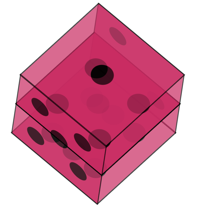
By now, you should see something that looks like this:
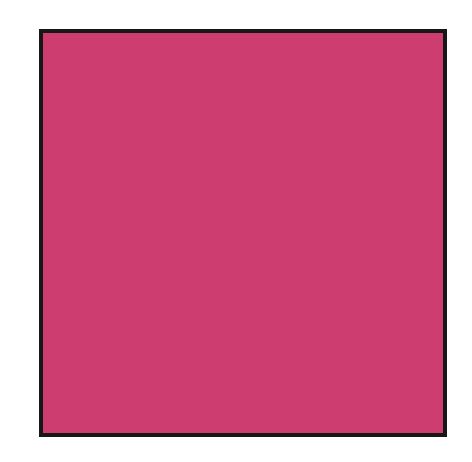
It might not look like much, but trust me, there are six sides!
Creating dice dots in CSS
I will start by explaining how I achieved the dots since this is quite an excellent technique.
I didn’t want to use a lot of extra divs, so each option only consists of one pseudo selector.
And it starts with the #1 side.
.side {
  &:before {
    content: '';
    width: 20%;
    height: 20%;
    background: black;
    border-radius: 50%;
  }
}
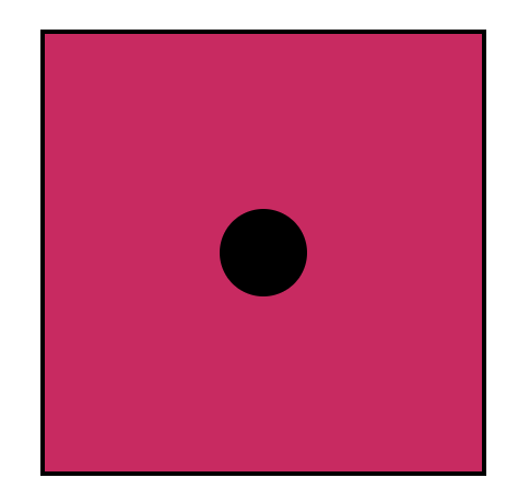
I can hear you think, but what about the others?
And there is a very cool trick for that! We can leverage the box-shadow rule for it.
And if we think about it, there are only seven positions a dot can have. We already have one, so let’s look at the other six.
&:before {
  content: '';
  width: 20%;
  height: 20%;
  background: black;
  border-radius: 50%;
  box-shadow: red -50px -50px 0px 0px, blue -50px 0px 0px 0px,
    yellow -50px 50px 0px 0px, green 50px -50px 0px 0px, orange 50px 0px 0px 0px,
    white 50px 50px 0px 0px;
}
I used random colors in the example above so you can see which position is which dot.
Note: The black dot is our initial dot.
Now let’s go ahead and create all possible dot variants.
For the #2 side, we don’t need the initial dot so that we can turn off the background.
.two {
  &:before {
    background: transparent;
    box-shadow: #000 -50px -50px 0px 0px, #000 50px 50px 0px 0px;
  }
}
For number three we can use a similar approach, but not hide the background:
.three {
  &:before {
    box-shadow: #000 -50px 50px 0px 0px, #000 50px -50px 0px 0px;
  }
}
Then for the fourth one:
.four {
  &:before {
    background: transparent;
    box-shadow: #000 -50px 50px 0px 0px, #000 -50px -50px 0px 0px,
      #000 50px 50px 0px 0px, #000 50px -50px 0px 0px;
  }
}
And on to number five:
.five {
  &:before {
    box-shadow: #000 -50px -50px 0px 0px, #000 -50px 50px 0px 0px,
      #000 50px -50px 0px 0px, #000 50px 50px 0px 0px;
  }
}
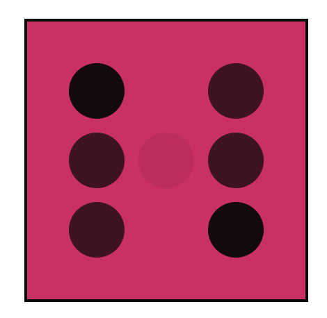
And last but not least, number six, which we used as our template.
.six {
  &:before {
    background: transparent;
    box-shadow: #000 -50px -50px 0px 0px, #000 -50px 0px 0px 0px,
      #000 -50px 50px 0px 0px, #000 50px -50px 0px 0px, #000 50px 0px 0px 0px, #000
        50px 50px 0px 0px;
  }
}
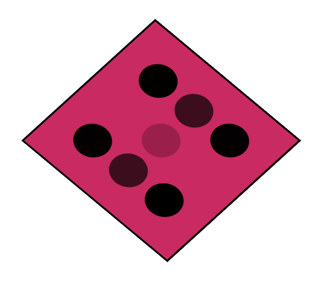
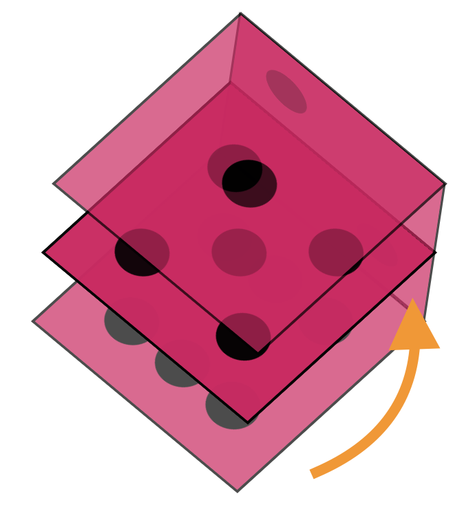
Our result will look weird since our transparent layers sit on each other.
Arranging a dice in 3D CSS
Now that we have all our elements in place let’s start the fun and apply our 3D effect!
We can achieve a 3D perspective in CSS by using transforms. We have three axes to play with: the X, Y, and Z axes.
First, let’s put our cube in perspective.
.dice {
  transform-style: preserve-3d;
  transform: rotateY(185deg) rotateX(150deg) rotateZ(315deg);
}
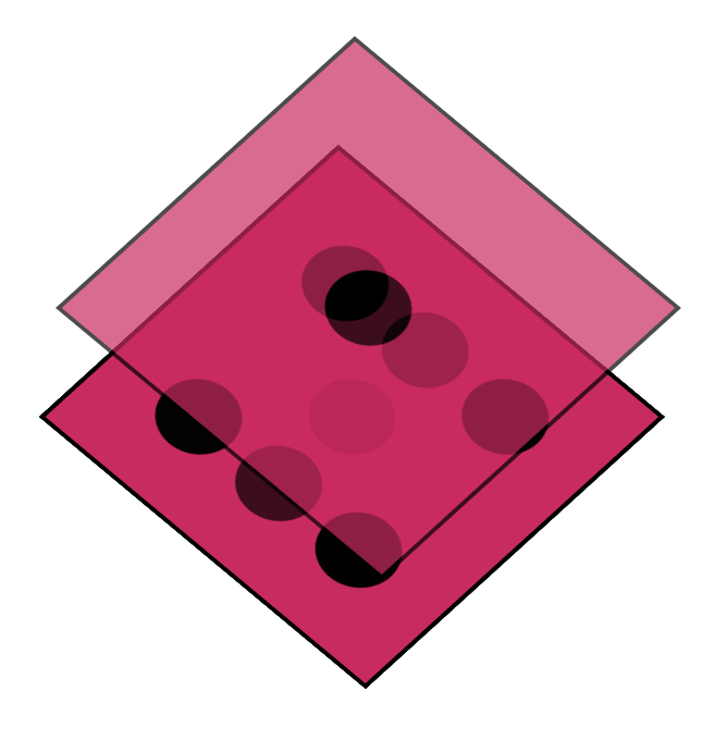
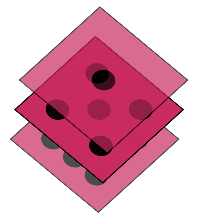
Now, it might look a bit weird if we look at what we got.
This is already 3D, but it doesn’t look like a cube yet. We need to modify each side to do its transformation.
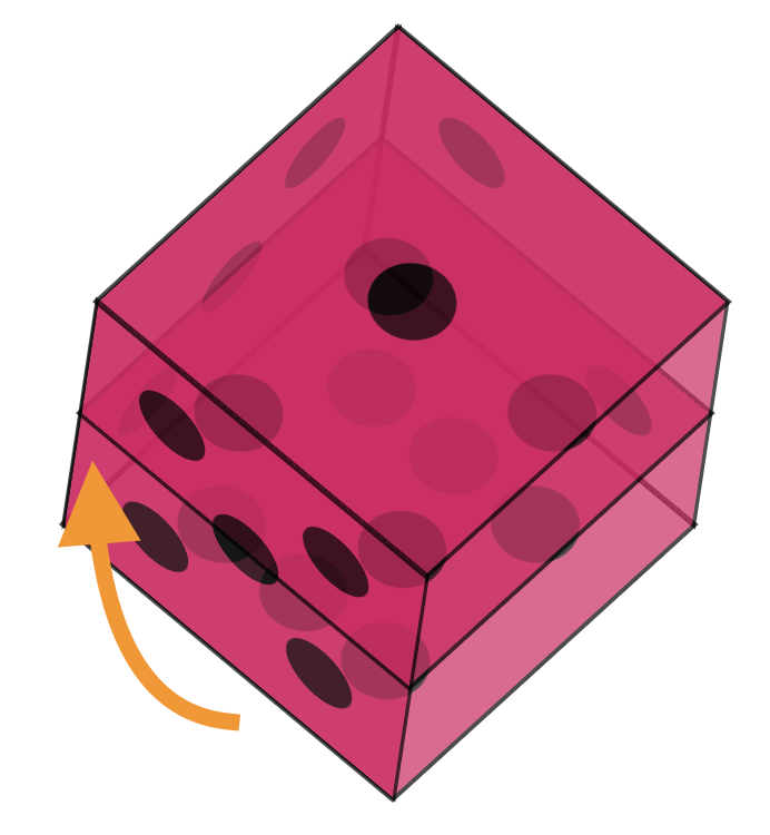
Let’s start with side one.
.one {
  transform: translateZ(100px);
}
This will lift the side, so it sticks out at the top.
You might already be able to see where this is going. Now let’s do the opposite end, which is side number six.
We will offset that to a negative 100px. This means the distance between one and six is now 200px (our cube size).
.six {
  transform: translateZ(-100px);
}
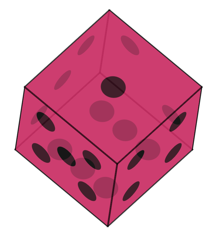
Now let’s do the number two side. This one needs to be connected by transforming a different axis.
.two {
  transform: translateX(-100px) rotateY(-90deg);
}
Now the easiest one to connect is the opposite, side number five.
.five {
  transform: translateX(100px) rotateY(90deg);
}
As you can see, it’s the same transformation, but we offset it by 200 pixels.
Two more sides left. Let’s do number three.
.three {
  transform: translateY(100px) rotateX(90deg);
}
As you can see, it’s the opposite transformation from two to five.
The last one we need is number four, which will be the opposite of number three.
.four {
  transform: translateY(-100px) rotateX(90deg);
}
With this one in place, our dice are complete!
Animating the dice
Now that we have our dice let’s make it a bit more interactive by animating it!
Each of the sides we described can also be animated, I’ll only be turning the dice on one side, but you can have a play around with any of them to achieve a different animation.
@keyframes rotate {
  from {
    transform: rotateY(0) rotateX(45deg) rotateZ(45deg);
  }
  to {
    transform: rotateY(360deg) rotateX(45deg) rotateZ(45deg);
  }
}

.dice {
  animation: rotate 5s linear infinite;
}
You can find the completed example in this CodePen.
See the Pen Untitled by Chris Bongers (@rebelchris) on CodePen.
Thank you for reading, and let’s connect!
Thank you for reading my blog. Feel free to subscribe to my email newsletter and connect on Facebook or Twitter