In part one, we started by styling the sidebar and menu for the lifestyle blog.
I started with custom SCSS classes, which resulted in the following result:
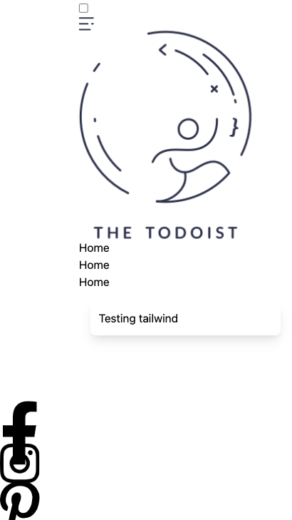
Yesterday we added Tailwind to our Eleventy project, so let’s see how to convert our CSS to Tailwind, so the frontend is styled once again.
Our initial styling looks like this at the moment:
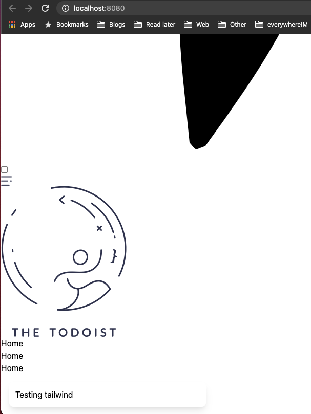
Oh no! This doesn’t look very pleasant. All our hard work is gone, but no worries, we will solve this!
Changing our CSS to Tailwind
Tailwind CSS is a utility-first CSS framework. It uses utility classes to achieve styling.
Luckily for us, we know exactly what we are looking for. We can use the Tailwind Docs to search what the corresponding class is.
Let me document how I go about changing the classes.
Let’s take the <main> element, for instance. This had the following CSS:
main {
  position: relative;
  min-height: 100vh;
  padding-left: (calc(2 * var(--side-width)));
}
Let’s first find the position: relative. Type it into the tailwind search bar.
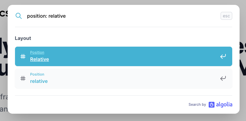
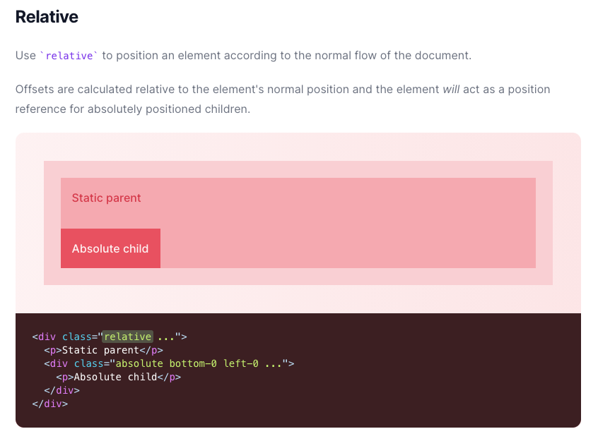
We can then click on the first result and see that we need to use the relative class.
Let’s add the relative class to the markup:
<main class="relative"></main>
One down, two to go.
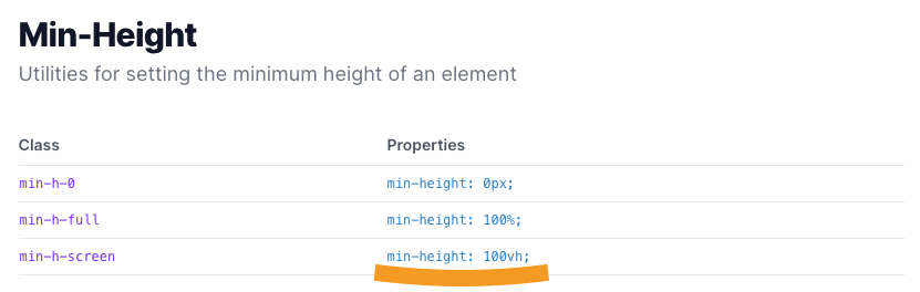
The second one is the min-height. We can use the same process and will find we need the min-h-screen class:
Nice, we are getting somewhere. The last CSS property to convert is difficult since we used a fixed position of 58px for each element.
Tailwind doesn’t work with fixed positions, although we could add them to our tailwind config.
However, we can take the closest tailwind size, 14 (3.5rem). The size converts to: 56px.
Getting back to our padding-left, we saw that we needed double that. So we use pl-28, which converts to padding-left: 7rem.
Our <main> element’s CSS results into these Tailwind classes:
<main class="relative min-h-screen pl-28"></main>
Converting the Styling of the aside element
Our <aside> element had the following CSS:
aside {
  width: var(--side-width);
  background: var(--purple);
  min-height: 100vh;
  position: fixed;
  left: 0;
  display: flex;
  justify-content: center;
  align-items: flex-end;
  z-index: 2;
}
We will get back to the color in a second, but we can achieve all the other classes with tailwind classes.
The CSS looks like this with Tailwind:
<aside
  class="fixed top-0 left-0 z-10 flex items-end justify-center min-h-screen w-14"
></aside>
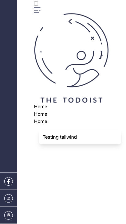
This will result in the following:
Still a bit of a mess. Let’s start styling those social icons before adding the colors.
We don’t need any classes for the <ul>.
The <li> items had the following CSS:
li {
  width: var(--side-width);
  height: var(--side-width);
  display: flex;
  justify-content: center;
  align-items: center;
  border-top: 1px solid var(--white);
}
These styles convert into the following Tailwind classes:
<li
  class="flex items-center justify-center border-t border-white w-14 h-14"
></li>
Then the <a> elements inside had the following CSS:
a {
  width: 1.75rem;
  height: 1.75rem;
  display: flex;
  justify-content: center;
  align-items: center;
  border: 1px solid var(--white);
  border-radius: 50%;
  color: var(--white);
}
We can convert that into these Tailwind classes:
<a
  class="flex items-center justify-center text-white border border-white rounded-full w-7 h-7"
></a>
The last element we need is the SVG:
svg {
  color: inherit;
  width: 0.625em;
}
For the SVG, we can use these Tailwind classes:
<svg class="w-2.5"></svg>
Now, we won’t see much since we need our purple background-color.
Adding custom colors to Tailwind
Unfortionally Tailwind doesn’t come with this exact color, but it does come with the option to add our own colors!
To do this, we must add the custom color to the tailwind.config.js file.
We can extend our custom color in the theme section under colors like so:
module.exports = {
  purge: [],
  darkMode: false, // or 'media' or 'class'
  theme: {
    extend: {
      colors: {
        purple: '#2d334d',
      },
    },
  },
  variants: {
    extend: {},
  },
  plugins: [],
};
In our case, purple only has one option.
Then we can go back to our aside element and add the bg-purple class.
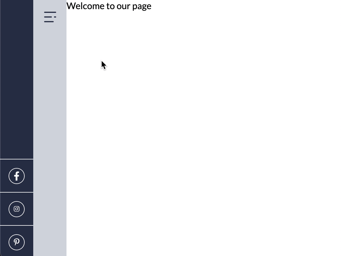
This will now result in the following:
Wow, that is already starting to look like what we had.
Changing the expanding menu CSS to Tailwind CSS
Now let’s see how we can style the menu to expand with Tailwind.
I’m going to be quickly going over the basic classes and spend more time explaining the checked state.
<nav> element CSS styling:
nav {
  width: var(--side-width);
  background: var(--light-blue);
  min-height: 100vh;
  position: fixed;
  left: var(--side-width);
}
CSS Converted to Tailwind classes:
<nav class="fixed top-0 min-h-screen left-14 bg-light-blue w-14"></nav>
Note: we also added our light-blue color which looks like this:
colors: {
  'purple': "#2d334d",
  'light-blue': "#d5d8e0"
},
The menu CSS holds the following styling:
.menu {
  width: 170px;
  height: 100vh;
  background: inherit;
  position: absolute;
  top: 0;
  left: -170px;
  z-index: 1;
  transition: all 0.5s ease;
  overflow: hidden;
}
Which can be turned into Tailwind like this:
<div
  class="absolute top-0 z-0 min-h-screen overflow-hidden transition-all duration-500 ease-in-out menu w-44 -left-44 bg-light-blue"
></div>
The checkbox can just get the hidden class:
<input type="checkbox" id="toggle" class="hidden menu--checkbox" />
As for the label, it looked like this in CSS:
label {
  width: var(--side-width);
  height: var(--side-width);
  display: flex;
  justify-content: center;
  align-items: center;
  position: absolute;
  z-index: 3;
}
Convert to Tailwind, the CSS looks like:
<label
  for="toggle"
  class="absolute z-30 flex items-center justify-center w-14 h-14"
></label>
I don’t think the ~ selector is available in Tailwind. So we would have to write a little bit of custom CSS just for this selector:
main nav .menu--checkbox:checked ~ .menu {
  @apply left-0;
}
This will apply the left-0 class to our menu once the checkbox is checked.
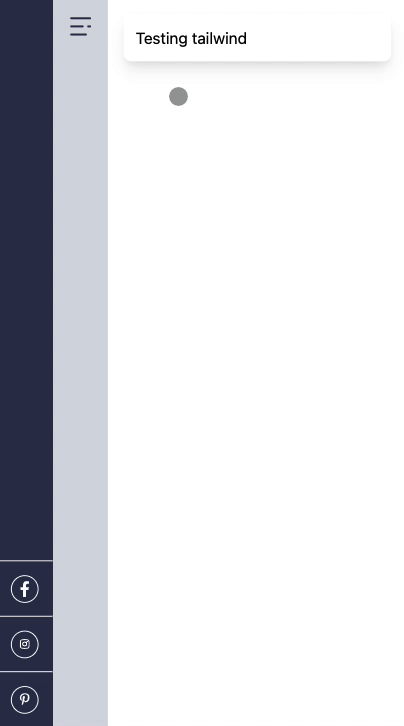
Let’s see if it works:
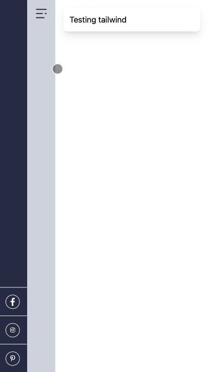
Nice! All we have to do is do the actual menu styling.
The CSS before for the logo:
.menu {
  &--logo {
    margin-top: 6rem;
    display: flex;
    justify-content: center;
    img {
      width: 85px;
    }
  }
}
Same CSS converted to Tailwind:
<a href="/" class="flex justify-center mt-24">
  <img
    class="w-20"
    src="https://thetodoist.com/static/media/logo.778cffe4.png"
  />
</a>
Then the list had the following CSS:
ul {
  margin-top: 2.5rem;
  li {
    padding: 0 25px 25px;
    color: var(--purple);
    a {
      color: inherit;
      text-decoration: none;
    }
  }
}
That we can convert into Tailwind as such:
<ul class="mt-10">
  <li class="px-6 pb-6">
    <a class="no-underline text-purple" href="#">Home</a>
  </li>
</ul>
We should have the result we had before, but all in Tailwind classes!
You can find these changes on GitHub.
Thank you for reading, and let’s connect!
Thank you for reading my blog. Feel free to subscribe to my email newsletter and connect on Facebook or Twitter