Our recipe website built in Astro is finally taking shape. We have our recipe collection set up, created some filter pages, and today we’ll look at styling and ordering the components.
What we’ll build today:
- Add Tailwind to our project
- Navigation component
- Header component
- Recipe component
- Pagination component
Adding Tailwind to an Astro project
This will be the short version. If you’re interested, follow my full article on integrating Tailwind in Astro.
To recap what we need to do:
- Install Tailwind
npm install -D tailwindcss
- Create a
tailwind.config.jsfile
module.exports = {
  mode: 'jit',
  purge: ['./public/**/*.html', './src/**/*.{astro,js,jsx,ts,tsx,vue}'],
};
- Modify
astro.config.jsfile
devOptions: {
  tailwindConfig: './tailwind.config.js';
}
- Add the Tailwind styles to the
global.cssfile
@tailwind base;
@tailwind components;
@tailwind utilities;
And this allows us to use the latest Tailwind version on our Astro website.
Creating a navigation component in Astro
We didn’t have an excellent way to navigate the website, so let’s go ahead and create a Nav.astro component in our components directory.
We’ll make use of the Frontmatter (---) part of creating an array that we can use to create the menu.
---
const menu = [
  { url: '/', text: 'Home' },
  { url: '/recipes', text: 'Find recipes'},
  { url: '/recipes/all', text: 'All recipes'}
];
---
We do this so we can loop over each menu item and only have one line of class code, which makes it easier to maintain later on.
Next, create the HTML part of our header.
<header class="border-b-2 border-gray-100">
  <nav class="flex items-center justify-between px-4 py-8 mx-auto max-w-7xl">
    <h1 class="text-4xl text-pink-400 uppercase tracking-narrow">
      <a href="/">Recipe blog</a>
    </h1>
    <ul class="flex">
      {menu.map(item => (
      <li>
        <a
          class="block mx-4 font-sans font-bold tracking-wider text-black no-underline uppercase "
          href={item.url}
          >{item.text}</a
        >
      </li>
      ))}
    </ul>
  </nav>
</header>
This code will serve as our menu. This menu will show a title on the left and the menu button on the right.
We use CSS Flex to align items correctly. We want them to space between the logo part and the navigation and use justify-between.
To use this component, we can use the following syntax.
---
import Nav from '../components/Nav.astro';
---
<!-- HTML Content -->
<Nav />

Header component in Astro
The next component we want to create is a header component. The header is a recurring component with two properties: a title and a text.
We create this component so it’s easier to share between pages.
Create a Header.astro file inside your components directory.
---
export interface Props {
  title: string;
  text: string;
}
const { title, text } = Astro.props;
---
As you can see, we define this component’s properties.
Now let’s create the HTML part for the header.
<section class="p-8 text-center bg-pink-400">
  <h1 class="mb-4 text-5xl text-white ">{title}</h1>
  <p class="text-xl text-pink-100">{text}</p>
</section>
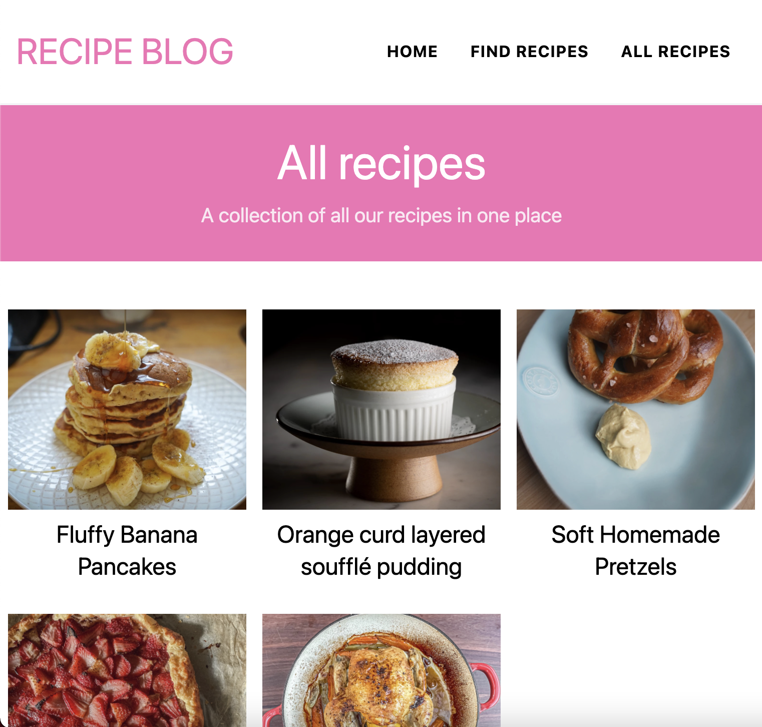
Now we can use this in our pages like so:
---
import Header from '../components/Header.astro';
---
<!-- HTML Content -->
<Header title="Our latest recipes" text="These are latest six recipes added to our blog." />
And that will return our header like so:

Creating a reusable recipe component
As you may have seen before we loop our recipes on multiple pages. This caused duplicate code, so let’s clean this up by moving the recipes into their component.
Create a Recipe.astro file in the components directory.
As we saw in the navigation component, we can define the properties for the data set.
---
export interface Props {
  recipe: {
      url: string;
      title: string;
      image: string;
  };
}
const { recipe } = Astro.props;
---
We can then use this data in our HTML below like this:
<article class="px-2 py-4 text-center">
  <a href="{recipe.url}" class="flex flex-col hover:opacity-60">
    <img
      class="object-cover h-[200px]"
      src="{recipe.image}"
      alt="{recipe.title}"
    />
    <h3 class="pt-2 text-2xl leading-tighter">{recipe.title}</h3>
  </a>
</article>
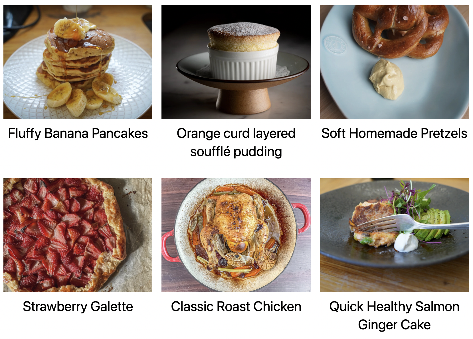
To use this recipe, we can modify our recipes loop, for instance, on the homepage:
---
import Recipe from '../components/Recipe.astro';
---
<!-- HTML Content -->
<section class="grid grid-cols-3 py-8">
  {recipes.map(recipe => (<Recipe recipe={recipe} />))}
</section>
Way cleaner, right?
Astro pagination component
Another recurring element is the pagination component. We used this on three different pages now, so let’s also make a component.
We can create the Pagination.astro component in the components directory.
The pagination has quite the data set, but we only use the previous and next elements for our simple pagination.
---
export interface Props {
  recipe: {
      url: {
          prev: number,
          next: number
      };
  };
}
const { data } = Astro.props;
---
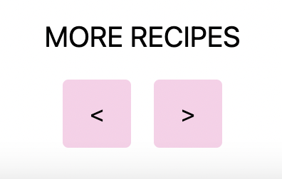
Then let’s render our HTML. I’m using JSX conditional rendering for this particular element to see if we have more than just one page of items.
{
data.last !== 1 && (
<footer class='py-8 text-center'>
<h2 class='mb-4 text-xl uppercase text-bold'>More recipes</h2>
<ul class='flex justify-center'>
<li>
<a
class='flex items-center justify-center w-12 h-12 mx-2 bg-pink-200 rounded'
href={data.url.prev || '#'}
>
<
</a>
</li>
<li>
<a
class='flex items-center justify-center w-12 h-12 mx-2 bg-pink-200 rounded'
href={data.url.next || '#'}
>
>
</a>
</li>
</ul>
</footer>
);
}
The footer will only render if there is more than one page. If so, it will show the previous and next buttons.
To use this component, we can use the following syntax:
---
import Pagination from '../../components/Pagination.astro';
---
<!-- HTML Content -->
<Pagination data={page} />
And that gives us pagination like this:
Conclusion
I’ve replaced all the code examples we have built so far into these components and added some small styling elements to wrap this article up.
I’m not a superb designer, but this should show you how to style your website easily!
I’ve also uploaded the complete code to GitHub.
And you can view the result on the actual Recipe demo website.
Thank you for reading, and let’s connect!
Thank you for reading my blog. Feel free to subscribe to my email newsletter and connect on Facebook or Twitter