Now that we have a brief first introduction to accessibility and what it entails, let’s take a moment to see what kind of users our website might get.
By understanding the type of interactions, someone can do on our website, we can optimize it better for those interactions.
Important notice
While going through these examples, it’s important to note this is not just people with permanent disabilities.
We must also take people into account with temporary disabilities.
Some common examples:
- Your laptop broke, and now you have to use an old phone to navigate websites
- You broke your arm and had to navigate websites differently
- People in an environment where they cannot play audio
- You have a limited network, where images and video might not load
- People are aging, and they might respond slower or struggle to read small text
And so on.
Within these temporary disabilities, we also see groups of people with situational disabilities. These include users affected by their situations, like someone with a heavy accent or a new parent who has a baby in one hand. Or someone who has a lot of stress at work and gets easily annoyed by things.
You’ll open yourself to how big the world of being accessible actually is by realizing this!
Now let’s take a look at what can be permanent disabilities that users might have browsing our websites.
The main disability categories
Did you know that one billion people in the world have some form of disability?
This means 15% of the whole world! When putting it like that, surely you don’t want to exclude 15% of the world from potentially using your website, right?
The disability spectrum has four primary categories, which are:
- Visual: Blindness, low vision, or colorblindness
- Auditory: Deafness and hard-of-hearing
- Motor: Inability to use a mouse, slow response time, limited fine motor control
- Cognitive: Learning disability, easily distracted, inability to remember or focus on a large amount of information
As you can imagine, each of these categories has its own challenges, some more than others, but we should always consider and focus on each individual one when auditing our websites.
We’ll now go into more details for each of the main categories to see what type of users we might find and how they interact.
Visual disabilities on the web
Visual disabilities it’s one of the more straightforward examples of what we should look out for.
For instance, someone who is blind might use our website via a screen-reader. Which is a software/a device that reads the website element by element. This is quite a big part of using a website, and we’ll dive into more detail on this in a separate article.
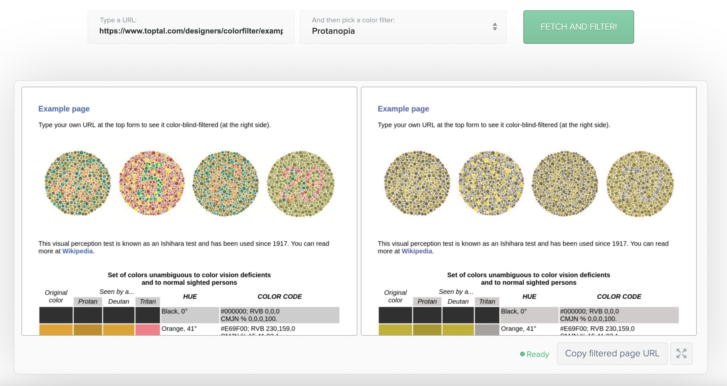
Second, people might have colorblindness which occurs in multiple variants.
For some people, our colors might be tough to see. Toptal made this color-blind filter tool to emulate different colorblindness.
Another visual disability might be when you have trouble reading small things. We can expect some people to navigate our website zoomed in. A typical zoom is even 400%.
Try and view your website by zooming in to 400%. Is it still navigable? Does it scale correctly?
These are not all the options for visually impaired users, but it gives a good overview of the types of hurdles people might find on the web.
Auditory disabilities on the web
Auditory disabilities have a group of people under it that have problems hearing or can’t hear at all.
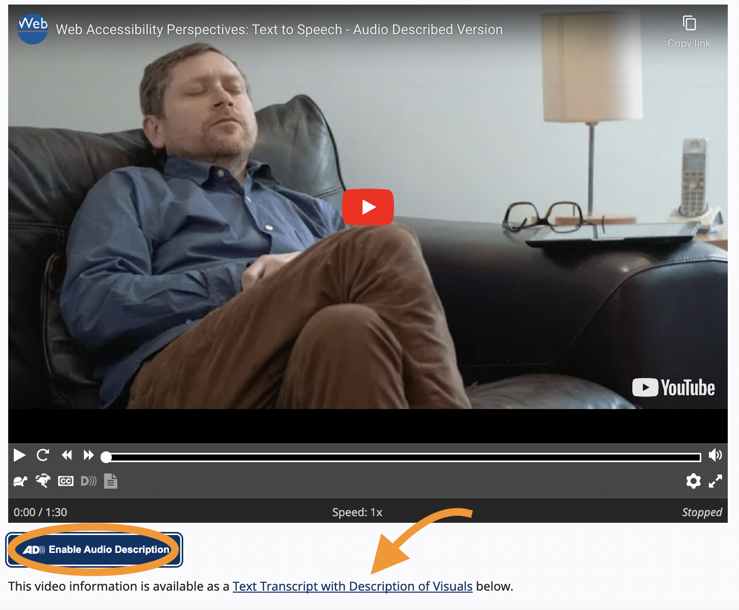
When our website offers sound, video with sound, or anything related to that, you can imagine that we have to be aware of this.
This often means enabling captions for sound elements or providing alternative ways of using the content for websites.
An example can be an audio section that users can listen to, but as a fallback, we can have a written summary below it.
Next, we should opt to make video captions clear and correct.
Motor disabilities on the web
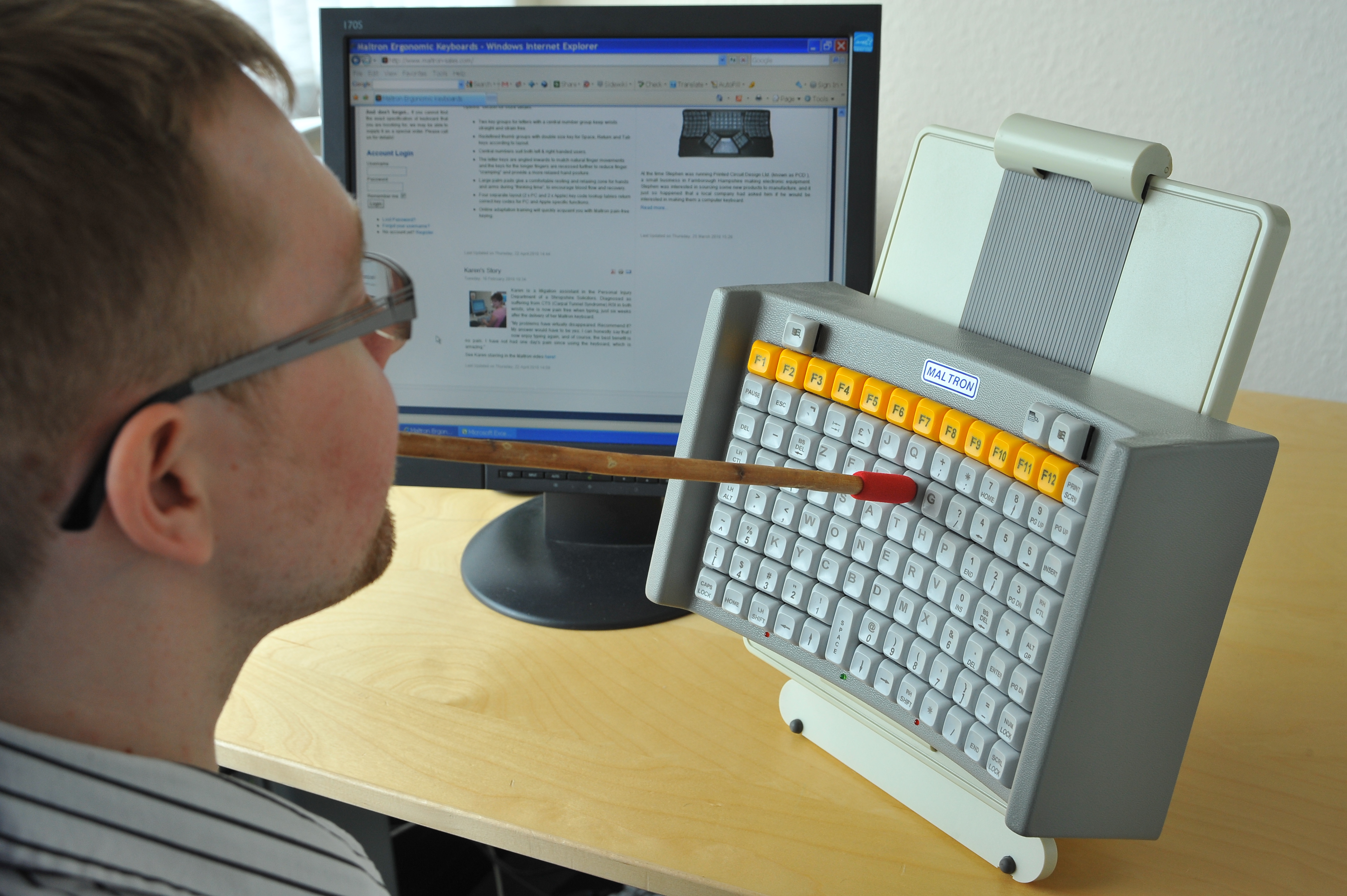
People with motor disabilities navigate the web using alternative devices to control the input.
There are many different ways people might navigate. Some might use a keyboard only and no mouse. Another example could be eye-tracking software to navigate a website. And in extreme cases, it can be a mouse-wand to use a touch-screen.
To aid this group of people, we should always opt to make our website easy to navigate. This includes enabling correct keyboard navigation and making your clickable elements not too small and close to each other.
Another thing we often forget in this category is the time to respond. Imagine you are navigating a website via keyboard only, or even via a mouse-wand or different input device.
It might take you longer to get to a specific area, so when we give people interaction options, we should be aware not to simply auto-remove them after a couple of seconds.
Cognitive disabilities on the web
This is almost the most challenging element to describe as it serves a wide variety of disabilities.
It comes down to many different subcategories, so let me give some examples of disabilities that fall under this category.
- People with learning disabilities might have issues understanding your website structure
- You use complex sentences on your website
- Serving long-form content to people with focus issues
- Flashing/moving/blinking content, background audio that cannot be turned off
- Visual designs that cannot be adapted by custom settings
As you can see, this is quite a mixed group of elements we can look out for.
To aid this group of disabilities, we should opt to make our websites clear in both layout and design. Second, we should always allow people to understand the flow and content of our website.
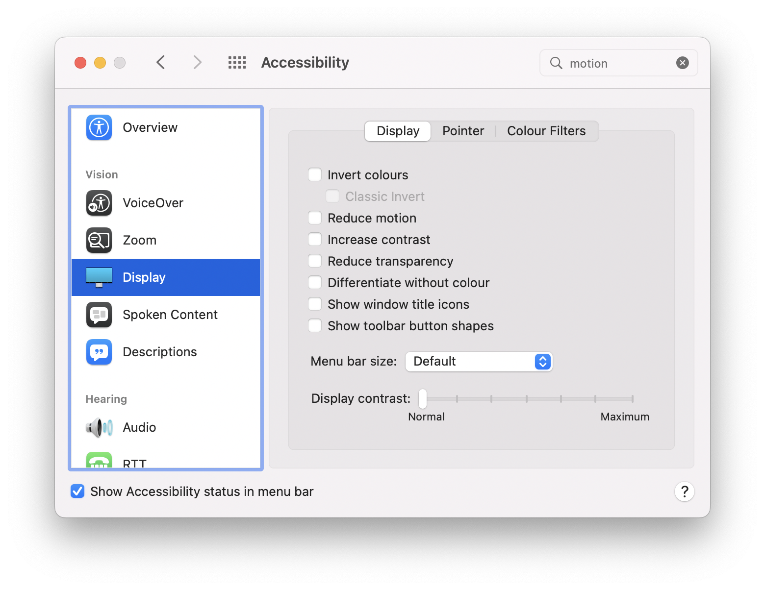
Lastly, we should respect the browser settings for each user. Some people might turn off animations, change their color contrast or disable video/audio.
Conclusion
There are a lot of different disabilities people might have while navigating our websites.
By understanding these different types of users, we can better identify what we need to change to make our website accessible for everyone.
While going through all the specific elements we can improve our website on, I’ll refer to which groups this might entail.
Thank you for reading, and let’s connect!
Thank you for reading my blog. Feel free to subscribe to my email newsletter and connect on Facebook or Twitter

