While auditing my website, I noticed a weird double tab behavior on my cards.
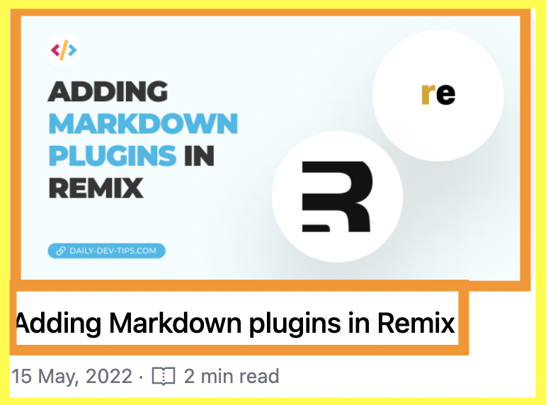
This is a common accessibility issue in card designs. To illustrate, let’s take one of my cards.

In the image, we can see the whole card. Inside the card, it starts with an image with a link. And below that is a title, which also contains a link. Under that, we have some generic post information that doesn’t have to be a link.
The accessibility issue
The issue arises with the two links. First of all, they both navigate to the same thing, so it’s a bit redundant to repeat itself.
Secondly, imagine the image having some other descriptive alt text that doesn’t necessarily explain the link?
The screen reader will read out that image alt-text, and the user might expect to go somewhere else.
So, we need to address this issue. And frankly, there are multiple ways of doing this.
Using tab index
In this way, you keep the two links, but you can set the tab index of the image to -1.
To make it even more robust, we can add an aria-hidden to this link to ensure it’s ignored.
<a href="/post" tabindex="-1" aria-hidden="true">
  <img src="img.jpg" alt="An image of Remix.run blog article" />
</a>
Because of this tab, index screen readers will navigate over it.
This is by far the easiest way, and screen readers will still be able to read your image in this case.
Alternatively, you could opt to make the whole link invisible by using CSS to hide it. We could then position it absolutely over the image.
Wrapping the card
Another option is to wrap the whole card and use a descriptive aria-label to tell the user what’s happening.
In my case, I only want the image and title to be linkable, and you might be wondering, but surely you can already do that?
And on desktop, I could, but if we look at my mobile view, you can see the text is actually in between the two. (This is also why the tab first goes on the title and only then on the image).

To wrap the whole card, we can cover it natively by using the <a href> around the content or adding an absolute positions link that sits on top.
I prefer the semantic way so it could look like this:
<a href="/post">
  <h3>Title of post</h3>
  <img src="img.jpg" alt="An image of Remix.run blog article" />
</a>
However, screen readers will now read “Link: Title of post An image of Remix.run blog article”.
And perhaps even more if we include more copies in the card. This is not ideal as we want to control what it reads.
We can fix this by adding an aria label to the link.
<a href="/post" aria-label="Title of post">
  <h3>Title of post</h3>
  <img src="img.jpg" alt="An image of Remix.run blog article" />
</a>
The screen readers will only read: “Link: Title of post”.
Conclusion
The duplicate links might give you more issues also from an SEO perspective, so you can always try and opt for the single link approach.
However, if you can’t because of multiple different links, you can opt to hide certain links from screen readers.
Pick your battles wisely, and don’t forget semantic HTML always wins!
Thank you for reading, and let’s connect!
Thank you for reading my blog. Feel free to subscribe to my email newsletter and connect on Facebook or Twitter

