Usually, I’m not one to jump on the hype train of new tooling and frameworks. However, Astro sparked my interest.
In its most basic form, it’s a framework to build websites. However, it turns out to be a bit more than that!
The team behind Astro took inspiration from the biggest open source projects around and used their principles in Astro.
Why Astro is so great
- Full HTML output, no JavaScript unless you need it, and even that comes with options!
- SEO focused, sitemap integrated, RSS feed is done, pagination and collections
- BYOF approach, choose whatever framework you are comfy with React, Svelte, Vue, or none of those 🤷♂️.
- Components that will turn into static HTML
This makes it like the super combination between an interactive component library like React and a static site generator like Eleventy.
Astro also comes with its files called .astro files. They are very much like .jsx files!
There are some minor differences on which Astro provides an excellent comparison table.
But of course, the main reason why Astro is so great:
Performance
No crazy reason behind it is so good on the speed index. It’s a natural cause of having a fully static HTML output. And I love it.
Of course, Eleventy is also pure HTML output, but not having JavaScript components we can easily reuse.
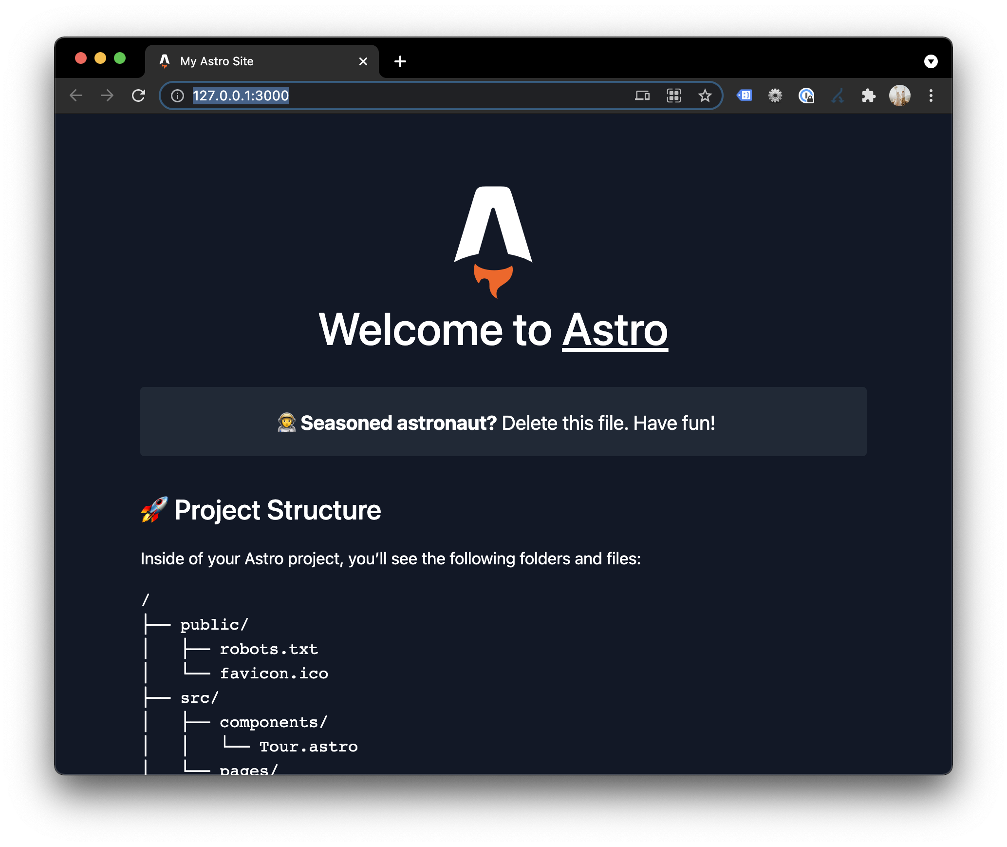
Getting started with Astro
The best way to get started with any framework or tool is to give it a try.
So let’s go ahead and give Astro a run. The installation is as easy as it gets.
# Create folder and navigate to it
mkdir astro-website
cd astro-website

# Init astro project
npm init astro
# Install all dependencies
npm install
# Start Astro!
npm start
Note: The Astro init gives you super cool options for which template and framework to use!
Data fetching in Astro
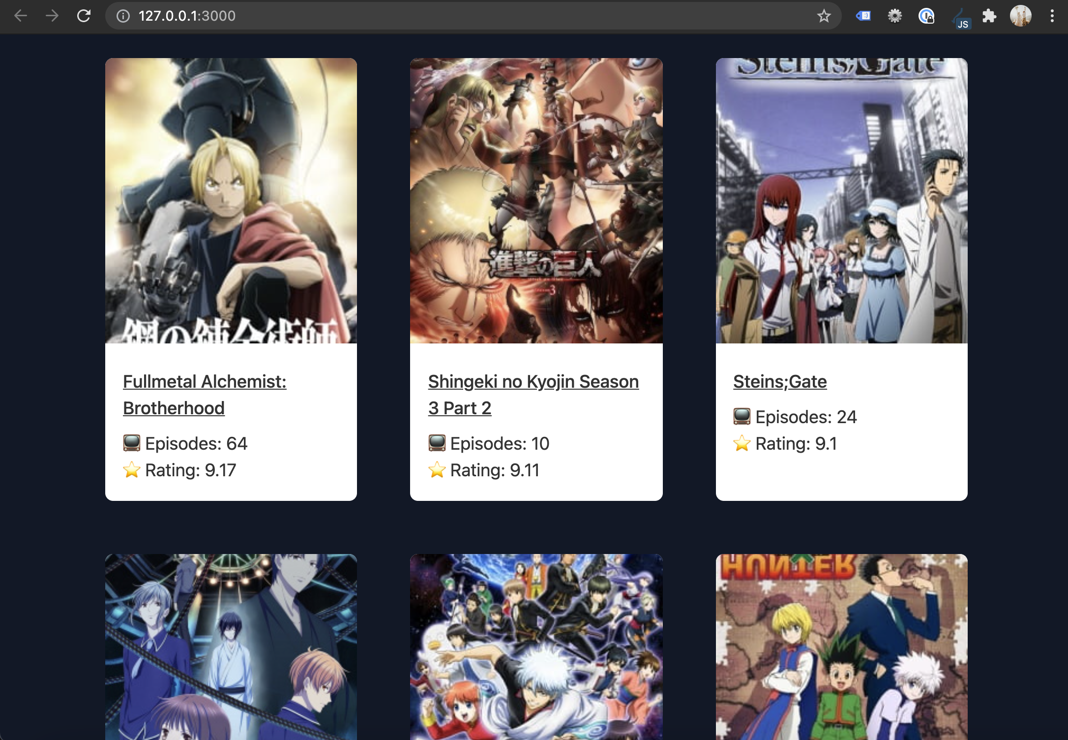
Let’s look at building a super simple website that will fetch some data from an external API and render some card components.
We’ll use the Anime API for today’s article, and I choose the top endpoint.
Let’s define that on the top of our index.astro file.
---
import Card from '../components/Card.astro'
const remoteData = await fetch('https://api.jikan.moe/v3/top/anime/1').then(response => response.json());
---
Then we want to create a card with the following data from each result:
- Title
- Image
- Episodes
- Score
- Href (To link)
Let’s go ahead and map all our data objects to cards.
<main class="grid">
  {remoteData.top.map((item) =>
  <Card
    title="{item.title}"
    score="{item.score}"
    episodes="{item.episodes}"
    href="{item.url}"
    image="{item.image_url}"
  />)}
</main>
You can see we added the grid class on the main element, and a cool thing we can do is add a style element. I’ve defined the language as SCSS so it can compile correctly.
<style lang="scss">
  .grid {
    margin: 4rem;
    display: grid;
    grid-template-columns: repeat(3, 1fr);
    @media (max-width: 650px) {
      grid-template-columns: repeat(1, 1fr);
      margin: 2rem;
    }
    gap: 3rem;
  }
</style>
Now let’s see how this would look at how this Card component looks.
Create a new file called Card.astro in the components library.
---
export interface Props {
  title: string;
  image: string;
  episodes: number;
  score: float;
  href: string
}

const { title, image, episodes, score, href  } = Astro.props;
---
<article>
    <img src={image} alt={title} />
    <div class="content">
        <a href={href}><h2>{title}</h2></a>
        <p>📺 Episodes: {episodes}</p>
        <p>⭐️ Rating: {score}</p>
    </div>
</article>

<style>
    article {
        line-height: 1.5;
        background: #fff;
        border-radius: 8px;
        color: #333;
        overflow: hidden;
    }
    img {
        max-height: 290px;
        width: 100%;
        -o-object-fit: cover;
        object-fit: cover;
    }
    .content {
        padding: 1rem;
    }
    h2 {
        font-size: 1rem;
        margin-bottom: 0.5rem;
    }
    ul {
        list-style: none;
    }
</style>
I find this approach super satisfying. We can simply pass data to our component, so it’s reusable.
And the component itself is nicely built of a definition part between the three lines --- that includes our actual code.
Then we have a section with HTML where we bind the variables.
And at the bottom, we have a style element to add some basic card styling.
This will result in the following.
You can also view it here:
(Or on GitHub)
Thank you for reading, and let’s connect!
Thank you for reading my blog. Feel free to subscribe to my email newsletter and connect on Facebook or Twitter