I felt like doing another CSS Art again, so today, we’ll be recreating Kirby using nothing but CSS ✨.
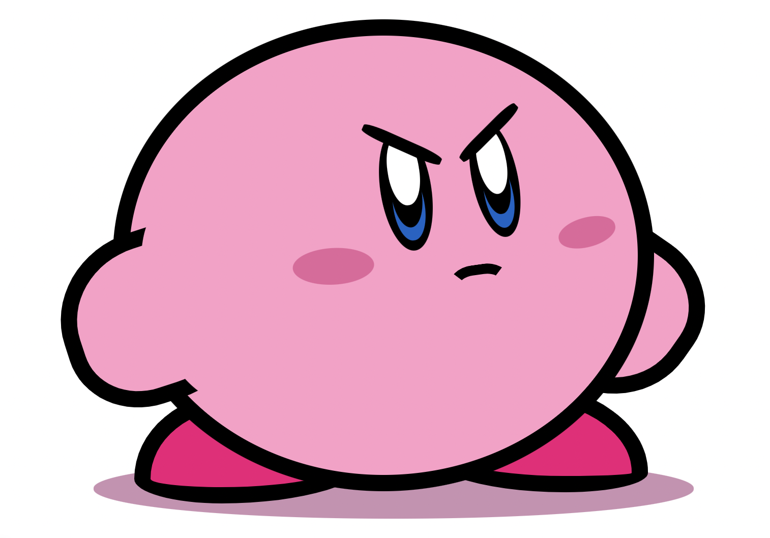
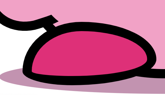
The result will be the amazing Kirby you see below.
Analysing Kirby
To start with our CSS art, we’ll first evaluate what kind of shapes we need.
I’ve created this quick image to show the shapes we’ll be using:
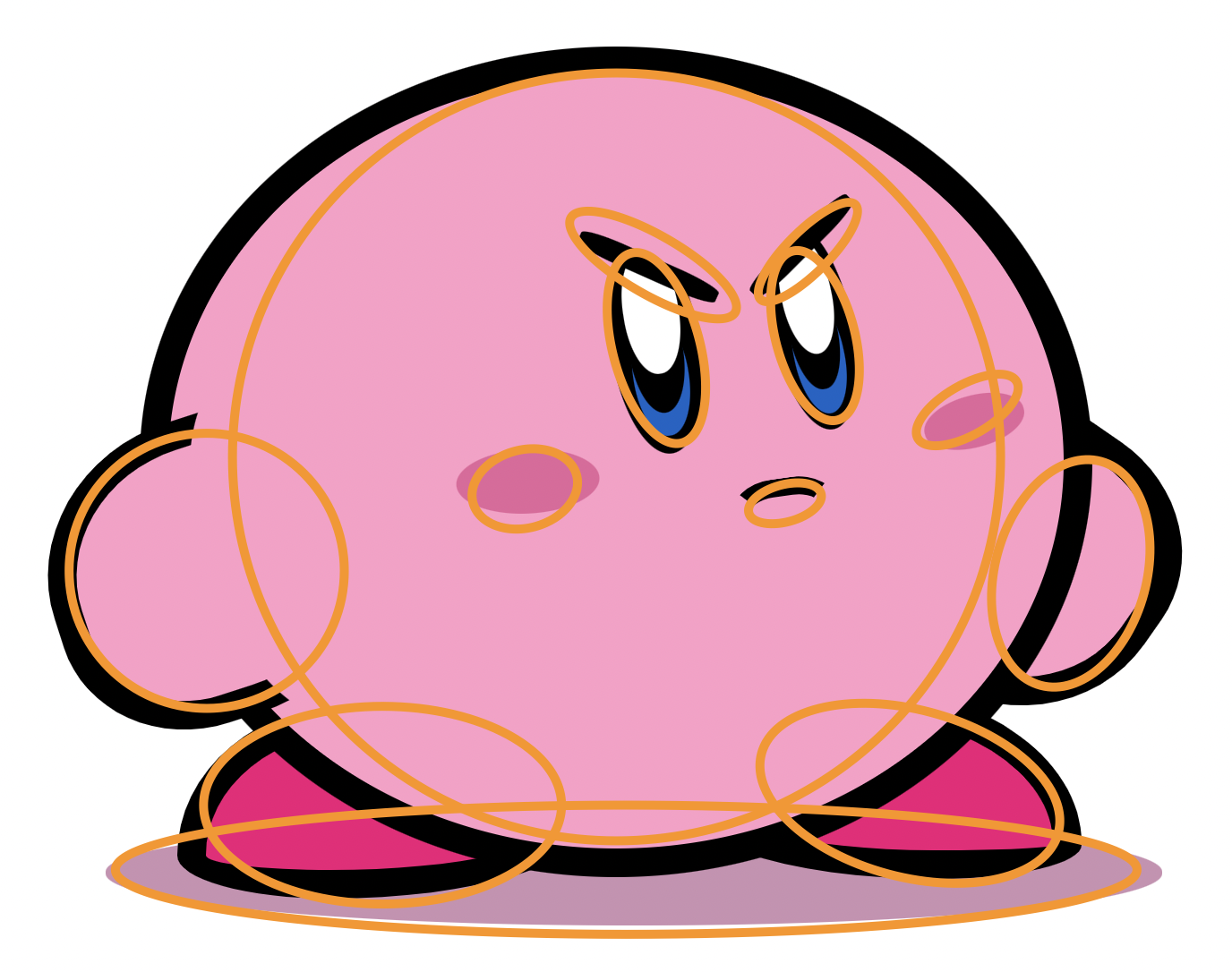
As you can see, almost all shapes are some round shapes, which we’ll overlap and sometimes hide under another layer.
Let’s start by creating the HTML elements we’ll need:
<div class="kirby">
  <div class="arm arm-left"></div>
  <div class="arm arm-right"></div>
  <div class="foot foot-left"></div>
  <div class="foot foot-right"></div>
  <div class="mouth"></div>
  <div class="eye eye-left">
    <div class="inner"></div>
  </div>
  <div class="eye eye-right">
    <div class="inner"></div>
  </div>
</div>
As you can see, the Kirby has its primary shape: the body, arms and feet, and the mouth and eyes.
Now we can move on and give this some styling!
Styling Kirby with CSS
Before starting with the styling, let’s define the colors we need to color in our Kirby.
:root {
  --pink: #ff9ec8;
  --deep-pink: #f20079;
  --shadow: #cb91b2;
  --cheek: #e5649c;
}
Then we can move to the body part of our Kirby. It’s a big round blob.
.kirby {
  width: 500px;
  height: 432px;
  background: var(--pink);
  position: absolute;
  border-radius: 50%;
  border: 1rem solid black;
}
Then with the pseudo :before selector, we give Kirby its shadow shape.
.kirby {
&:before {
content: '';
width: 118%;
height: 13.8%;
background: var(--shadow);
position: absolute;
bottom: -10%;
border-radius: 50%;
z-index: -2;
left: -7%;
}
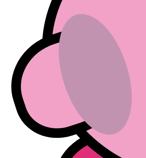
}These pseudo-elements are great for creating shapes like the shadow, which are small details in the picture.
Then let’s move on to the arms, we created two divs for them, but they have their custom style.
.arm {
  &-left {
    width: 31%;
    height: 32%;
    background: var(--pink);
    position: relative;
    top: 44%;
    border-radius: 50% 40%;
    transform: rotate(342deg);
    border: 1rem solid black;
    left: -13.5%;
    &:before {
      content: '';
      width: 70%;
      height: 150%;
      border-radius: 50%;
      background: var(--pink);
      position: absolute;
      left: 47%;
      top: -25%;
    }
  }
}
This will create a basic round shape, and we’ll use the before element to offset it to the background.
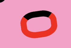
To show you how that works, let’s see the element without the overlapping before first:
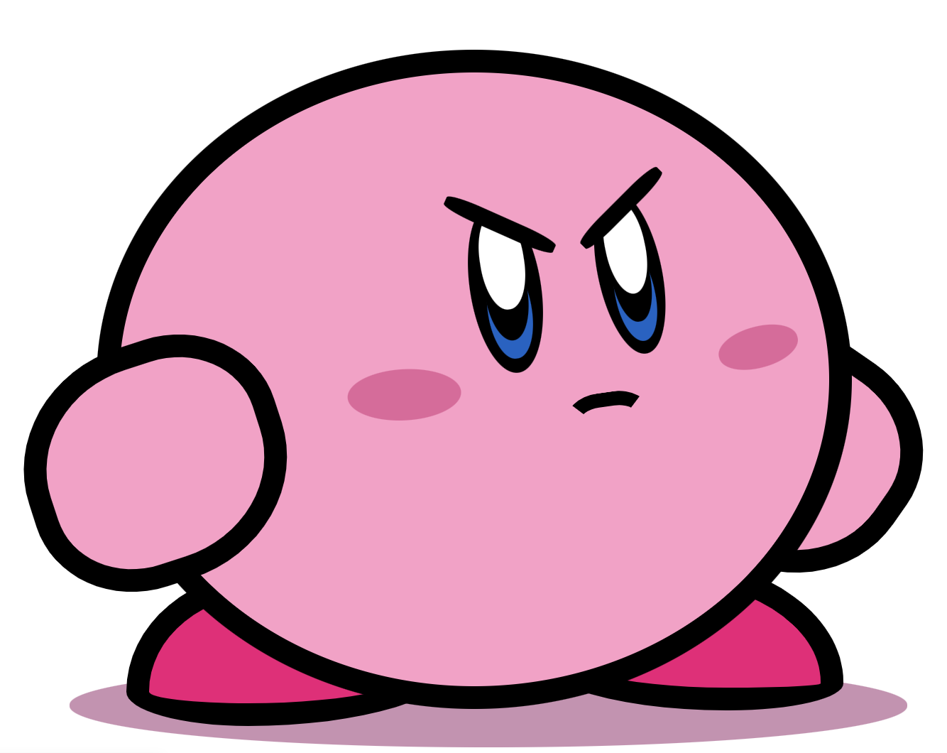
And for the example, I’ve made the overlap a different color so you can see what happens.
The trick with the arm is to make the overlapping element the same color as the body, so it disappears into the background.
Then we have the right arm, which is a bit easier as it goes behind the body. In our case, we’ll use z-index to offset it.
.arm {
  &-right {
    width: 31%;
    height: 32%;
    background: var(--pink);
    position: relative;
    top: 2%;
    border-radius: 50% 40%;
    transform: rotate(215deg);
    border: 1rem solid black;
    right: -75%;
    z-index: -1;
  }
}
The feet are similar, but we’ll use a double border-radius to offset the shape more.
.foot {
  &-left {
    position: absolute;
    width: 40%;
    height: 18%;
    background: var(--deep-pink);
    border-radius: 44% 56% 63% 37% / 78% 59% 41% 22%;
    left: 1%;
    bottom: -6.5%;
    border: 1rem solid black;
    z-index: -1;
  }
  &-right {
    position: absolute;
    width: 40%;
    height: 18%;
    background: var(--deep-pink);
    border-radius: 42% 58% 35% 65%/54% 82% 18% 46%;
    right: -2%;
    bottom: -4%;
    border: 1rem solid black;
    z-index: -1;
  }
}
The foot shape in total will look like this. However, it’s placed more to the back by the use of z-index again.
The next thing we have is the mouth, which is tricky to get. We’ll create a square with rounded corners, but only color the top color.
.mouth {
  position: absolute;
  top: 52%;
  left: 63%;
  width: 2.5em;
  height: 1.5em;
  transform: translateX(-50%);
  color: #000;
  border: 0.625rem solid transparent;
  border-top-color: currentColor;
  border-radius: 41%;
  transform: rotate(352deg);
}
I’ve made the rest of the border red in the image below to see what’s happening.
Then the mouth part also has a before and after for the cheek shading. This was easier because it’s kind of offset from the mouth.
.mouth {
  &:before {
    content: '';
    position: absolute;
    width: 200%;
    height: 150%;
    background: var(--cheek);
    border-radius: 50%;
    left: -400%;
    transform: rotate(5deg);
    top: -190%;
  }
  &:after {
    content: '';
    position: absolute;
    width: 143%;
    height: 120%;
    background: var(--cheek);
    border-radius: 50%;
    right: -300%;
    transform: rotate(353deg);
    top: -170%;
  }
}
Then for the eyes, we use another two rounded elements. We use the before and after to create the eyebrow and hide whatever is left under the eyebrow.
.eye {
  position: absolute;
  background: black;
  &-left {
    width: 10%;
    height: 28%;
    border-radius: 50%;
    top: 21%;
    left: 49.5%;
    transform: rotate(351deg);
    &:after {
      transform: rotate(33deg);
      content: '';
      width: 190%;
      height: 1rem;
      background: var(--pink);
      position: absolute;
      top: -4%;
      left: -38%;
      z-index: 1;
    }
    &:before {
      content: '';
      width: 168%;
      height: 0.75rem;
      background: black;
      position: absolute;
      border-radius: 30%;
      z-index: 9;
      transform: rotate(33deg);
      top: 0.625rem;
      left: -28%;
    }
  }
  &-right {
    width: 9%;
    height: 27%;
    border-radius: 50%;
    top: 19%;
    left: 67.5%;
    transform: rotate(348deg);
    &:after {
      transform: rotate(327deg);
      content: '';
      width: 190%;
      height: 1rem;
      background: var(--pink);
      position: absolute;
      top: -4%;
      left: -37%;
    }
    &:before {
      content: '';
      width: 169%;
      height: 0.75rem;
      background: black;
      position: absolute;
      border-radius: 30%;
      z-index: 9;
      transform: rotate(327deg);
      top: 6%;
      left: -26%;
    }
  }
}
Then, you might have spotted three things going on in the inner part.
- The white pupil
- The black pupil in the middle
- The blue part at the bottom
To recreate this, we’ll place the black part first and use the before and after selectors for the white and blue parts.
.eye {
  .inner {
    width: 60%;
    height: 56%;
    background: #000;
    border-radius: 50%;
    position: absolute;
    top: 25%;
    left: 19%;
    &:before {
      content: '';
      position: absolute;
      width: 105%;
      height: 100%;
      background: #0164c7;
      border-radius: 50%;
      bottom: -20%;
      z-index: -1;
    }
    &:after {
      content: '';
      position: absolute;
      width: 105%;
      height: 102%;
      background: white;
      border-radius: 50%;
      top: -34%;
      z-index: 0;
    }
  }
}
And that’s it. We now have our excellent CSS-powered Kirby.
I hope you enjoyed this article and found some valuable tips for your artwork.
You can also view the complete code example on the following CodePen.
See the Pen by Chris Bongers (@rebelchris) on CodePen.
Thank you for reading, and let’s connect!
Thank you for reading my blog. Feel free to subscribe to my email newsletter and connect on Facebook or Twitter