I’m sure you’re all aware of Pac-Man, the famous yellow ball that eats dots and gets chased by ghosts.
I wanted to try and make an excellent little HTML divider that represents the feeling of this fantastic game.
The end result will look like this:
See the Pen Creating a Pac-Man themed divider by Chris Bongers (@rebelchris) on CodePen.
Setting up the divider structure
Let’s get started by setting up our basic structure.
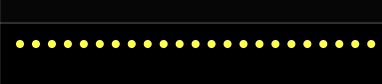
A divider in HTML is often represented by a <hr /> element.
An hr is a thematic break (Horizontal Rule) and can be used to divide content.
So for our HTML section, all we need is the following code.
<hr />Now let’s add some styling to it. I’ve decided to make my page black, so the effect shows better.
html {
  background: #000;
}
And for the hr, we want to remove the default border and introduce a single border that will be our dots as seen in the Pac-Man game.
hr {
  border: 0;
  width: 100%;
  height: 0;
  border-top: 0.3rem dotted yellow;
  position: relative;
  overflow: visible;
  margin: 2rem 0;
}
So far, we should see the following result:
It might already start to look familiar, right?
Now let’s add our Pac-Man character into the mix.
This will use the :before pseudo-element.
hr:before {
  animation: move 10s infinite linear;
  position: absolute;
  top: -14px;
  left: 0;
  right: 0;
  bottom: 0;
  background-image: url("data:image/svg+xml,%3Csvg xmlns='http://www.w3.org/2000/svg' height='571.11' width='541.6'%3E%3Cpath style='fill:%23ffcc00' d='M535.441,412.339A280.868,280.868 0 1,1 536.186,161.733L284.493,286.29Z'/%3E%3C/svg%3E");
  background-size: 22px;
  background-repeat: no-repeat;
  background-position: 100% 0;
  content: ' ';
  height: 24px;
}
A lot is going on, so let’s break it down more.
First, we add an animation called move. This animation runs forever and lasts 10 seconds.
Then we make this :before an absolute positioned element and set all sides to zero.
The Pac-Man itself is set as the background image using an encoded SVG.
You can use the following site to encode SVG’s
And then, we set some background properties to show the initial state correctly.
Small note, the content: ' ' is mandatory for a pseudo-element to show.
Now we should see our Pac-Man at the end of our horizontal line.

We’ll get to the moving part. Let’s first introduce the ghost!
We will leverage the :after pseudo element.
hr:after {
  animation: move 10s 1s infinite linear;
  position: absolute;
  top: -14px;
  left: 0;
  right: 0;
  bottom: 0;
  background-image: url("data:image/svg+xml,%3C%3Fxml version='1.0' encoding='UTF-8'%3F%3E%3Csvg version='1.1' viewBox='0 0 400 444.34' xmlns='http://www.w3.org/2000/svg'%3E%3Cg fill-rule='evenodd'%3E%3Cpath d='...");
  background-size: 24px;
  background-repeat: no-repeat;
  background-position: 100% 0;
  content: ' ';
  height: 24px;
}
As you can see, it’s pretty much the same concept. However, we added a 1s delay to the animation, causing the animation of the ghost to be a bit delayed.
Note: I cut down the SVG for display purposes. You can find the full one on the CodePen linked on top.
Now all that’s left to do is introduce the move animation, which will be as simple as this:
@keyframes move {
  0% {
    background-position: 0 0;
  }
}
And there you go, a super cool yet simple Pac-Man-themed divider.
Thank you for reading, and let’s connect!
Thank you for reading my blog. Feel free to subscribe to my email newsletter and connect on Facebook or Twitter