I made this cool animated Multi-colour text effect in CSS. I was re-looking this article and thought we could use some of these learnings to make a cool animated border effect!
The result for today will be this cool animated border gradient.
See the Pen Untitled by Chris Bongers (@rebelchris) on CodePen.
Setting up the basis for a gradient border
Gradient borders in CSS are tricky, as we need to leverage the border-image property. It’s not a super well-known property and comes with some caveats.
However, let’s give it a go.
We’ll first make a single div in our HTML setup.
<div></div>Let’s give this div a big width and height so we can have a good demo.
div {
  width: 50vmin;
  height: 50vmin;
  border: 1rem solid;
}
This will create a div that is half the width of our viewport. And give this div a 1rem border.
The next thing we want to add is the actual border-image. We can pass an actual image or set SVGs or a gradient as this gets rendered as an image.
div {
  width: 50vmin;
  height: 50vmin;
  border: 1rem solid;
  border-image: linear-gradient(0deg, #12c2e9, #c471ed, #f64f59) 1;
}
We should now have our basic border setup, which should look like this.

Pretty close already. Now we need to animate this! Let’s use some CSS variables to make the position animatable.
div {
  --angle: 0deg;
  width: 50vmin;
  height: 50vmin;
  border: 1rem solid;
  border-image: linear-gradient(var(--angle), #12c2e9, #c471ed, #f64f59) 1;
}
This introduces a new --angle variable. This is nothing that CSS knows about but our variable.
We can then add a basic animation query as well.
animation: 5s rotate linear infinite;And the rotate animation will look like this:
@keyframes rotate {
  to {
    --angle: 360deg;
  }
}
However, nothing will happen! The value will change, but since it’s not a know CSS variable, we need to define it as a changeable property.
@property --angle {
  syntax: '<angle>';
  initial-value: 0deg;
  inherits: false;
}
And now we got our working animated border in CSS!
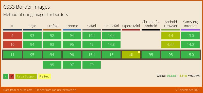
Browser Support
For browser support, we have to look at multiple properties technically. Still, the one below should give you an excellent example of the support.
Thank you for reading, and let’s connect!
Thank you for reading my blog. Feel free to subscribe to my email newsletter and connect on Facebook or Twitter